back to gridWork
- Home Page
- Apigee needed to appeal to both developers and enterprise customers that work with APIs.
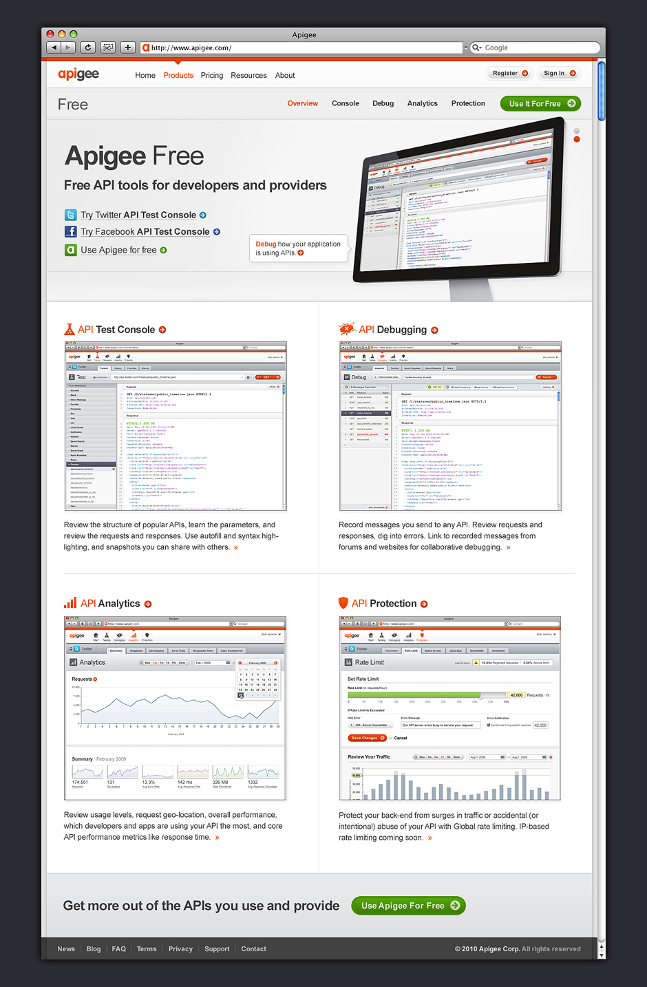
- Developer Product
- The aim of this page was to get developers working with Apigee's API tools as quickly as possible.
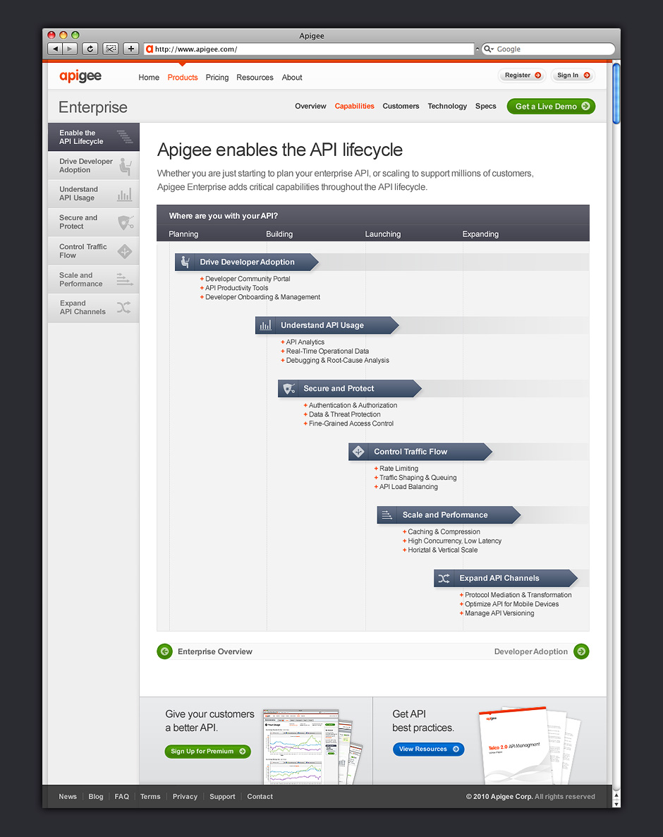
- Enterprise Capabilities
- API management was a relatively new thing, so the site needed to educate prospective customers.
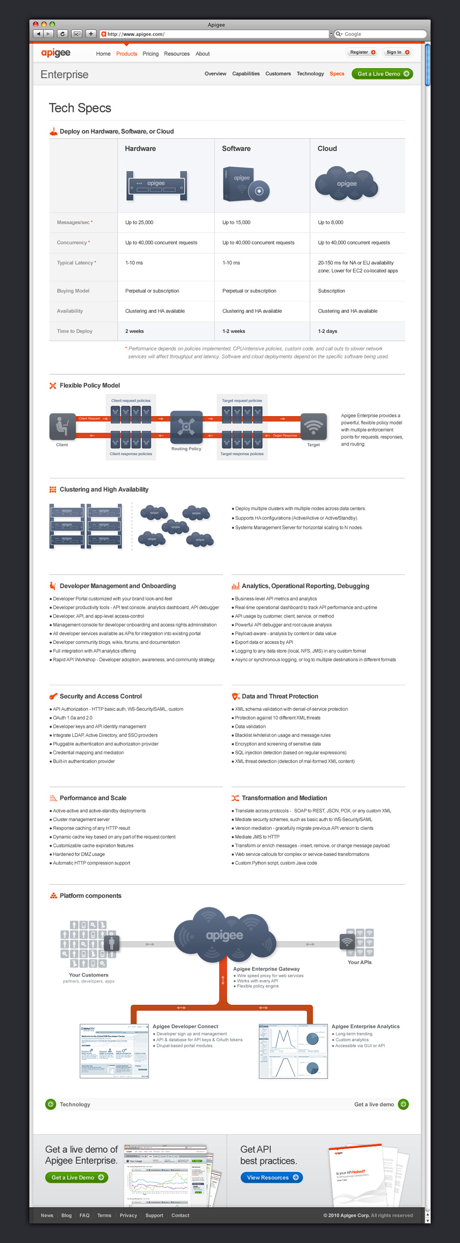
- Tech Specs
- Illustrations and diagrams were used to make a very technical subject more digestible.
- Contact Us
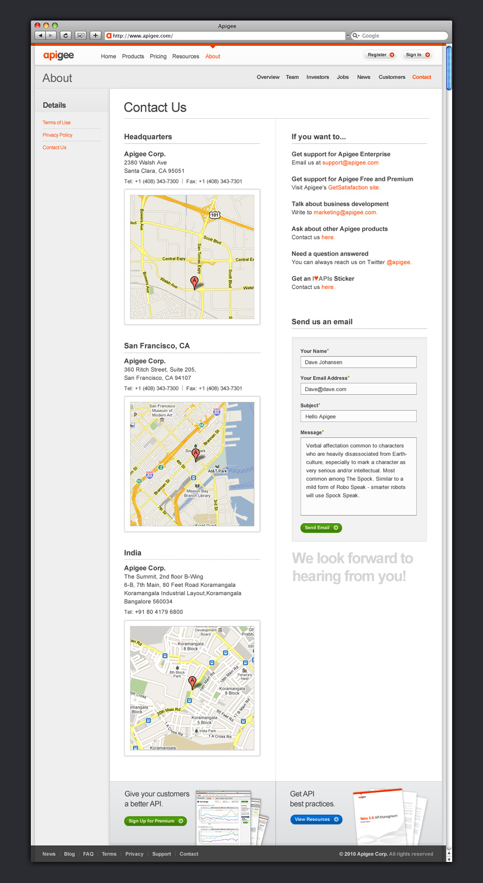
- This site was created on a very tight timeline. Google maps makes this page feel more like a destination.
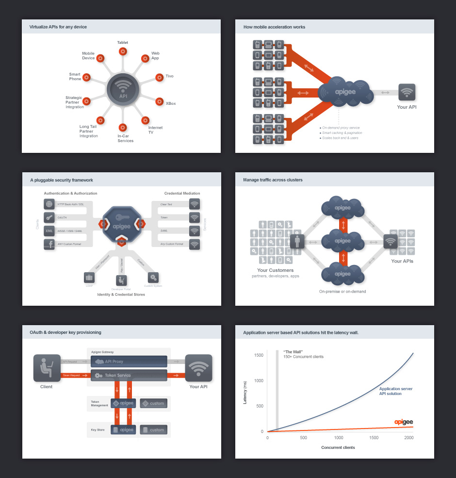
- Marketing Diagrams
- This system of diagrams was intended to help customers understand how Apigee's technology works.
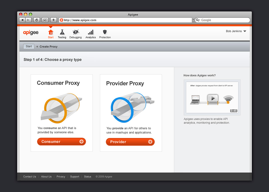
- Setup
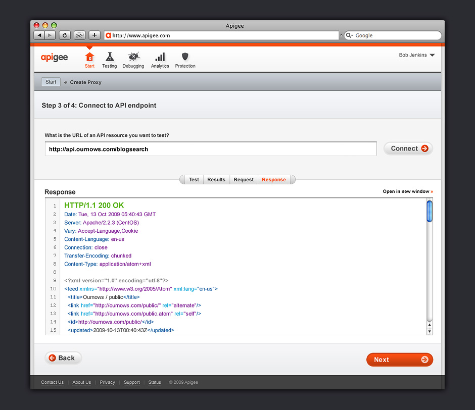
- We needed developers to understand that they would be funneling their traffic through Apigee.
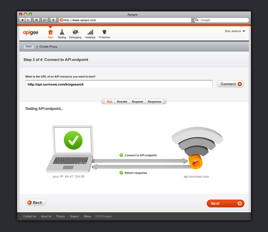
- Test API Endpoint
- Animations were used to make the setup process feel engaging.
- View Response
- Since this application was for developers, it was important to give them access to code.
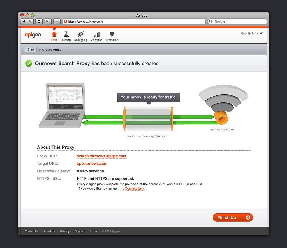
- Setup Confirmation
- The animation on this page was used as a reward for enabling the application.
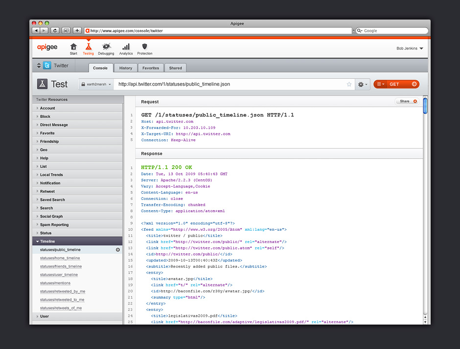
- API Console
- This tool allowed developers to learn new APIs.
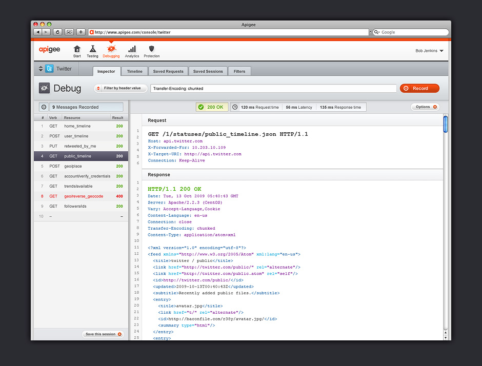
- API Debugger
- This tool helped developers debug how their applications interact with the APIs they consume.
- API Analytics
- This tool helped developers understand how their applications consume API data.
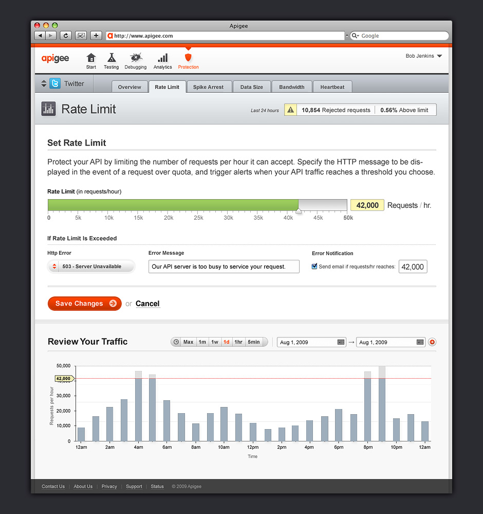
- API Rate Limiting
- This tool helped developers apply basic protections to the APIs they publish.
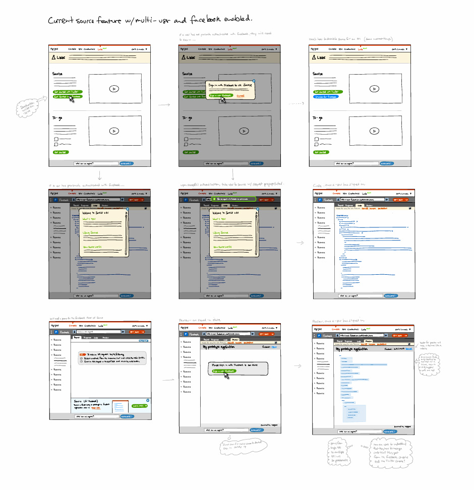
- Exploratory Sketches
- When exploring ideas for features, I often make digital sketches.
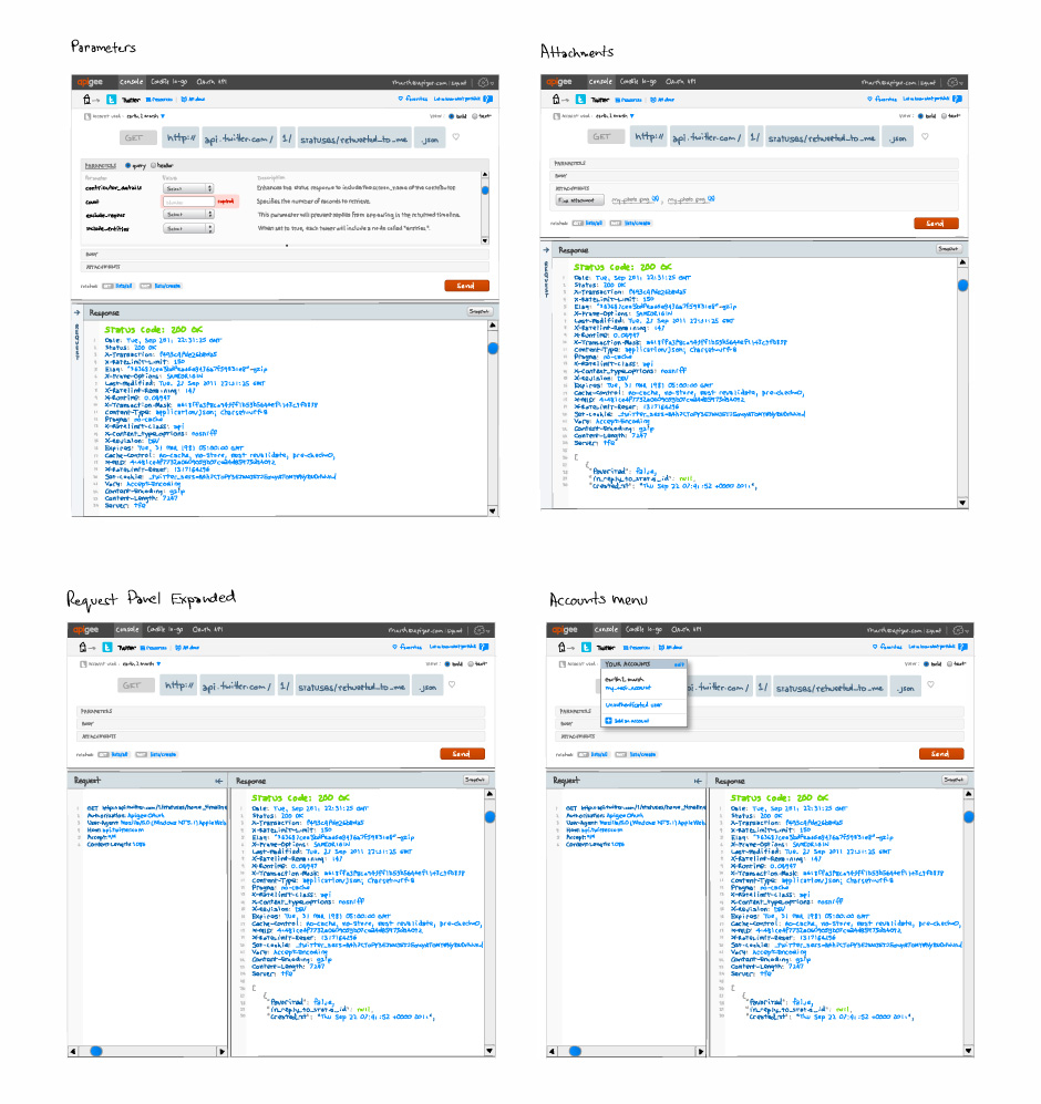
- Detailed Sketch
- There are times when more detail is needed to understand whether a feature has merit.
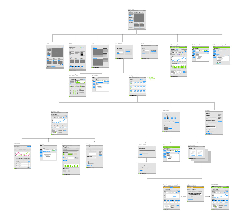
- Architecture Diagram
- This is a useful way to help team members understand what a large design effort will entail.
- Diagram Detail
- This hints at the kinds of content each page will contain.
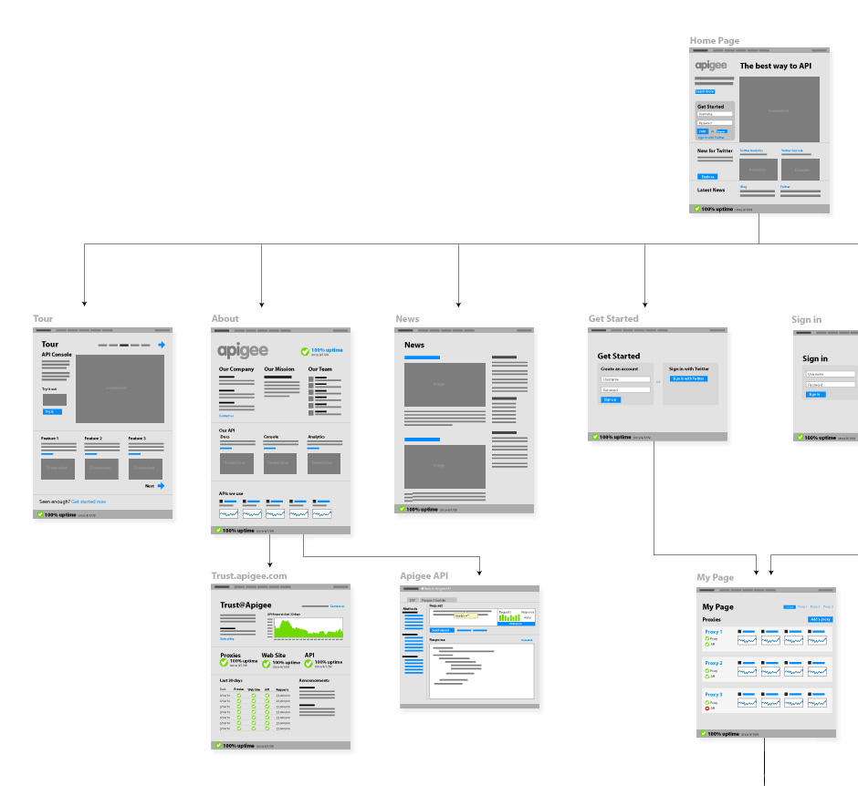
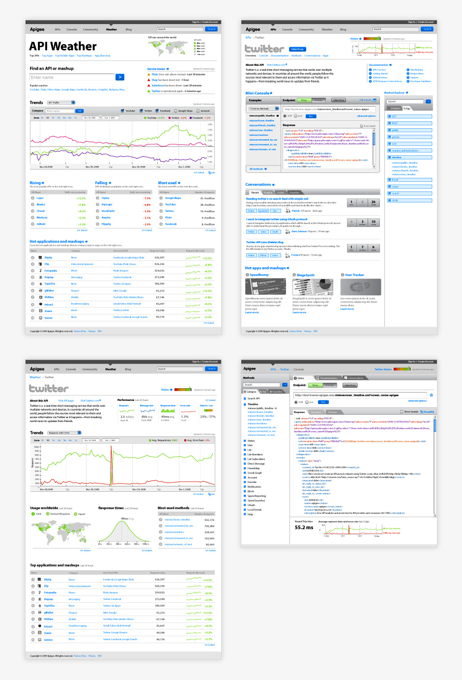
- Wireframes
- These wireframes were made when we were exploring what Apigee would be in the future.
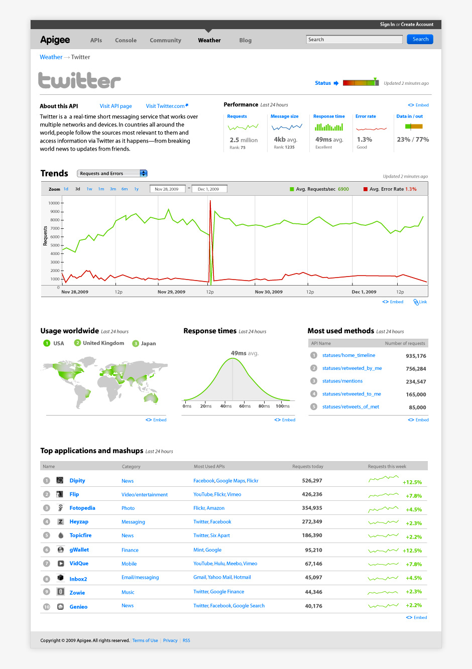
- Wireframe Detail
- Details helped team members more effectively evaluate future product ideas.
- Logo Design
- I designed Apigee's logo. We aimed for something that would appeal to both developers and enterprise companies.
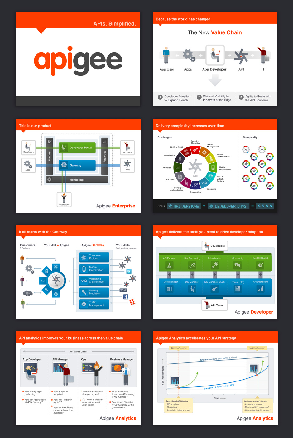
- Sales Presentation
- I also designed sales and marketing materials.
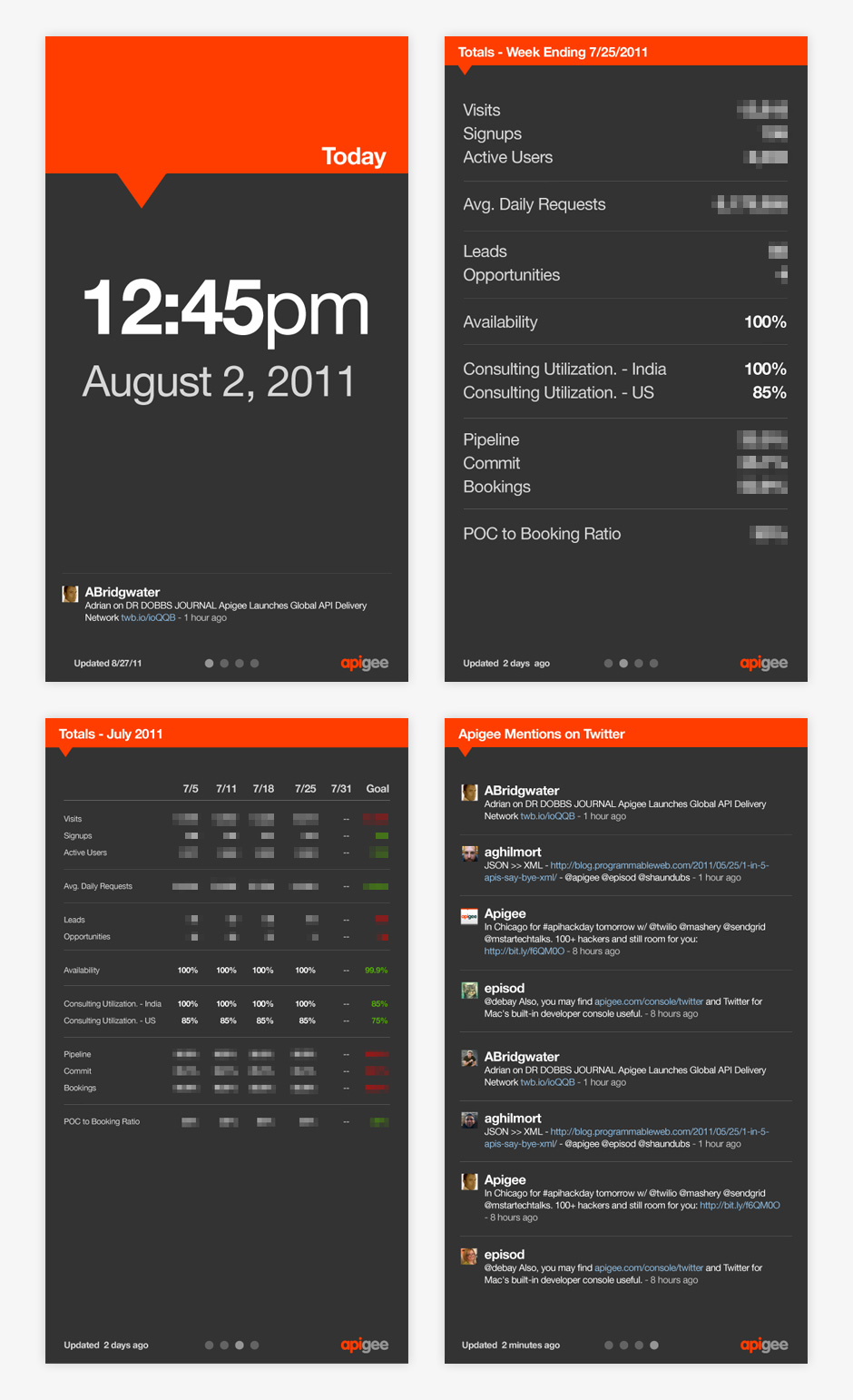
- Company Dashboard
- This company dashboard was a hackday design project. The dashboard is displayed at Apigee HQ.
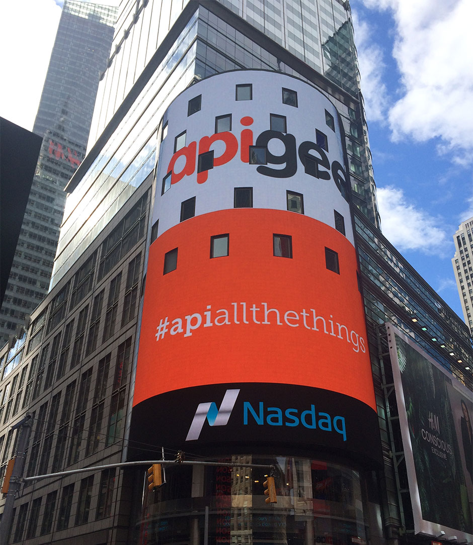
- Going Public
- In 2015, Apigee went public. I was surprised and proud to see my work in Times Square.
- Going Public
- In 2015, Apigee went public. I was surprised and proud to see my work in Times Square.
Apigee
Role: Design Direction, Visual and Interaction Design
Apigee began life as Sonoa Systems, a company that manufactured API management appliances. In 2008,
it became clear that many of the world's companies were going to rely on hosted services via APIs. Sonoa realized the company needed to move away from the hardware business towards offering cloud-based API management services.
The company decided it needed to have the room to experiment free from Sonoa's legacy, so we created
a separate brand named Apigee. Under Apigee, we worked to develop a set of tools to encourage software developers to build with APIs. Over the course of four years, I designed Apigee’s identity, marketing site, and tools that help developers learn and debug APIs.
Apigee was so well-received by Sonoa's customers and investors, the company decided to rebrand itself. In the three years following the rebrand, Apigee has enjoyed a ten-fold increase in visitors and revenue, and has become a recognized leader in the API management space.
View this Project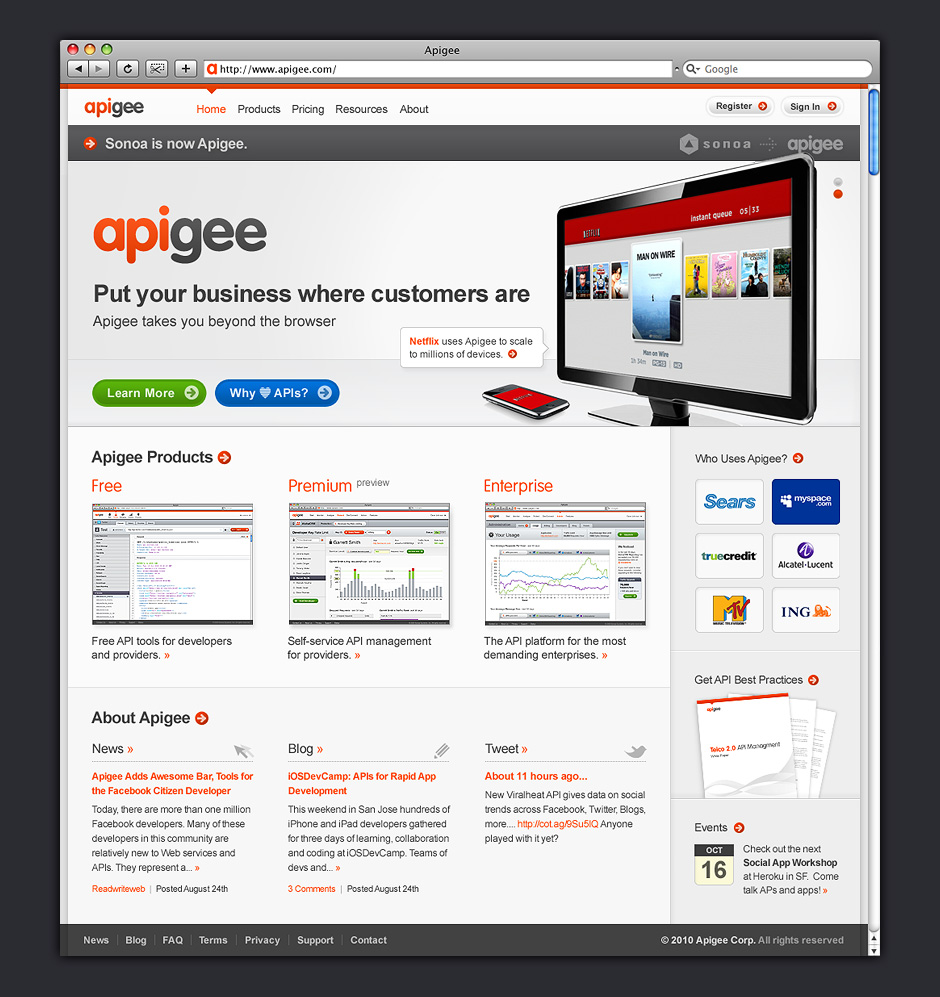


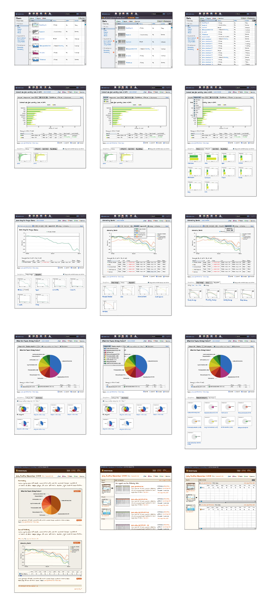
- v.1 Getting Started
- Swivel started out as an application for people who were operating businesses enabled by online services.
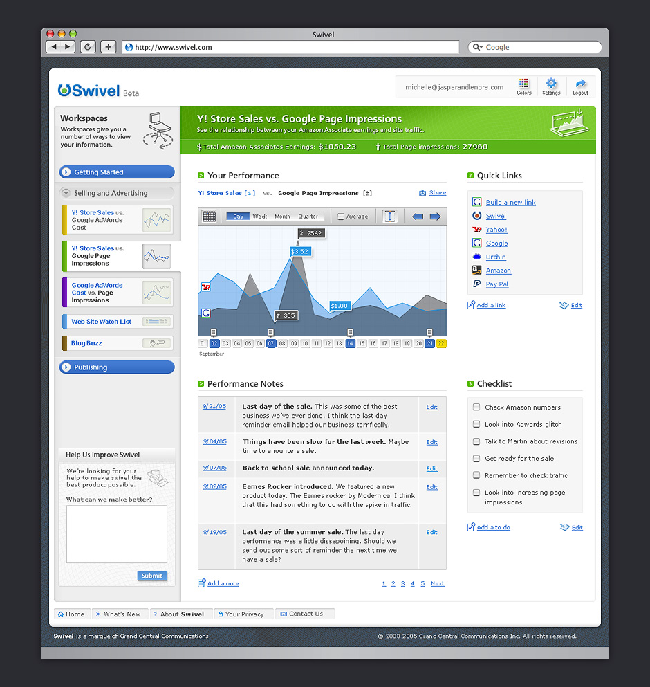
- v.1 Dashboard
- Swivel wanted to offer people a better way to see across the services they were consuming.
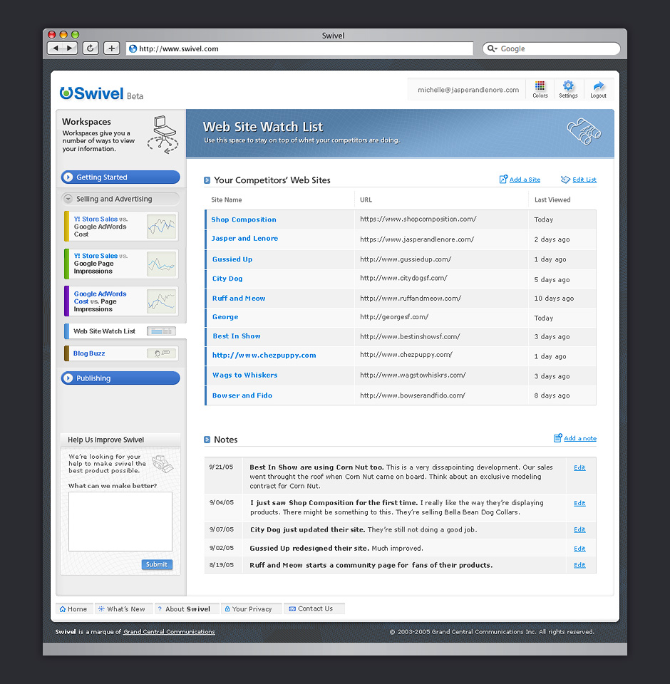
- v.1 List Page
- Swivel also gave people the ability to stay on top of what their competitors were doing.
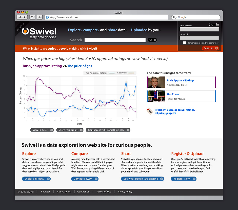
- v.2 Home Page
- Swivel morphed into a site for social data exploration. This design was simplified for quicker iteration.
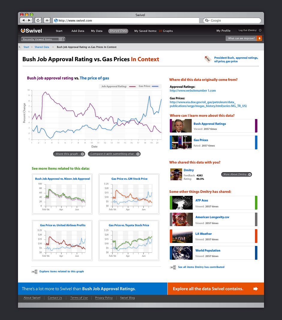
- v.2 Chart Context
- Each chart in Swivel was a node for data exploration.
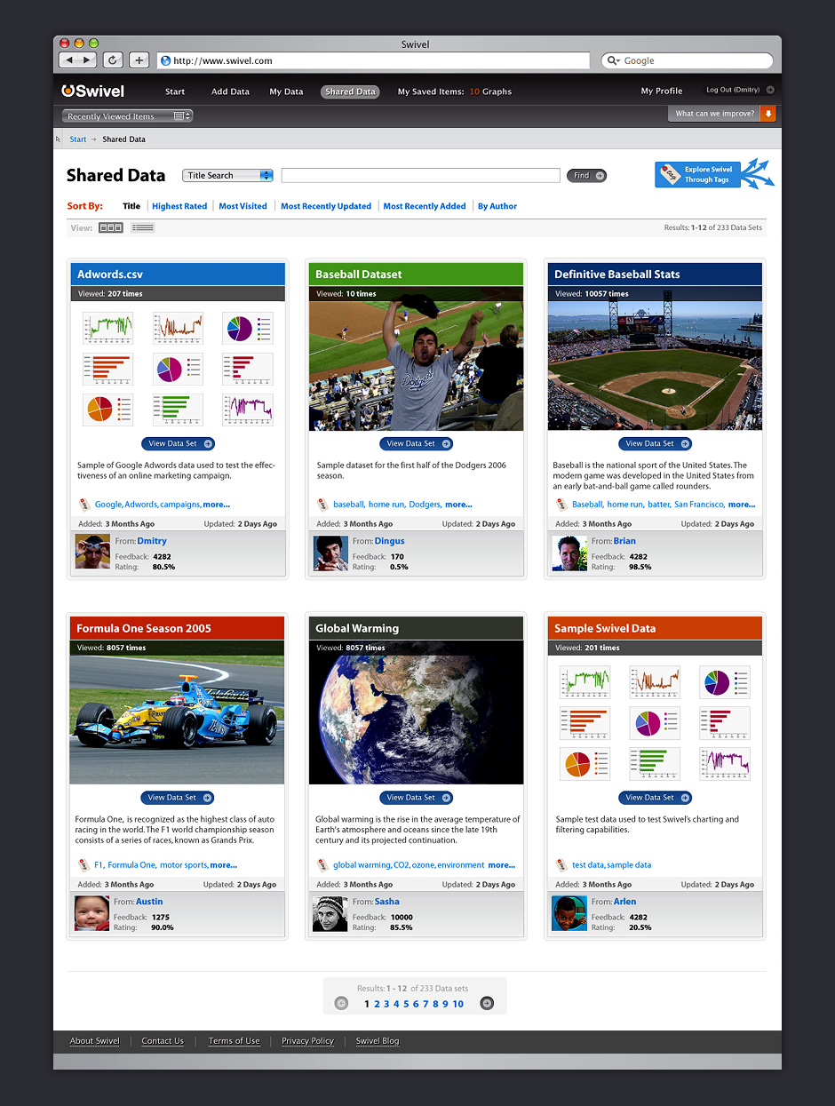
- v.2 Shared Data
- Swivel provided a place where people could share and discover lots of data.
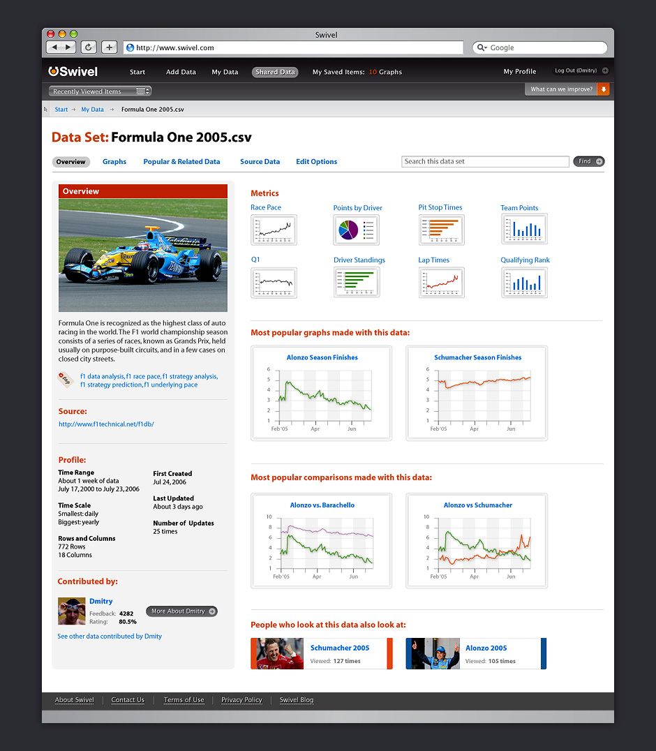
- v.2 Dataset Profile
- Every data source in Swivel had its own profile. This page shows all of the social activity related to this data.
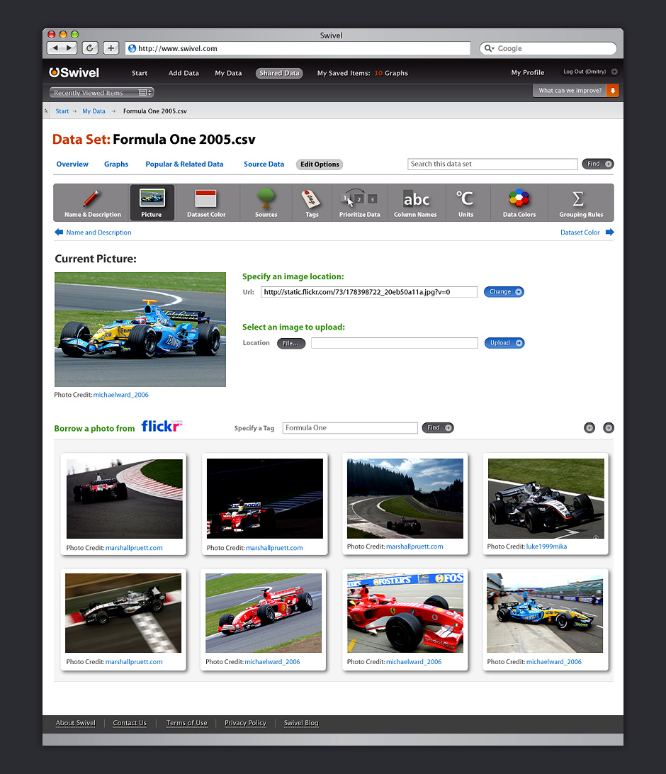
- v.2 Data Options
- Swivel offered ways for users to describe and differentiate their data.
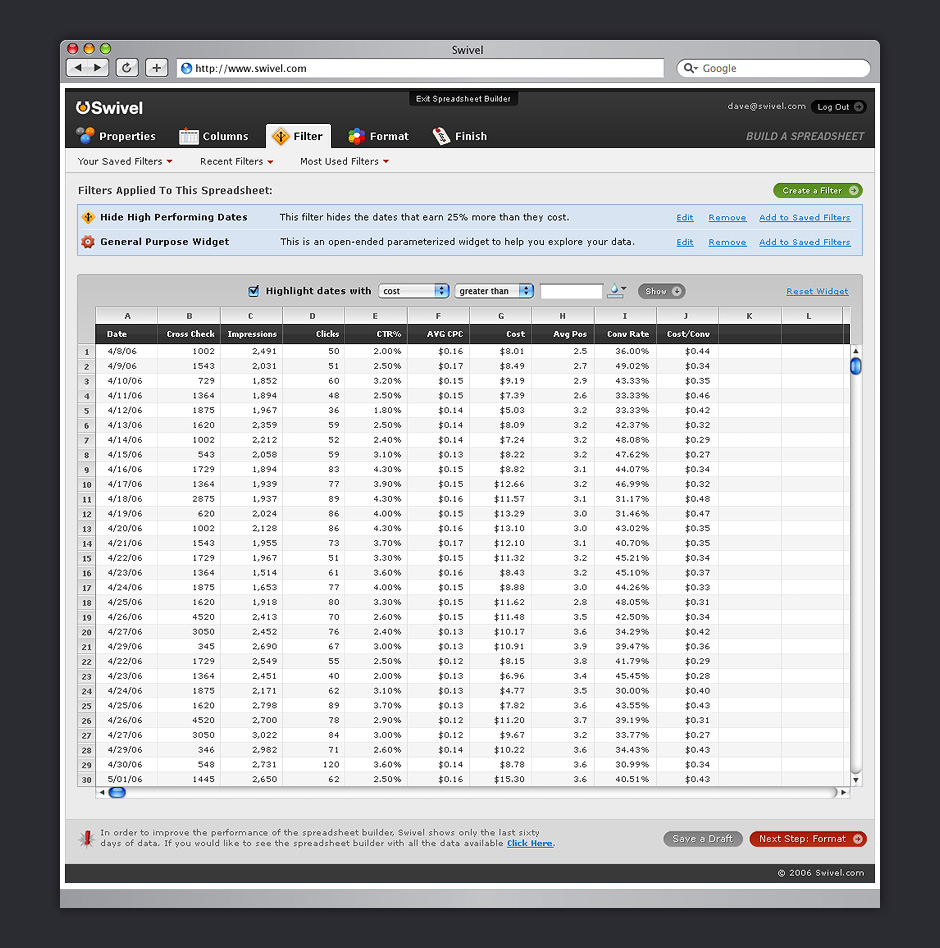
- v.2 Spreadsheet with Filters
- Filters offer a non-destructive way to extract useful views from large datasets.
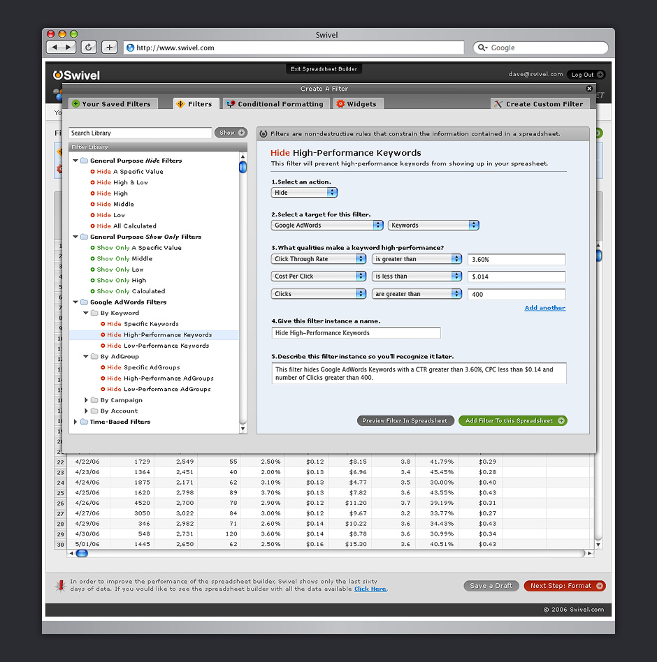
- v.2 Create Filter
- Preset filters were planned to help people isolate useful data.
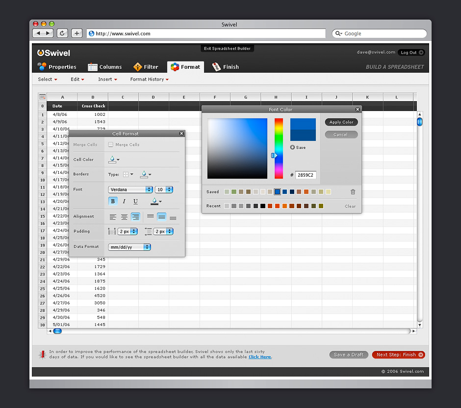
- v.2 Format Data
- Since data can be very complex, it was important to allow people to format data for clarity and communication.
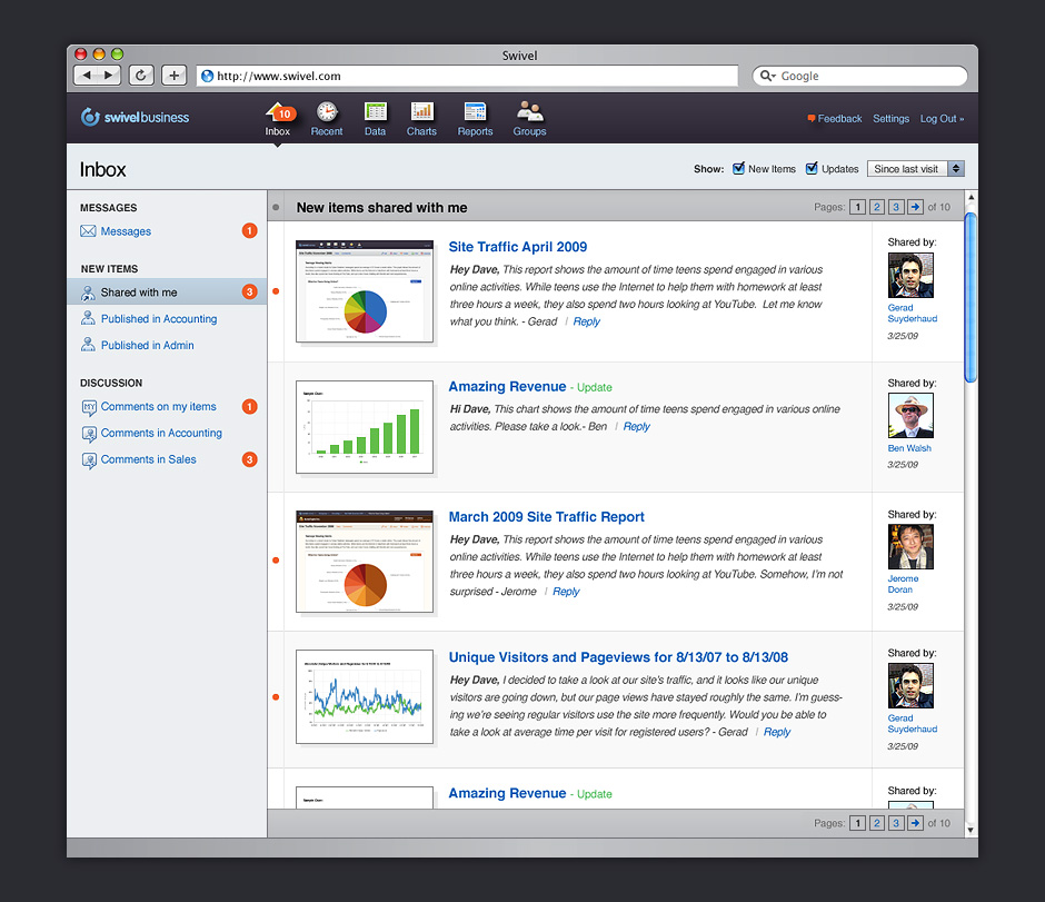
- v.3 Swivel Business
- Swivel underwent another major transition. The design of the site was adjusted for a new audience.
- v.3 Chart Exploration
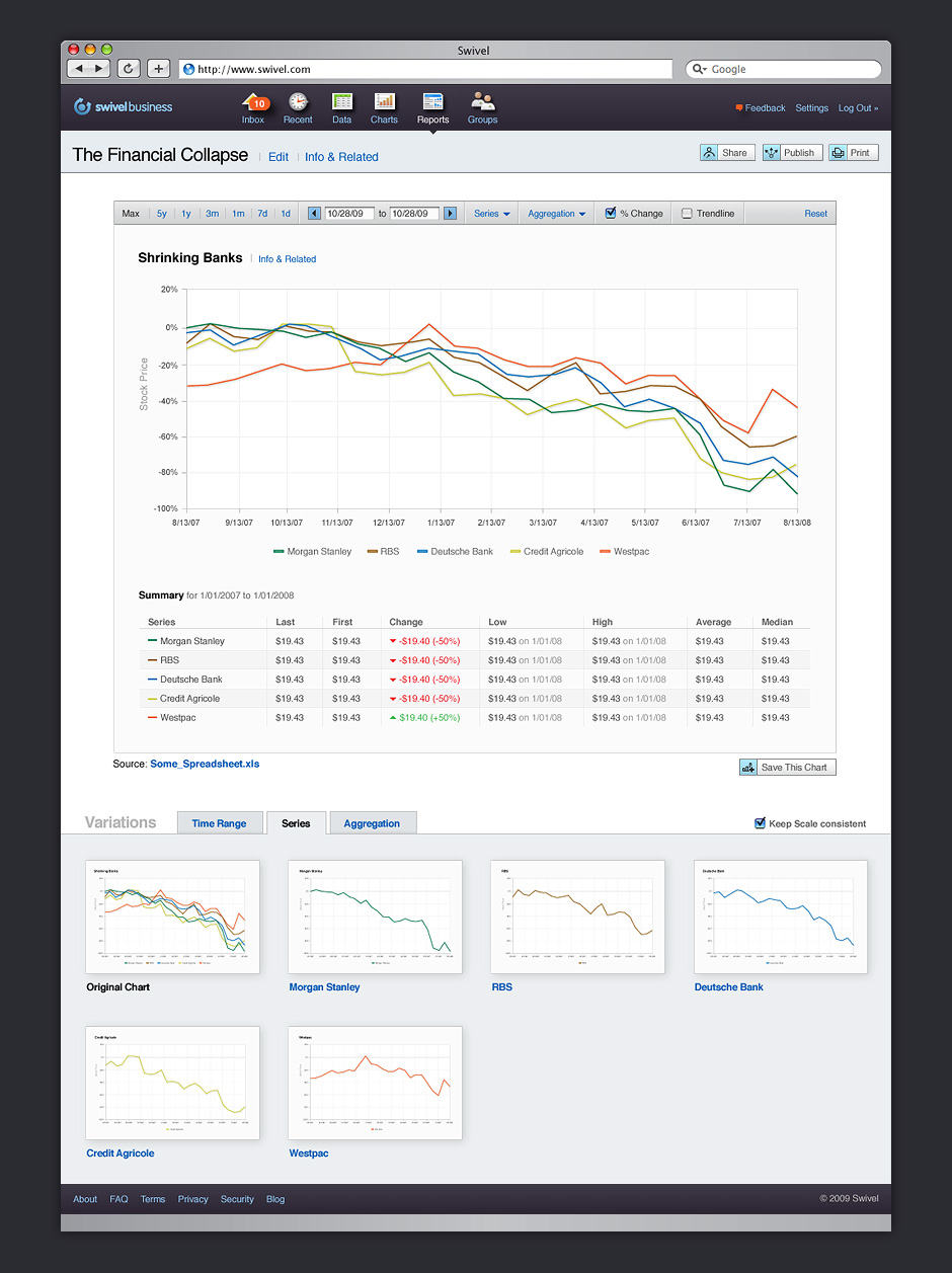
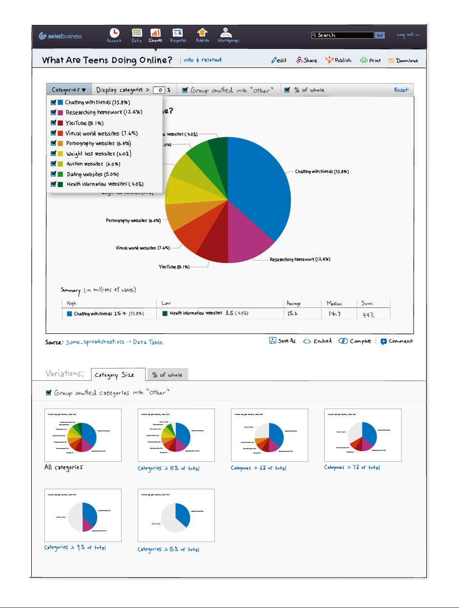
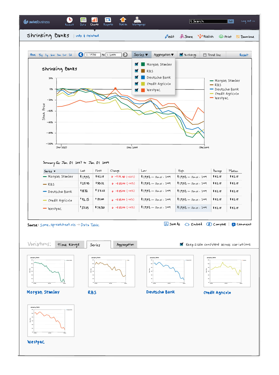
- Each chart developed in Swivel could be explored. Chart variations were generated based on the data.
- v.3 Fix Data Issues
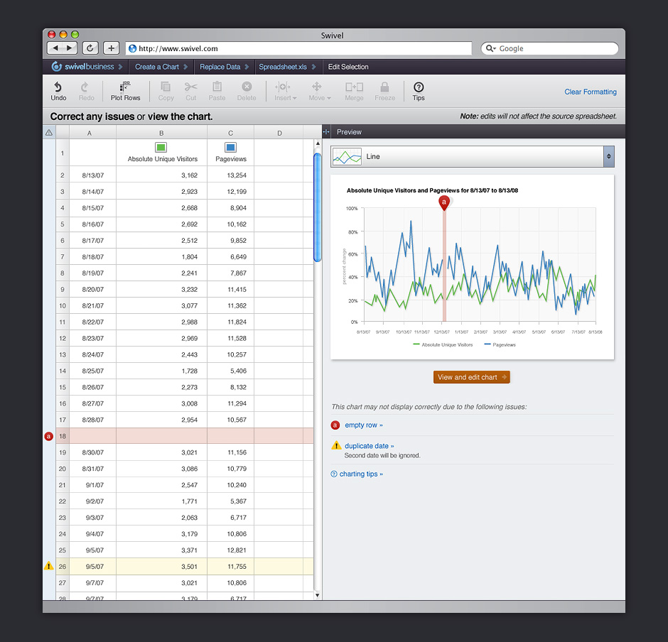
- Getting data into a usable format could be a challenge. Swivel needed to help users correct gaps in data.
- v.3 Format Chart
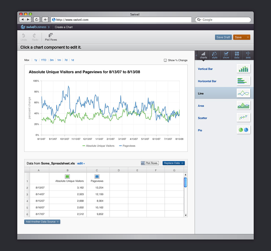
- An important part of sharing data is the ability to modify how it is styled.
- v.3 Data Options
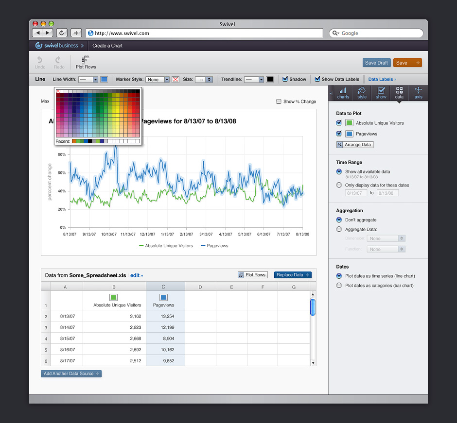
- Swivel provided non-destructive ways to adjust how data was displayed in charts.
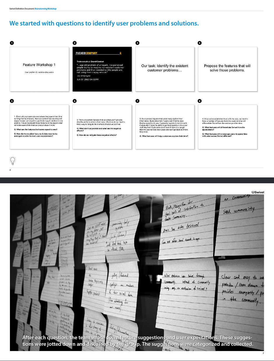
- Brainstorming Workshop
- Swivel began with a team brainstorming session. I assembled questions and organized the results.
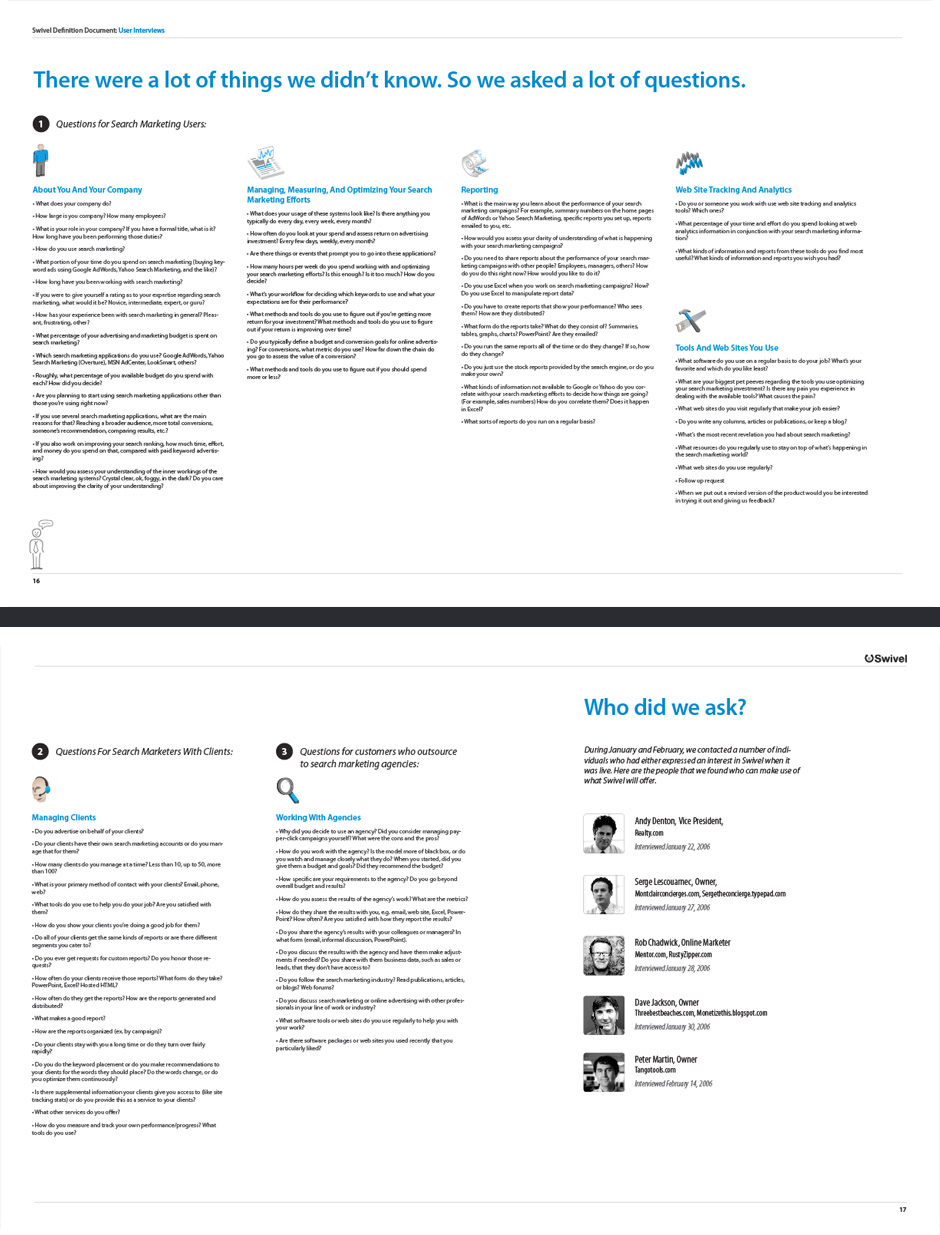
- User Interviews
- We conducted interviews to identify a target audience and understand the challenges they face.
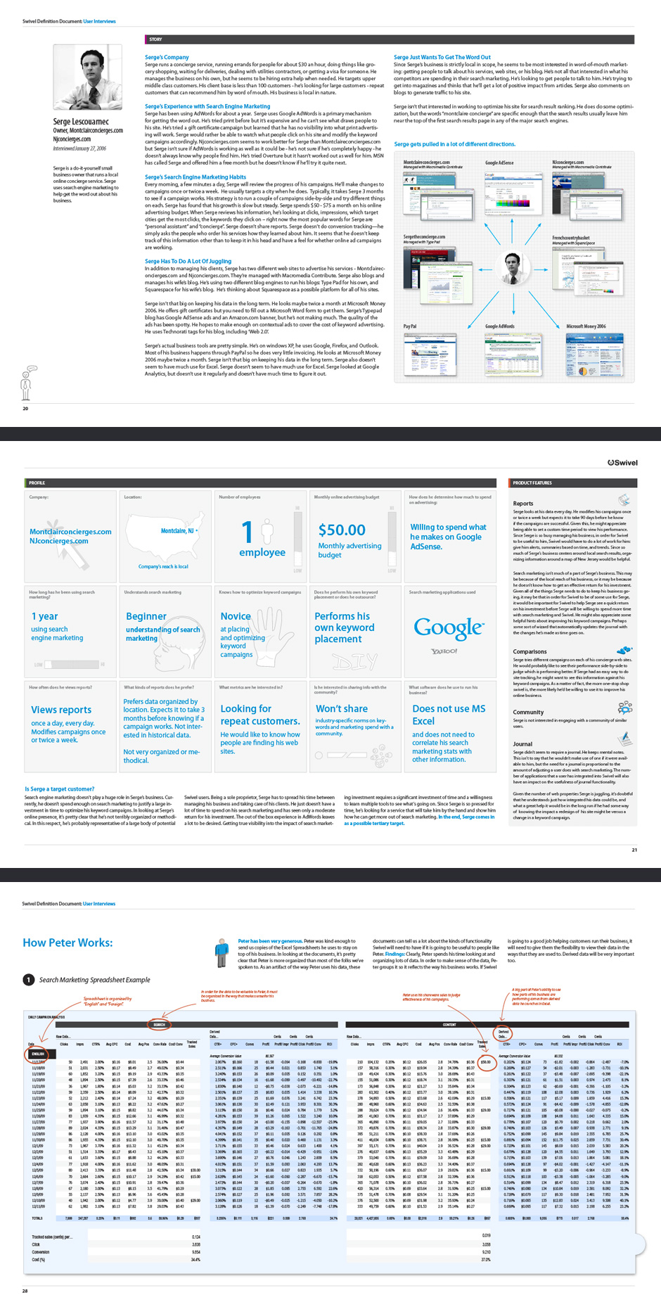
- User Profile
- I organized our findings so we'd have a better picture of our target customer.
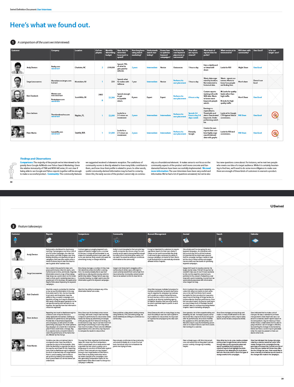
- Feature Takeaways
- This summary detailed the features needed to serve our target audience.
- Product Story
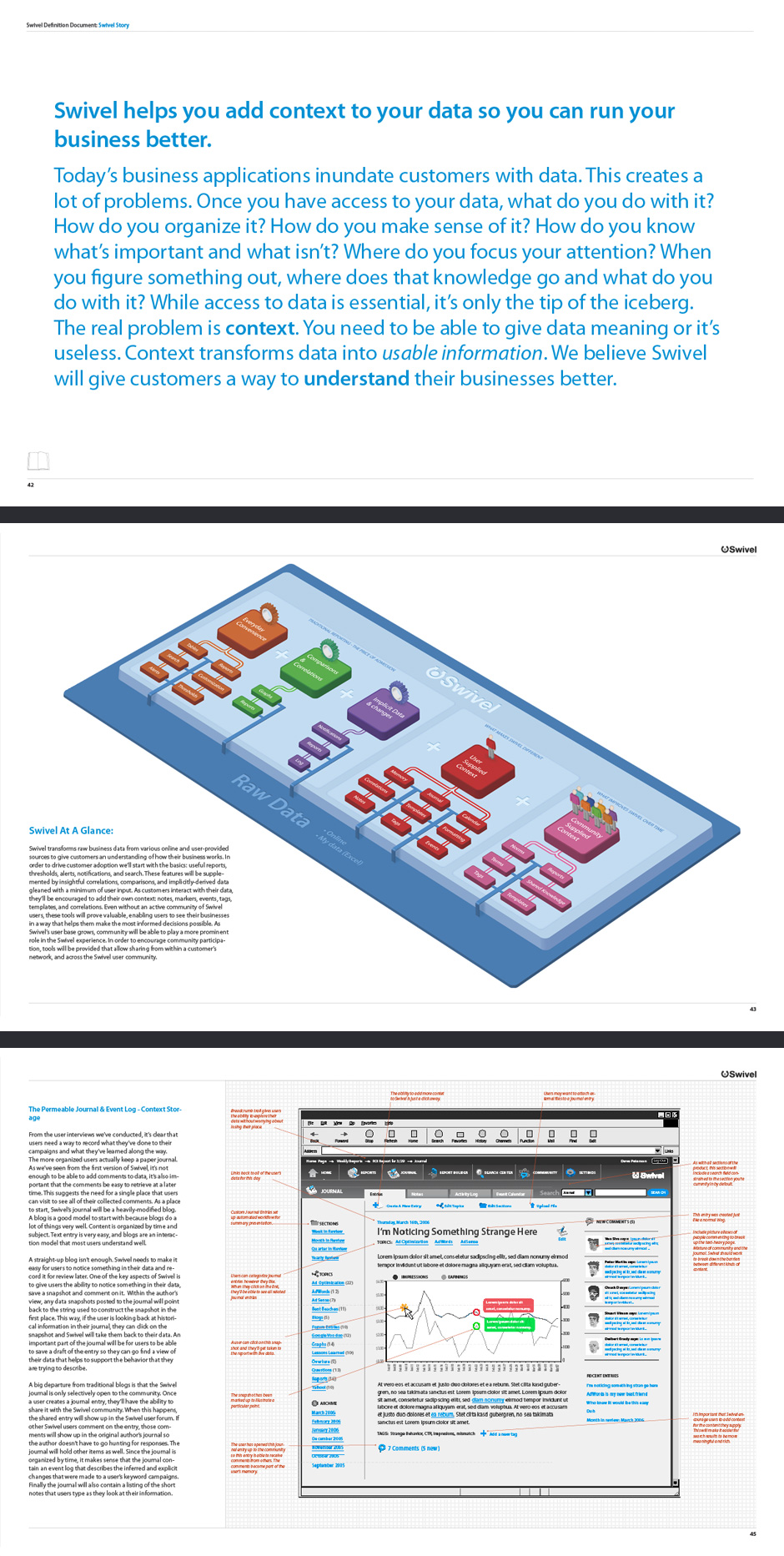
- Once we felt we had a sufficient handle on what Swivel would be, we created an illustrated product story.
- Product Map
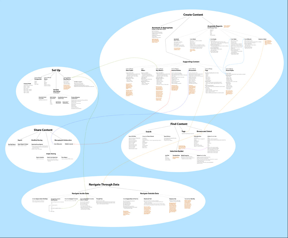
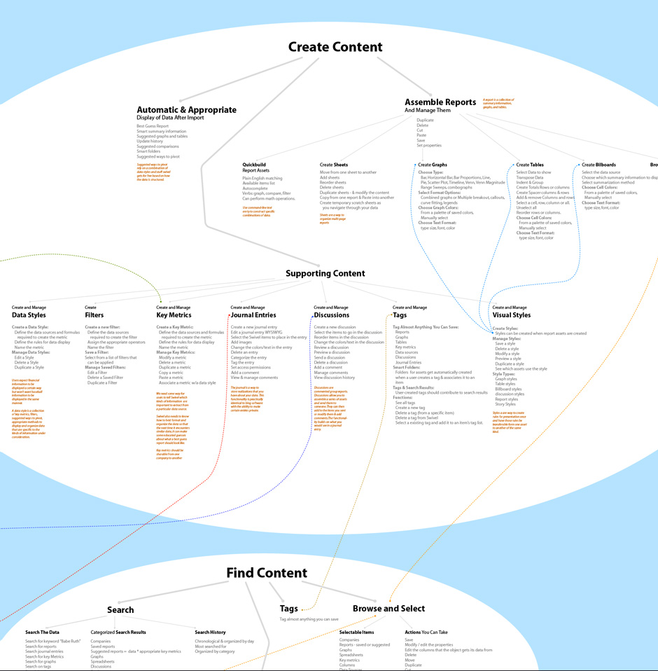
- This is a large-format map of the features Swivel planned to offer.
- Product Map
- It outlines the key activities that the application would need to support.
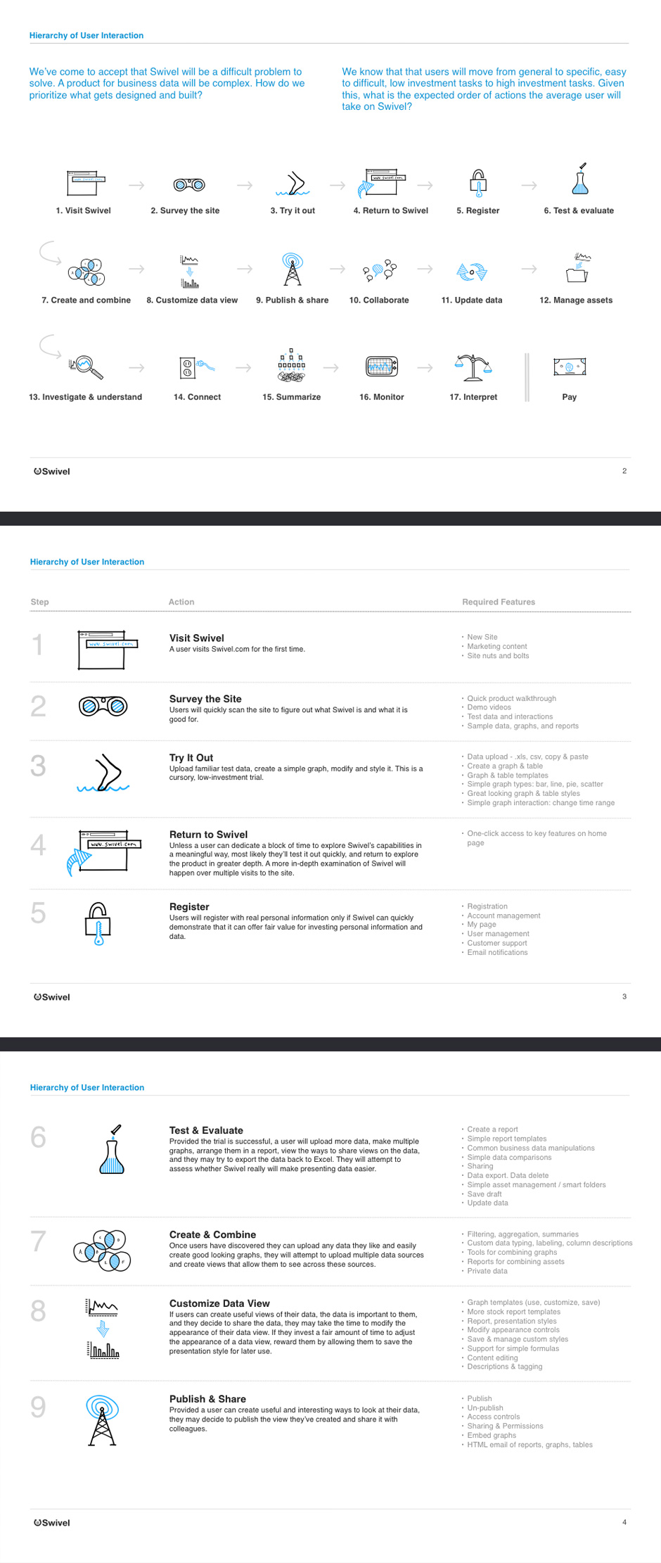
- Hierarchy of User Interaction
- Swivel was a big project, so we needed a way to prioritize construction of the product's features.
- Site Inventory
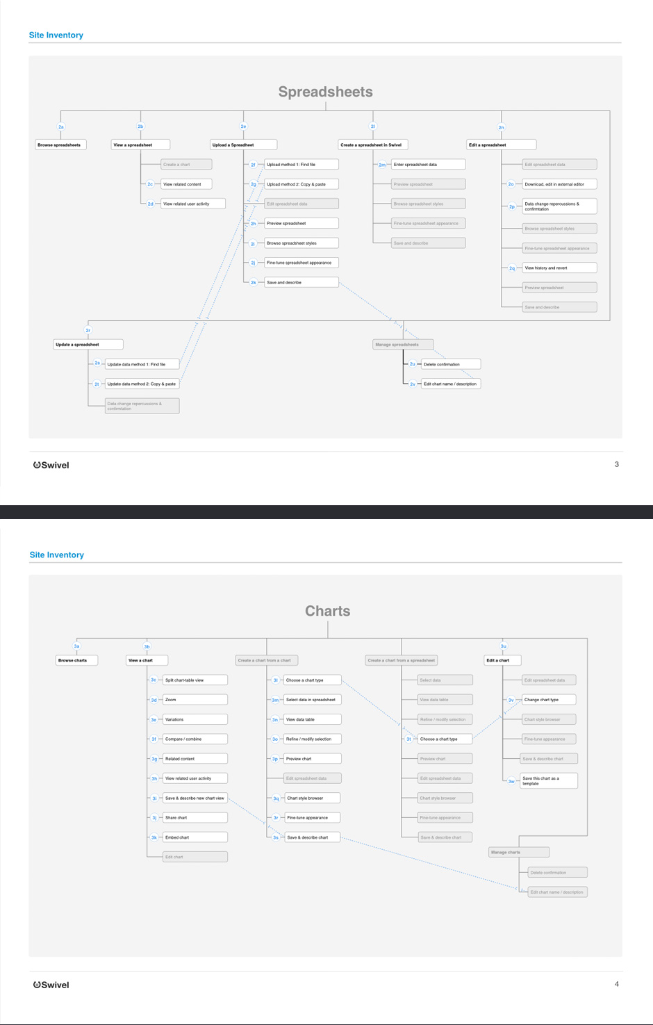
- Once we decided on the features we'd have for launch, we needed to understand how they would be arranged.
- Application Flows
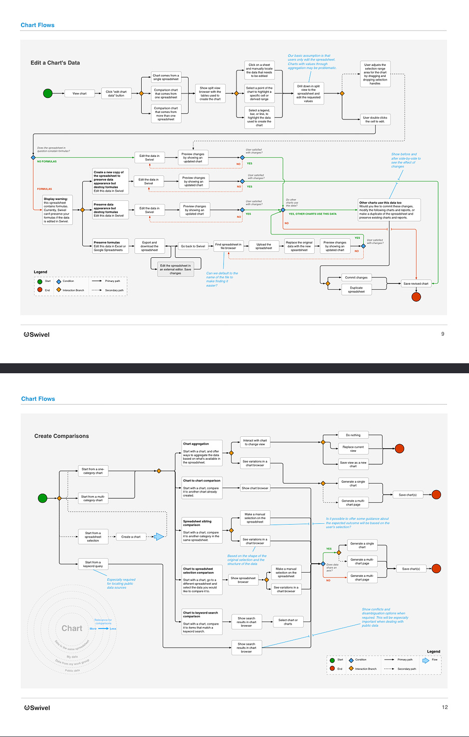
- These diagrams were used to help us understand how the application would need to behave.
- Interaction Specifications
- Complex UI interactions were broken down into buildable chunks.
- Wireframe
- Wireframes were digitally sketched for speed.
- Wireframe
- Digital sketching combines freeform thinking with the power that comes with working on the computer.
- Wireframe Variations
- Wireframe variations are sketched on a large canvas to see how the application works as a whole.
Swivel
Role: Design Direction, Visual and Interaction Design
Swivel was started with a simple observation: people are drowning in data. Swivel's founders believed that when citizens, businesses, and governments can see data better, they will make better decisions. We set out to provide a place where people could collect, explore, present, and discuss data.
During my time at Swivel, I designed three significant generations of the product. I developed interaction models for social data exploration and storytelling.
I worked closely with the product team determine
the features required for launch.
Unfortunately, Swivel was not a success. We discover-ed that the problem space for social data sharing is extremely complex. Real data is messy. Deriving meaning from data is hard, and presenting it in a way that increases understanding is quite difficult.
Despite Swivel not succeeding, the problems we set out to solve still exist and are more relevant than ever.
View this Project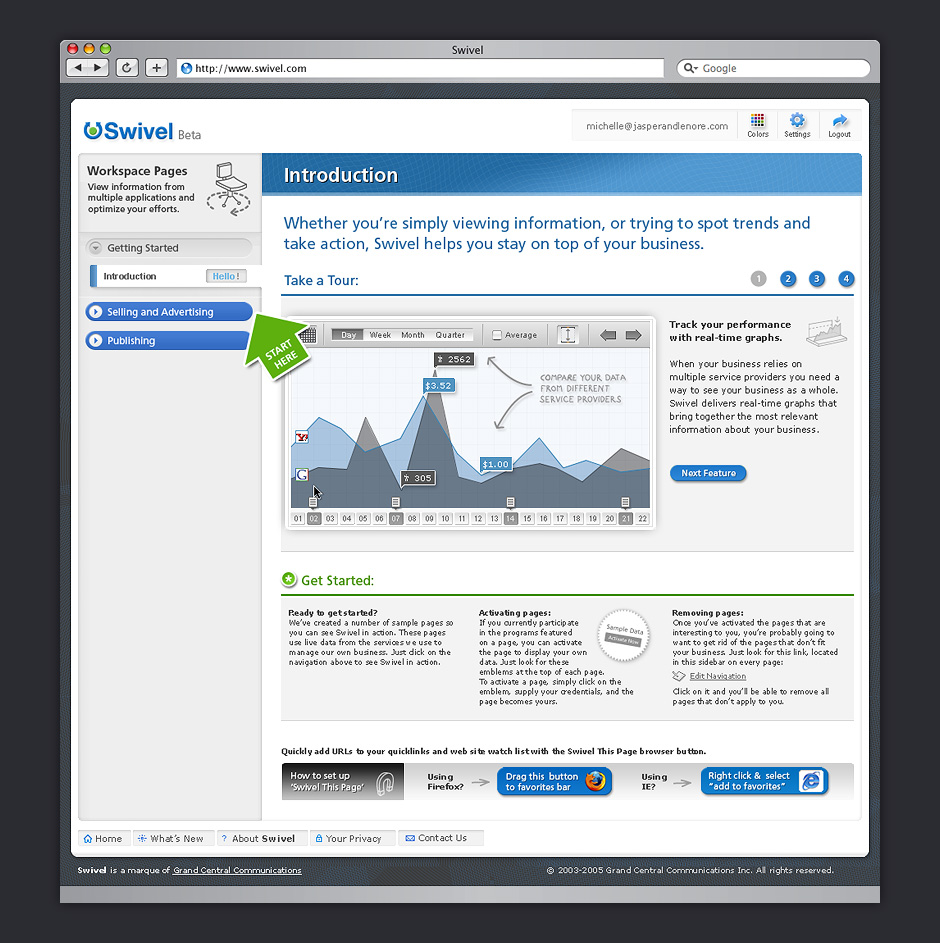

- Home Page
- The site was designed to be a neutral container for changing photographic content.
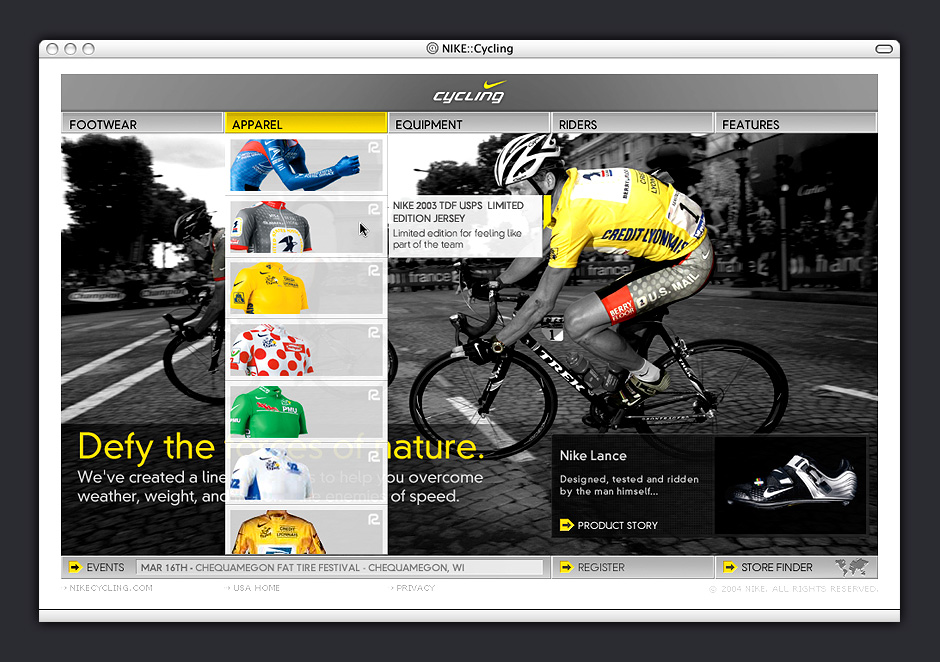
- Navigation
- This navigation treatment gave visitors a preview of the site's content while keeping page layouts simple.
- Product Page
- Once an item is selected, the navigation cycles over to the left and fades back.
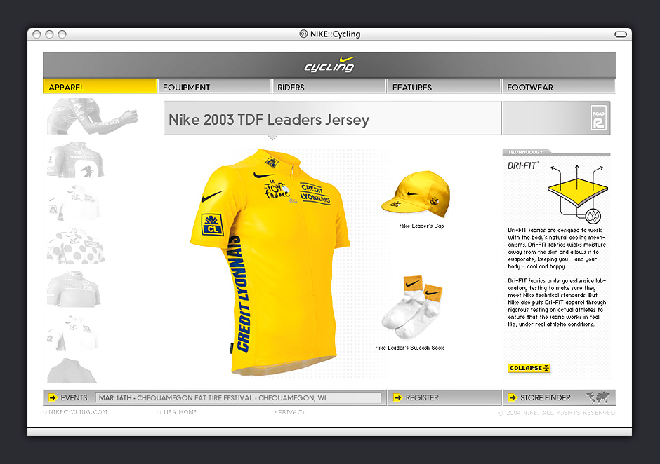
- Product Detail
- It was important to showcase Nike's technical and material advancements.
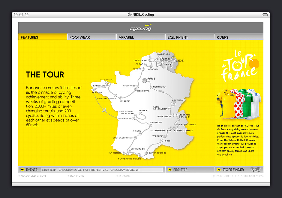
- Special Feature
- The site's visual language made reference to the materials used in bicycle components.
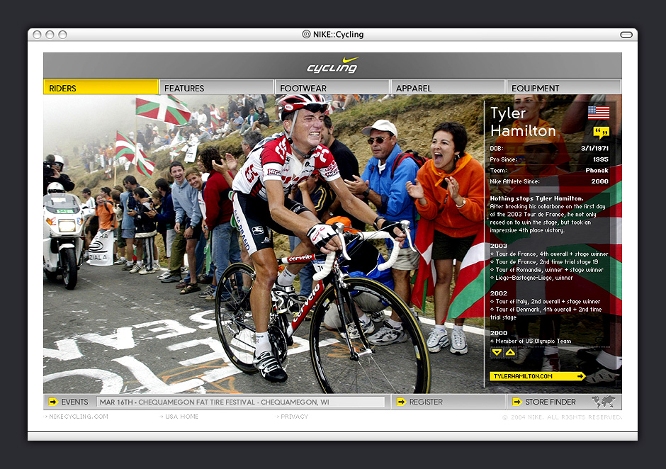
- Sponsored Rider
- The job of the design was to enhance Nike's amazing assets rather than compete with them.
- Sponsored Rider
- A restrained visual framework gave us the room to make some interactive flourishes.
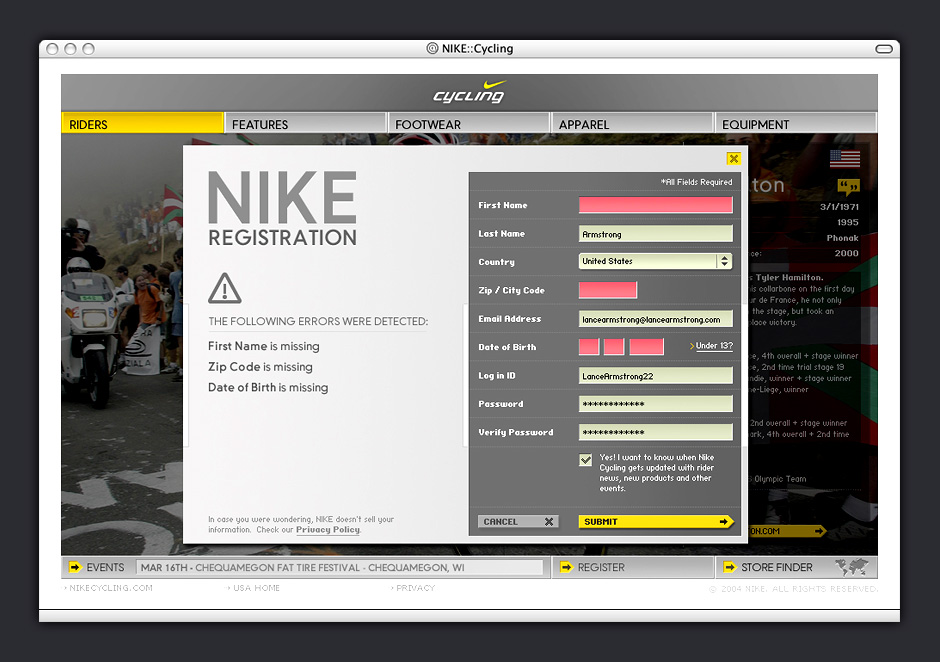
- Registration
- Obvious error states encouraged visitors to complete registration.
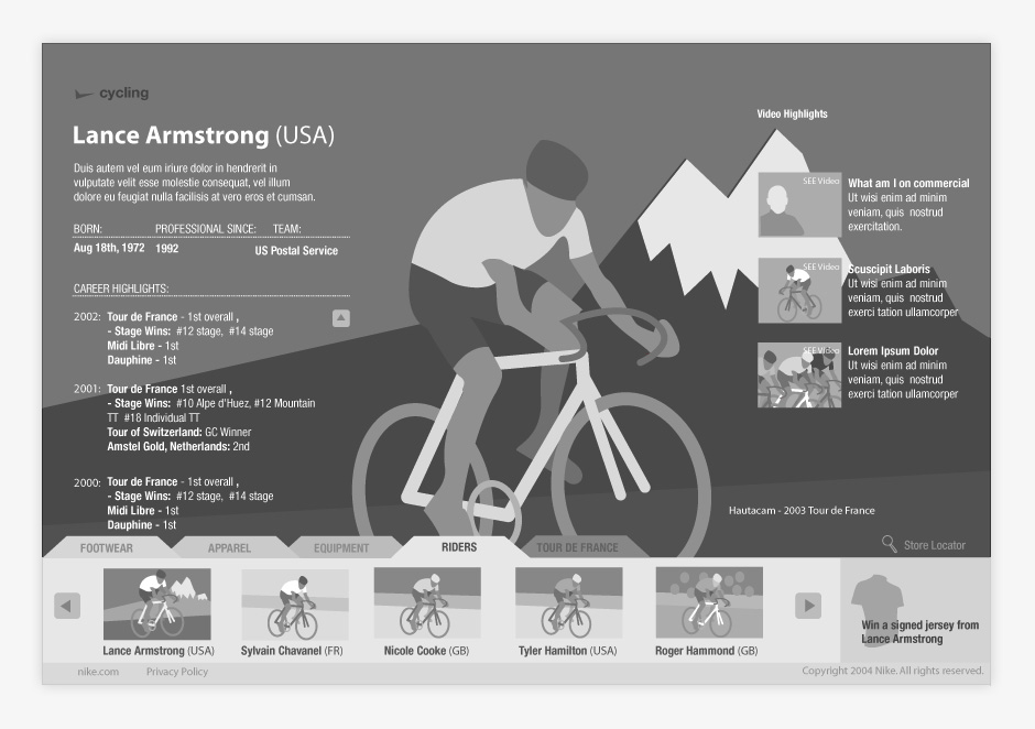
- Wireframe
- Design concepts were clearly articulated. This helped us get better feedback from decision-makers.
- Recognition
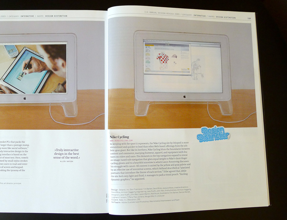
- Nikecycling.com was recognized in ID Magazine's 51st Annual Design Review.
- Recognition
- Nikecycling.com was recognized in ID Magazine's 51st Annual Design Review.
- Recognition
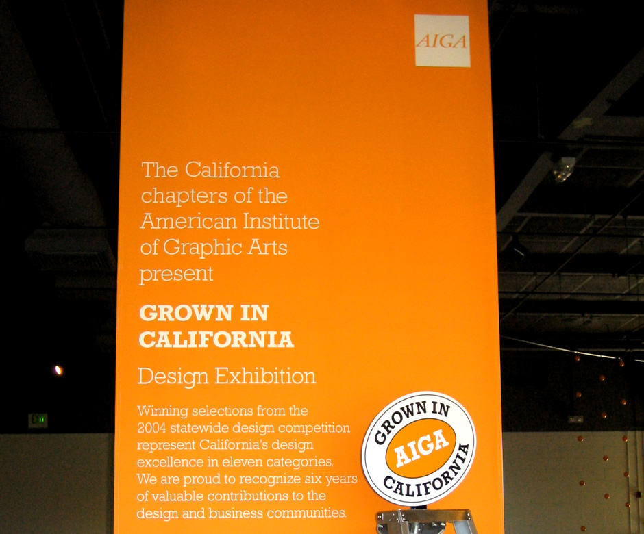
- Nikecycling.com was recognized by the American Institute of Graphic Arts.
- Recognition
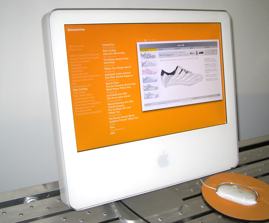
- Nikecycling.com was recognized by the American Institute of Graphic Arts.
Nike Cycling
Role: Visual and Interaction Design
Creative Direction: Tim Barber - Odopod
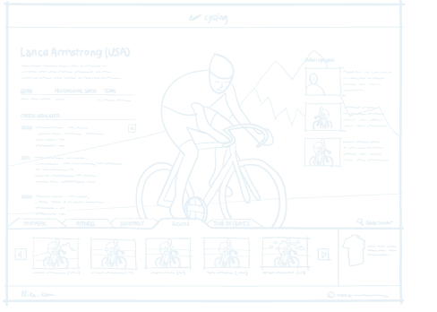
In the spring of 2004, Nike initiated a large marketing push to showcase cycling clothing, promote Lance Armstrong, and give the brand credibility with cycling enthusiasts.
We had a limited palette of assets to work with: product images, some athlete photos, and a couple of feature stories. The primary design challenge was to find a way to pull these into a cohesive whole.
Some sections of the site contained only a few items, so we devised a navigation scheme that incorporated product photos. This simplified the site's structure and reduced the number of clicks needed to see product details. The site's restrained appearance was used as a backdrop for interactive flourishes and animations.
Nike Cycling has been recognized by I.D. Magazine and the American Institute of Graphic Arts.
View this Project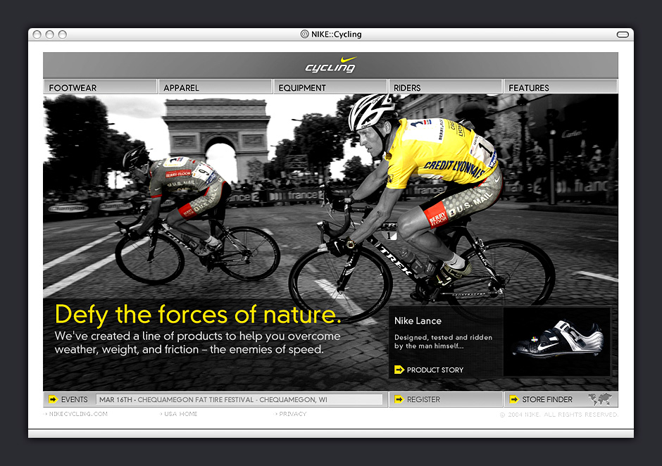



- Home Page
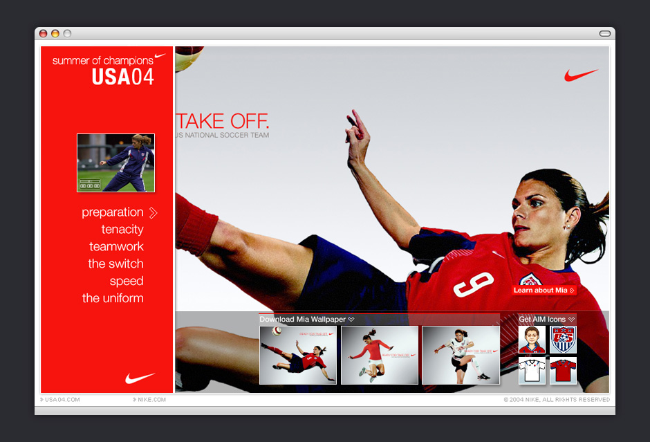
- The site was a simple container for a couple of athlete bios, videos, and downloadable assets.
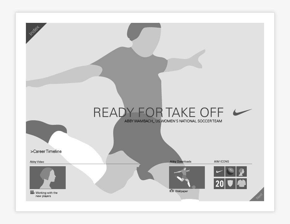
- Athlete Page
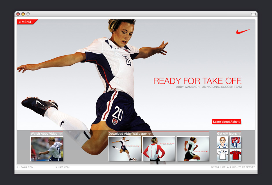
- The navigation packed away in order to better showcase this amazing photography.
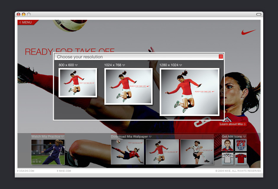
- Wallpaper Overlay
- The site was extremely simple, so it was vital that every detail was considered.
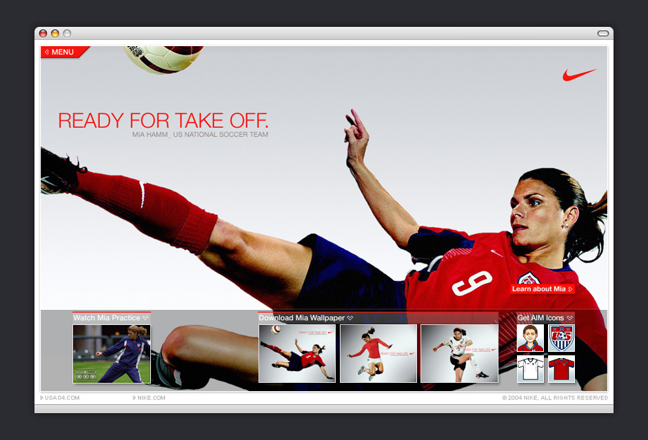
- Navigation Panel
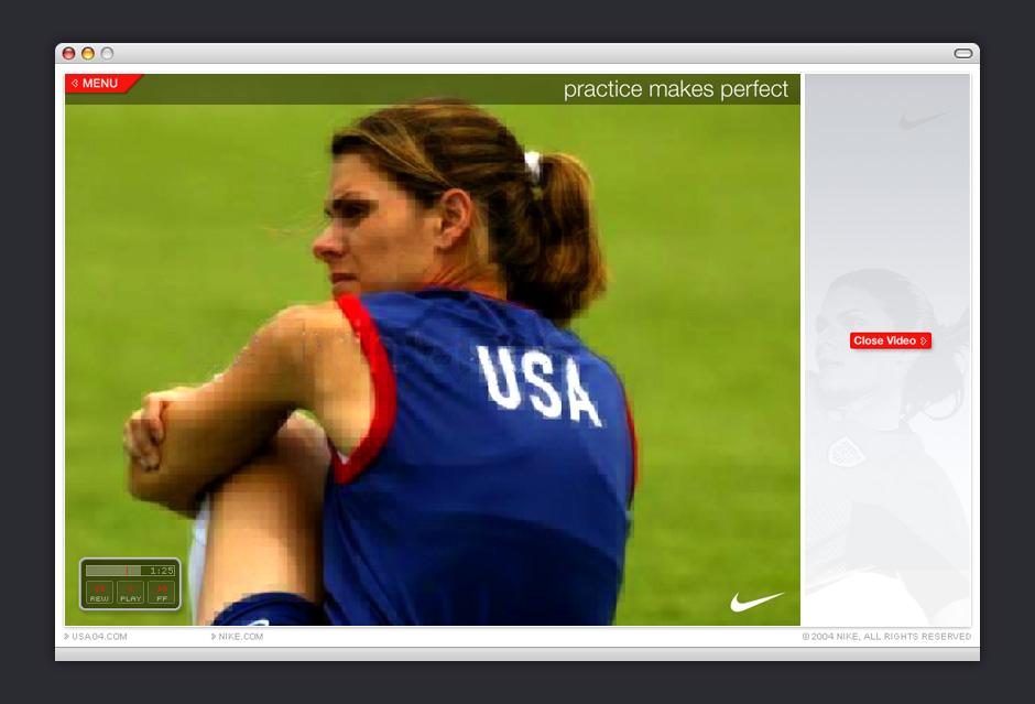
- The site also featured a number of candid behind-the-scenes videos.
- Video Viewer
- Videos were upsampled for greater impact.
- Athlete Page
- Site visitors could click on athlete images for more information.
- Bio Overlay
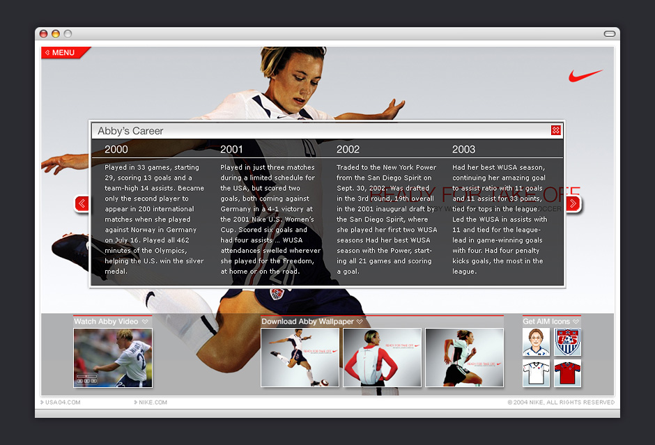
- Flash did a poor job antialising small text, so we used a bitmapped font for increased legibility.
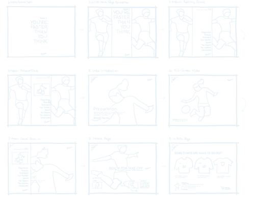
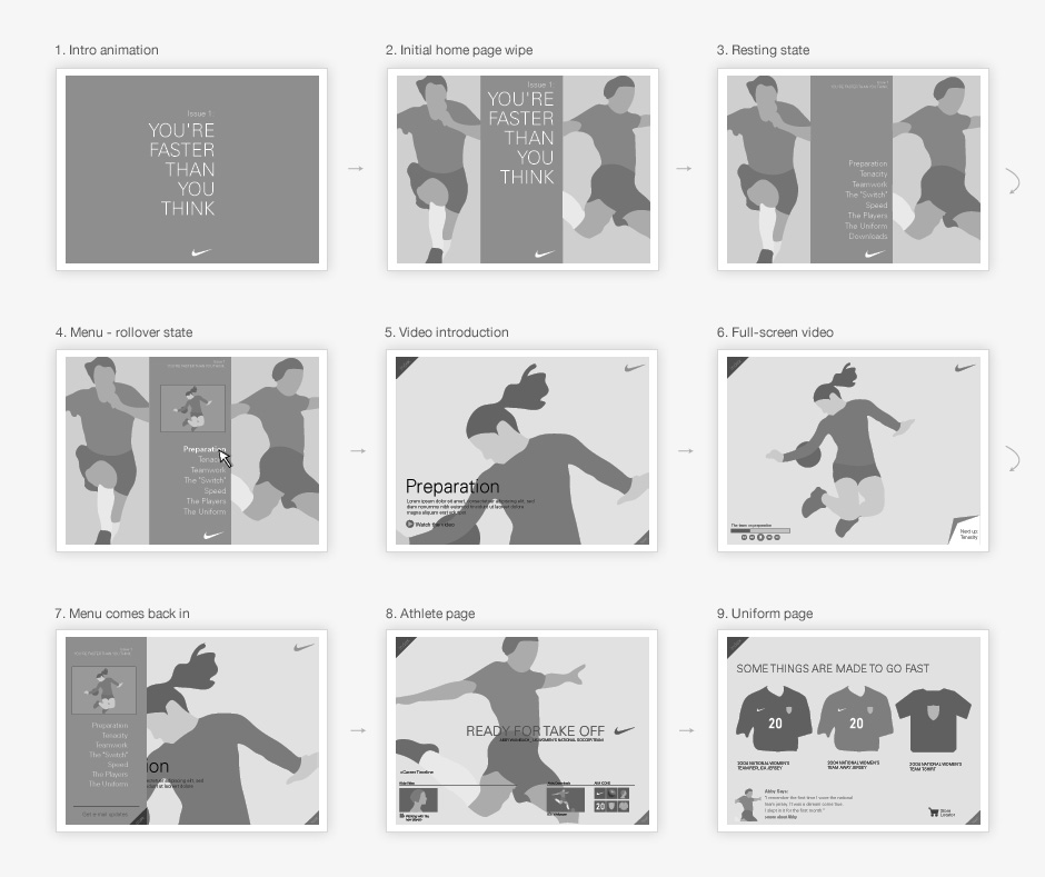
- Wireframe Sequence
- The wireframes made reference to the photography that was available for the project.
- Wireframe Detail
- This level of fidelity enabled us to work through layout issues and get quick approval from decision-makers.
Nike Women's Soccer
Role: Visual and Interaction Design
Creative Direction: Jacquie Moss - Odopod
Nike kicked off a $50 million marketing campaign in preparation for the 2004 summer Olympics. It wanted a small promotional site for teenage girls featuring videos about Nike-sponsored athletes on the US National Women’s Soccer Team.
The site was limited in scope, offering a handful of interview videos, bios of the team’s two most popular athletes, and some downloadable assets. Our challenge was to make this small site seem more complete and substantial than it actually was.
Doing work for Nike can be very inspiring, but there's a danger of over-designing things. This site's photography was its strength, so we made sure the visual design served to enhance, rather than compete.
View this Project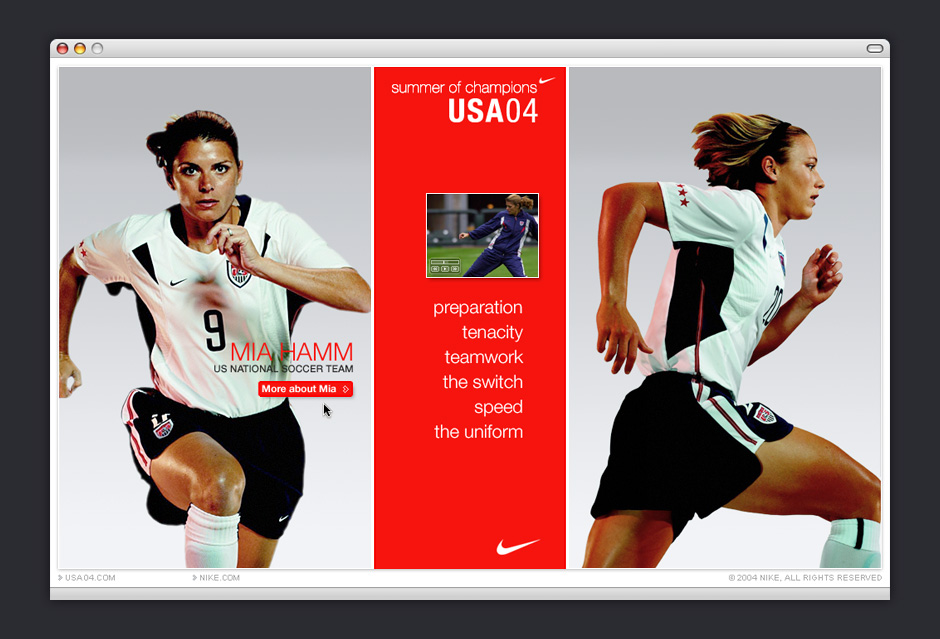
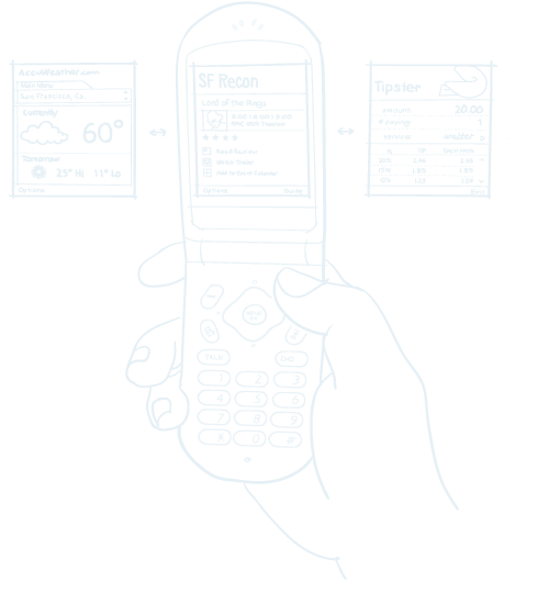
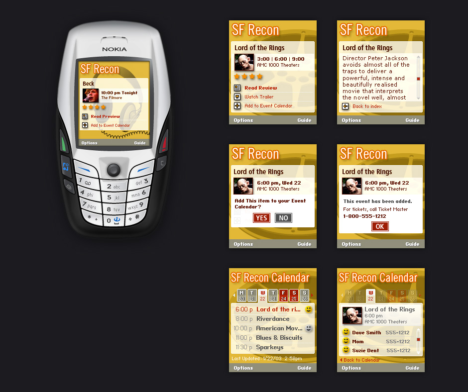
- Mobile Flash
- Macromedia FlashCast was designed to show the potential of Flash as a mobile application platform.
- Local Events Channel
- Background illustrations were used communicate the entertainment category while saving space.
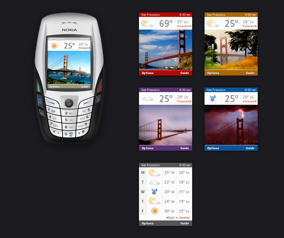
- Original Weather Channel
- This channel used both icon animations and photos to indicate the current weather.
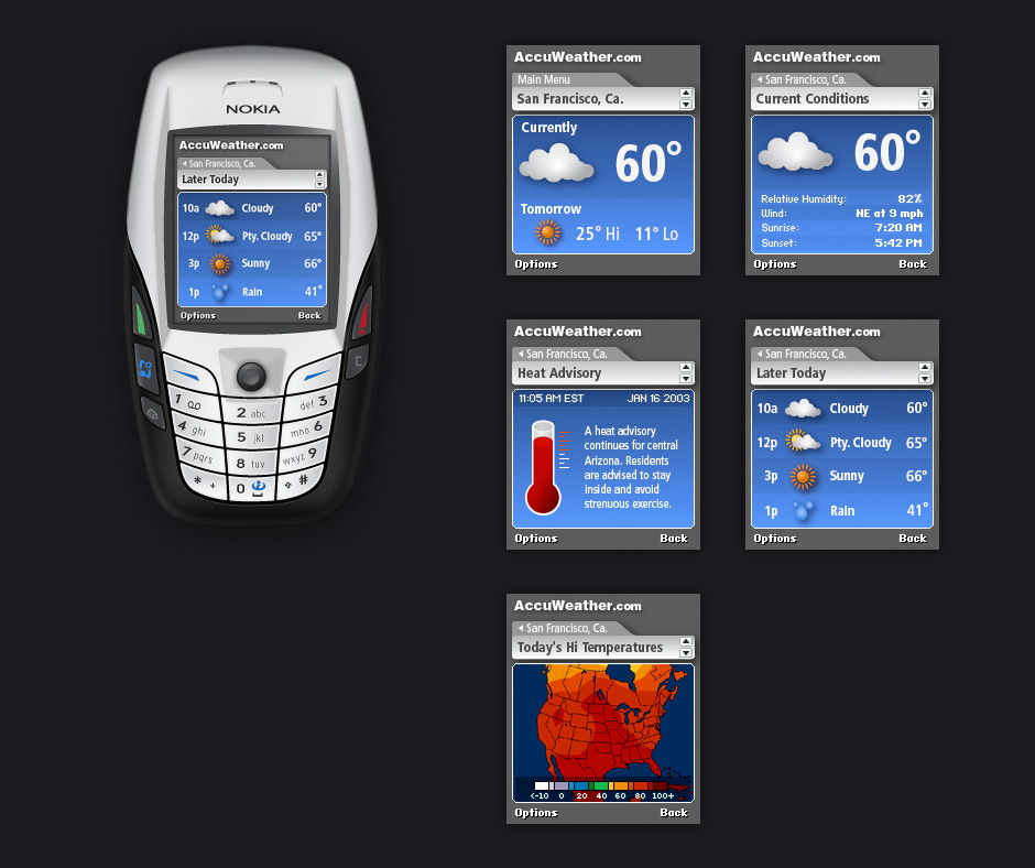
- Accuweather Channel
- This was Flashcast's first commercial application.
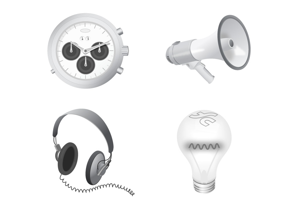
- Background Illustrations
- These illustrations were used as background elements for FlashCast channels.
- Weather Icons
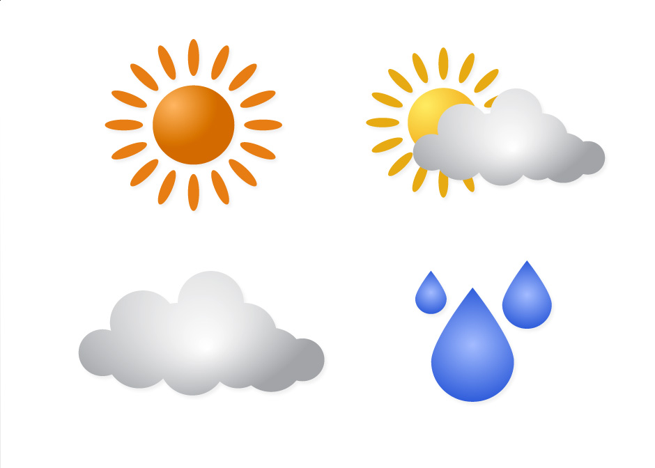
- These weather icons made use of repeating elements to keep file sizes to a minimum.
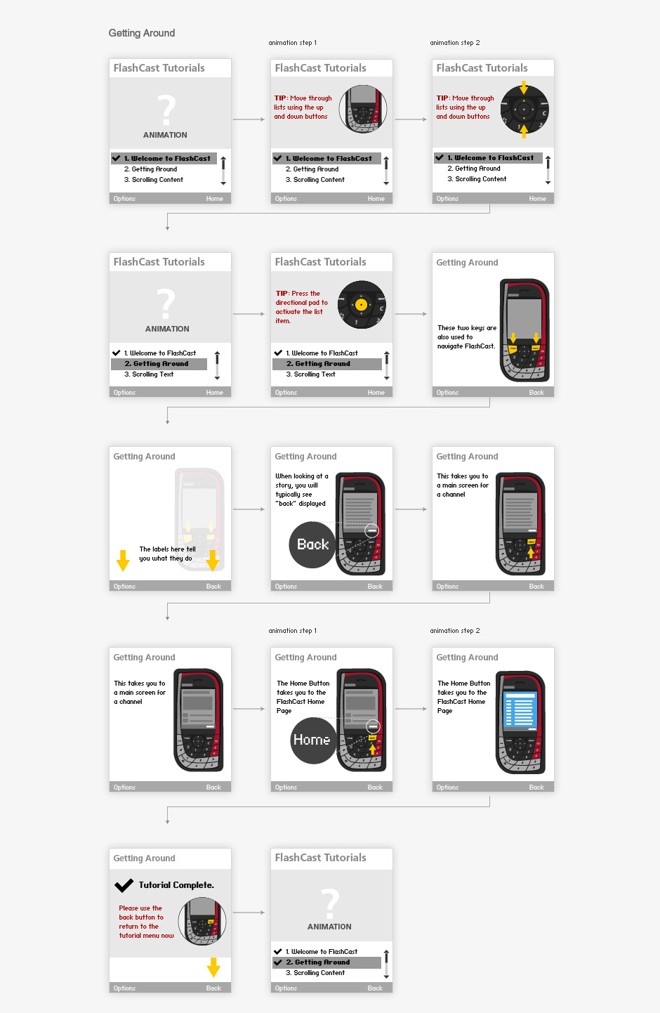
- Tutorial Wireframes
- We missed the mark here. A tutorial is usually an indicator that a UI isn't intuitive enough.
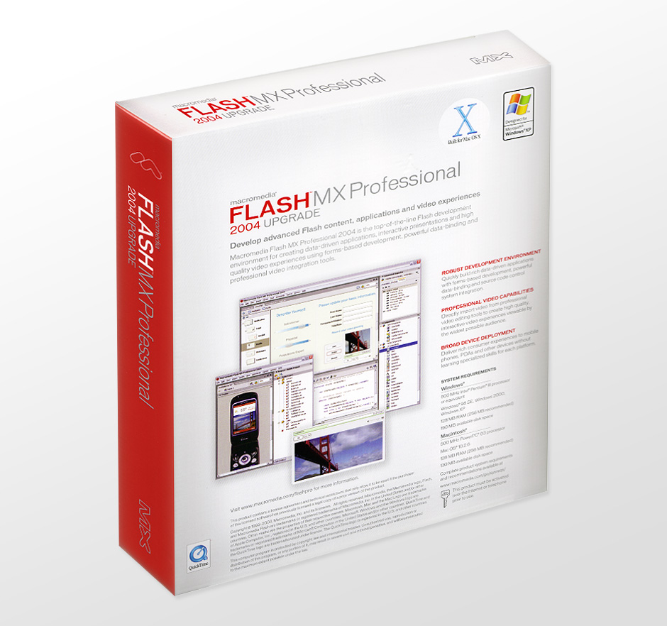
- Surprise!
- Flash MX Professional packaging came with a surprise. The box included a shot of my weather channel design.
Macromedia FlashCast
Role: Visual and Interaction Design
Creative Direction: Jacquie Moss - Odopod
In 2002, the mobile web was primarily consumed through custom carrier-authored applications and WAP-enabled web sites. Macromedia commissioned
a series of live demos to show how Flash could be deployed on mobile devices. I designed weather channels, a local entertainment guide, and a tutorial
on how to use FlashCast.
The design of these demos embraced a number of technical and physical constraints. Memory was in short supply. Screen resolution was a tiny 176 x 208 pixels, and phone controls were not well-suited for complex interactions. Despite these limitations, we were able to make something that was quite compelling for the time.
In the end, FlashCast suffered from the shortcomings of a platform that was fundamentally unequipped to provide what people really wanted. As history has shown, mobile technology needed a complete rethink before becoming a pervasive part of everyday life.
View this Project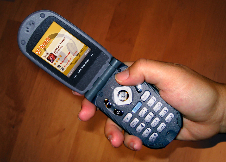
- Home
- The design emphasizes students and teachers working together. Hand-drawn elements make the site feel approachable.
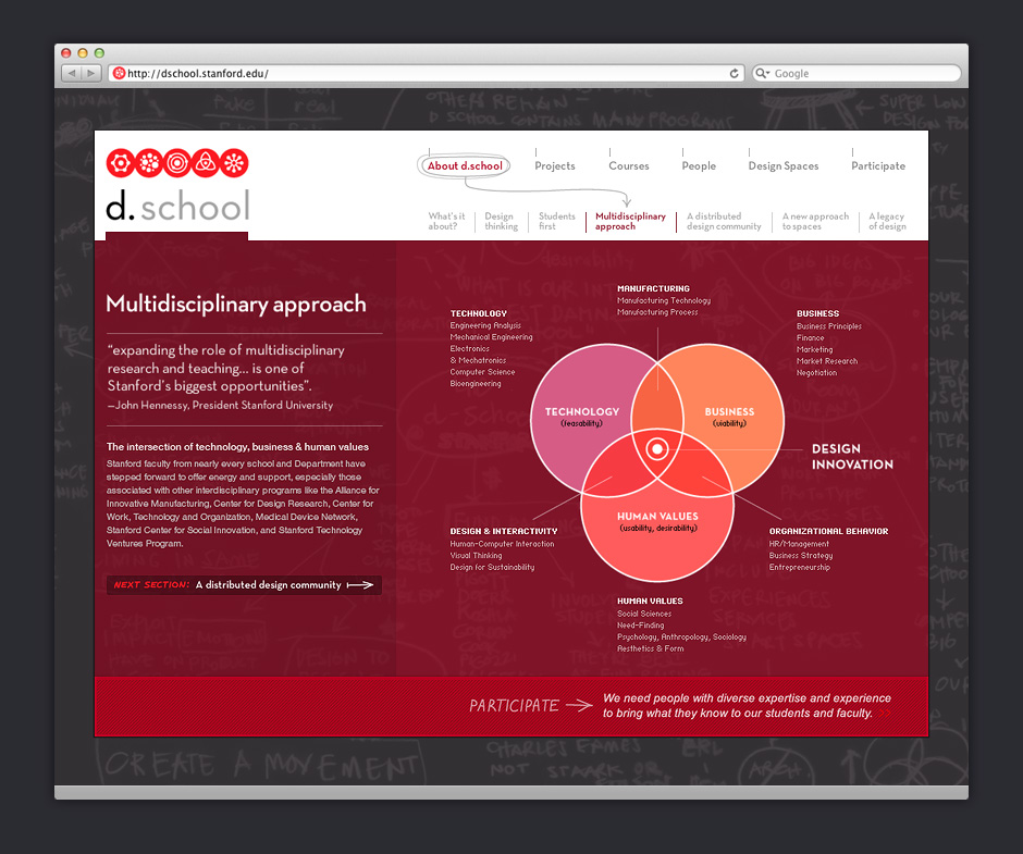
- Multidisciplinary Approach
- The site was designed to be able to change its character to suit the content.
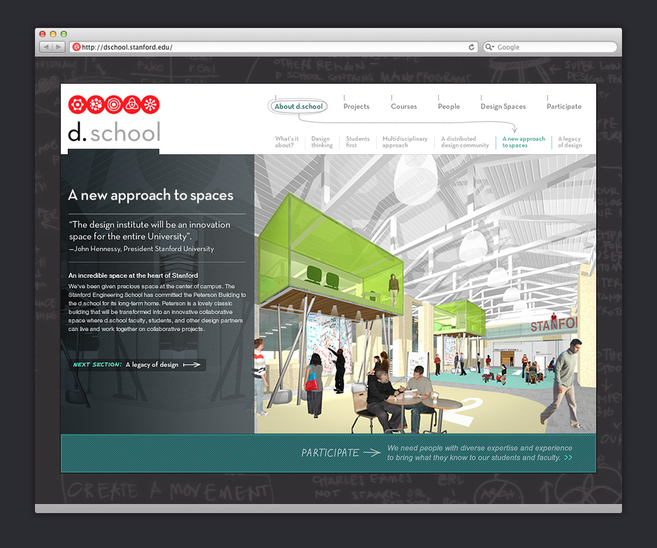
- Spaces
- A well-defined page structure made it possible to change section colors and have the site still hold together.
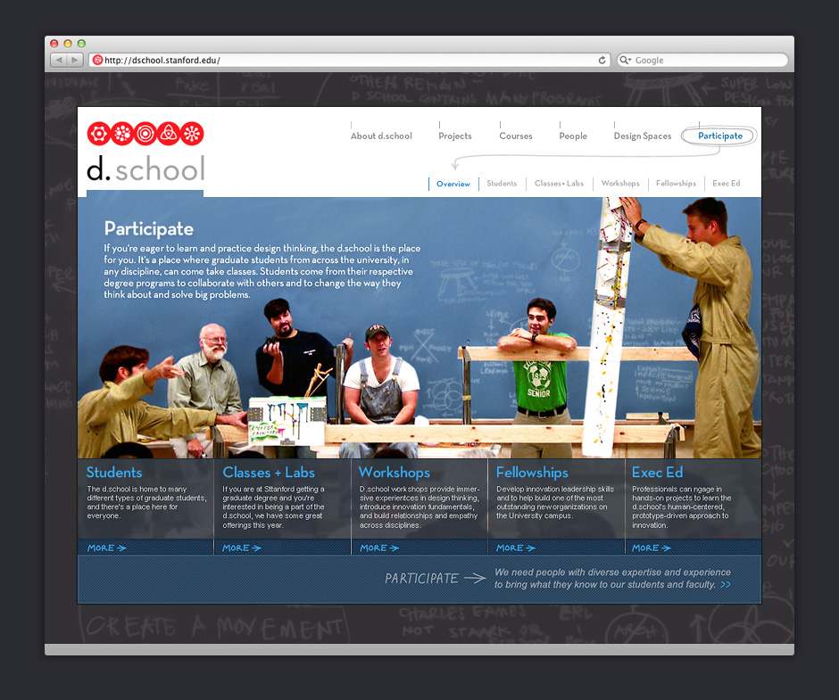
- Participate
- It was important to communicate that learning at d.School would be hands-on and highly collaborative.
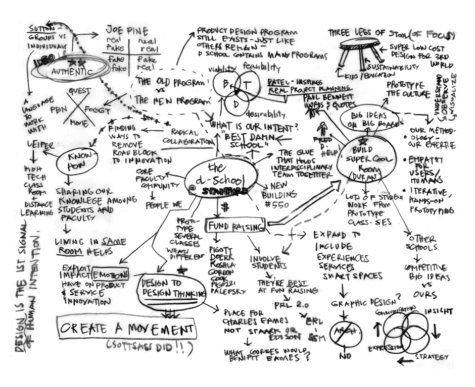
- Inspiration
- This sketch, made by the school's founder, became the backdrop for the site.
- Inspiration
- We began visual design by collecting examples that addressed similar problems.
Stanford d.school
Role: Visual Design
Creative Direction: Guthrie Dolin - Odopod

In 2004 David Kelley, co-founder of IDEO, set about creating a new design school at Stanford University. The d.school's charter was to offer a multidisciplinary approach to design learning. The school needed a stop-gap website to educate students about the programs offered and encourage fundraising.
The budget for this project was small, so we had to organize the site based on existing content. One of the assets we had to work with was a mind map David Kelley developed to articulate the scope and approach of the new design school. This became the background image for the site and the inspiration to use hand-lettered text for important calls to action.
These designs were completed over a four-day period and became the foundation for the site build-out.
View this Project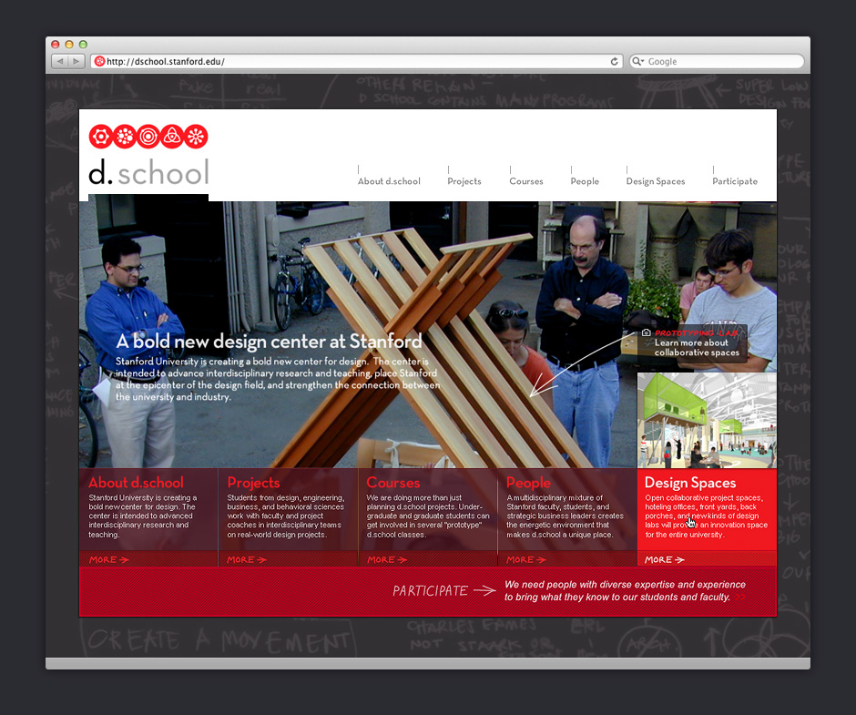
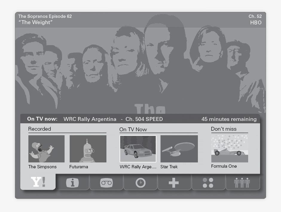
- Yahoo IPTV
- Yahoo IPTV was prototyped on Windows Media Center and controlled via a remote.
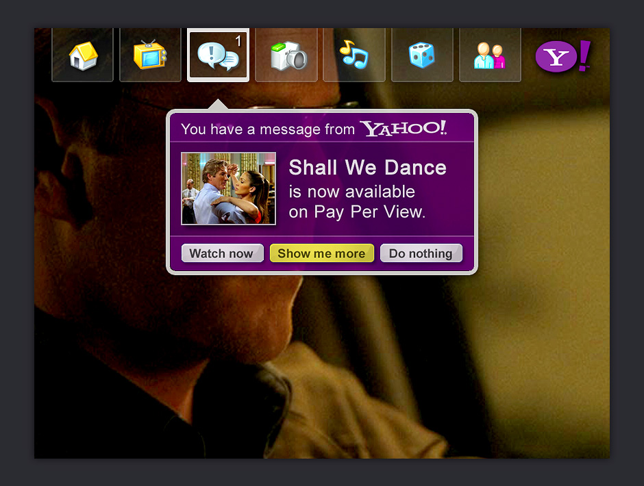
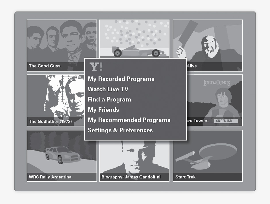
- Message Menu
- Yahoo IPTV planned to offer live and recorded TV, movies, photos, music, games, and sharing.
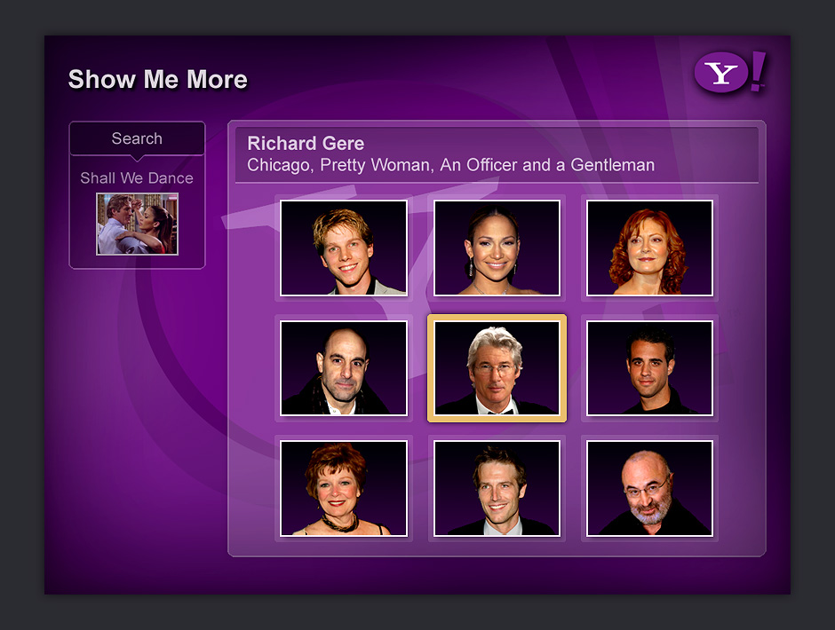
- Explore by Actor
- When there's unlimited content available, viewers need interesting ways to discover the programming they like.
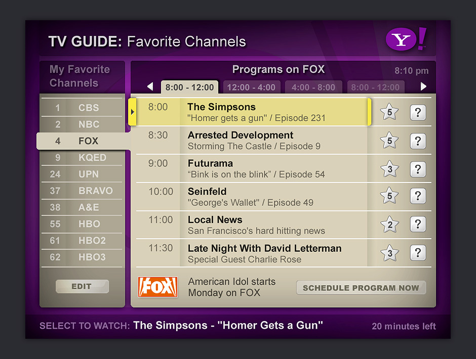
- Favorite Channel Menu
- This menu displays the program schedule only for the channels you like.
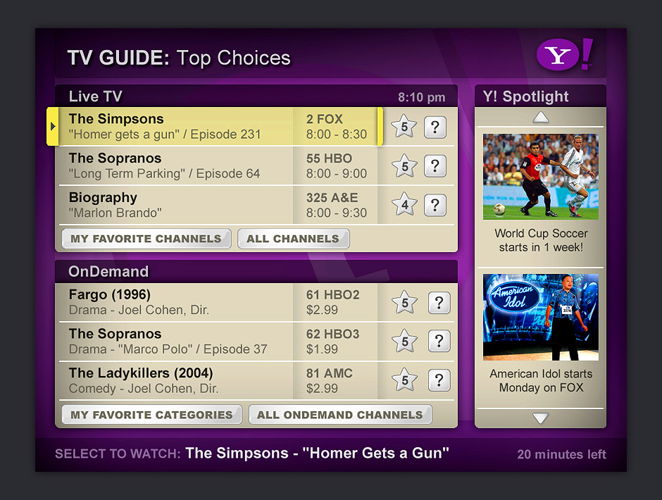
- Live and On Demand
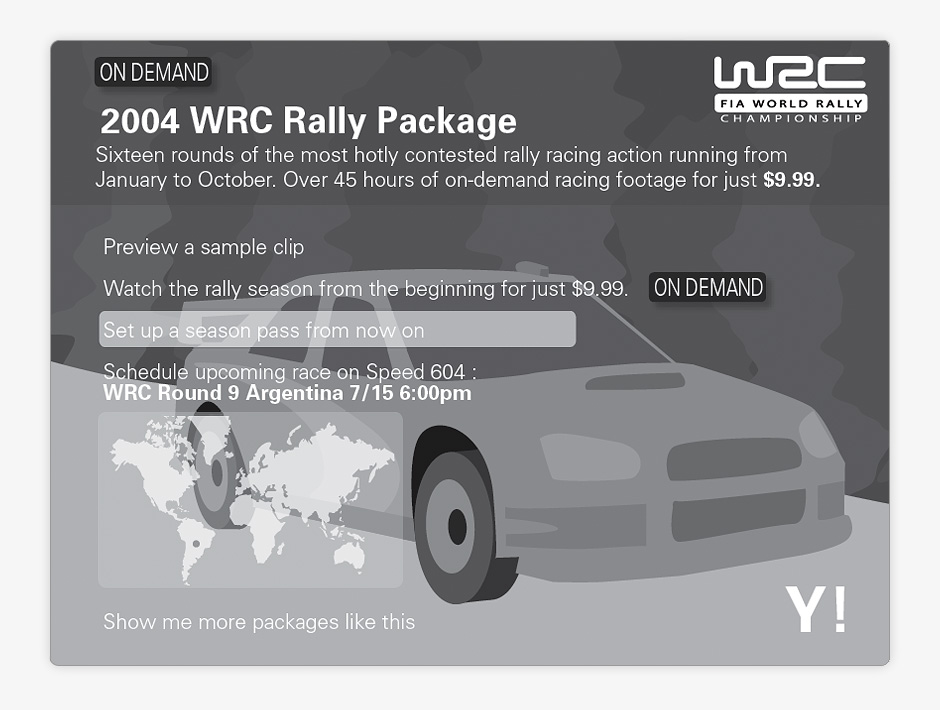
- We were asked to explore how paid programming could be integrated into the viewing experience.
- Show Details
- IPTV would have been an internet-enabled experience. Show details could include streaming video previews.
- Nav Menu Wireframe
- We explored what IPTV would be like if the interface emphasized visuals over menus.
- Navigation Overlay
- When nearly limitless content is available, personalization plays an important role in discovery.
- On Demand Package
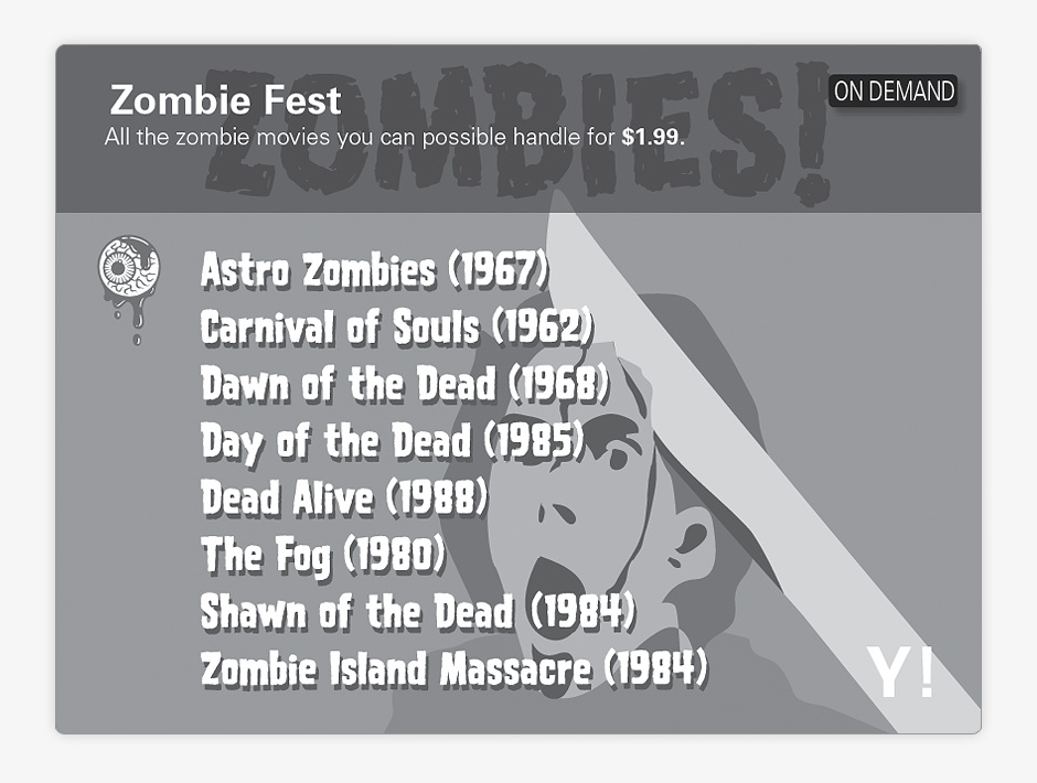
- We explored using visual themes as a way to package premium content and create a sense of place.
- Themed Packages
- Themed packages would give IPTV users the feeling of interacting with DVD-style menus.
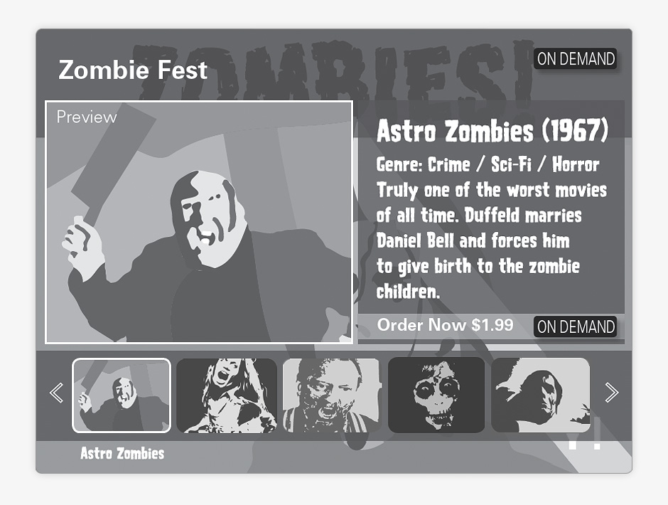
- Package Explorer
- This is an exploration about how IPTV could entice viewers to purchase on-demand movie rentals.
Yahoo IPTV Explorations
Role: Visual and Interaction Design
Creative Direction: Tim Barber - Odopod
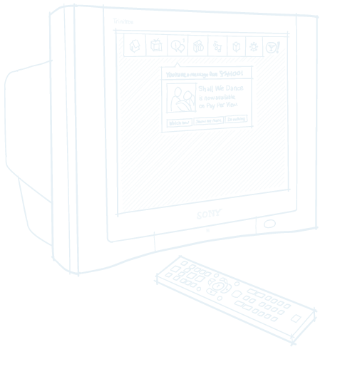
In 2004, Yahoo had begun to explore what on-demand Television over IP (IPTV) would look like. We were tasked with exploring the implications for the discovery of nearly unlimited amounts of on-demand video programming. We were also asked to consider what happens when you add personalization and a live social component to TV viewing experiences.
I made concept wireframes for video discovery and designed high-fidelity mockups that were incorporated into a live prototype used to promote Yahoo IPTV to executive decision-makers.
Designing for the 10-foot experience is very different than designing for web. Remote-based navigation places a great deal of importance on clearly indicating available navigation options. Low information density is an issue. These screens were designed for CRT displays which require special attention be paid to minimize contrast between screen element boundaries.
Yahoo IPTV did not make it to production.
View this Project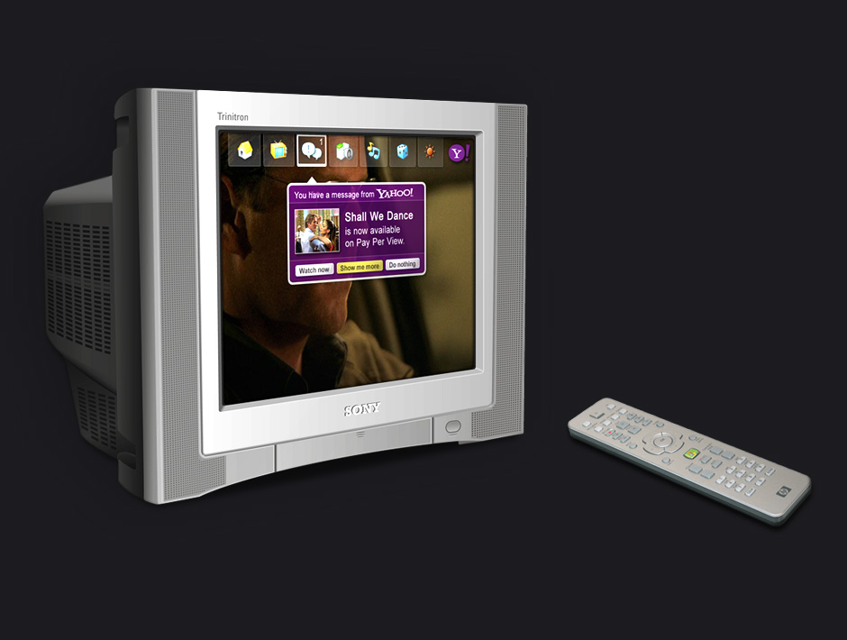

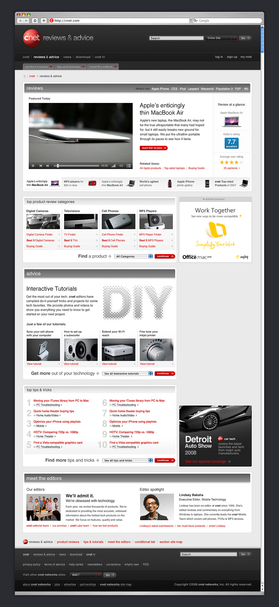
- Product Reviews
- CNET was looking for a departure from its original color scheme. This direction aimed for a cool, techy feel.
- Review Detail
- The design needed to make many flavors of content feel like they were part of a unified whole.
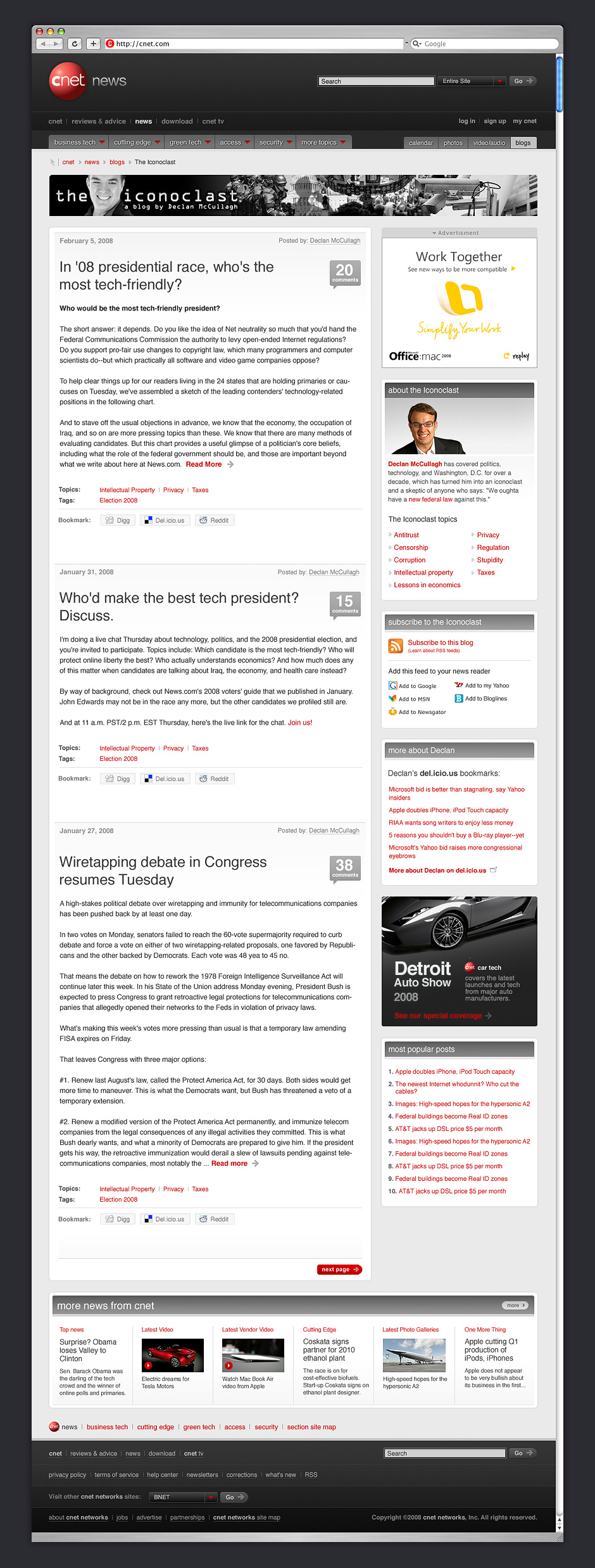
- News
- The design attempts to subtly differentiate navigation, editorial content, and advertising.
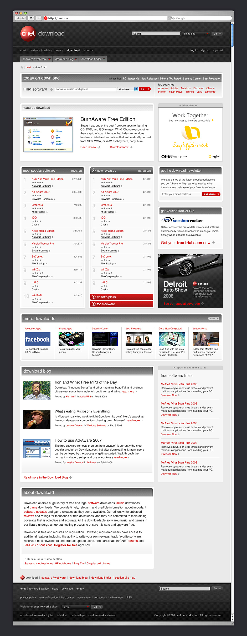
- Downloads
- Many pages had an overabundance of content. The design compensates by organizing features into discrete modules.
CNET
Role: Design Direction, Visual Design
Creative Direction: Tim Barber - Odopod
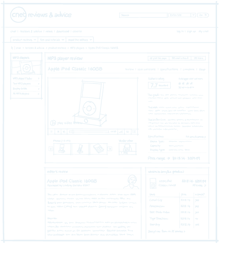
In spring 2007, CNET decided it was time for a major redesign. We were asked to create a reference design that would be the basis for a visual build out by CNET design staff. I was the design lead for the project.
I gathered requirements and supervised a small design team to develop some look-and-feel options.
The challenges were considerable. CNET had a massive amount of content. Editorial and advertising were difficult to distinguish from one another. Each section of the site was owned by a different business group with its own revenue goals. Each page on the site was highly monetized with specific requirements for ad placement.
The screens that follow show the visual direction that
I created. Some aspects of this design were incorporated into the direction that was approved for launch.

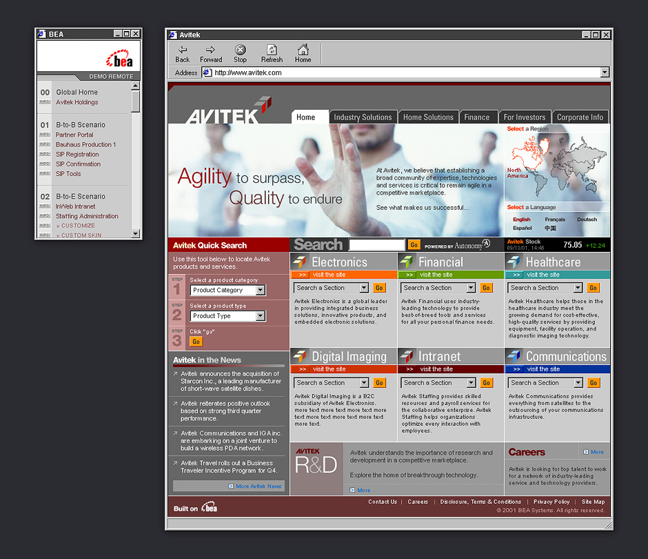
- Avitek
- We created a fictitious company as a backdrop for demo scenarios. Color is used to announce changes in context.
- Demo Remote
- A separate index of demo pages allowed presenters to jump from one scenario to another.
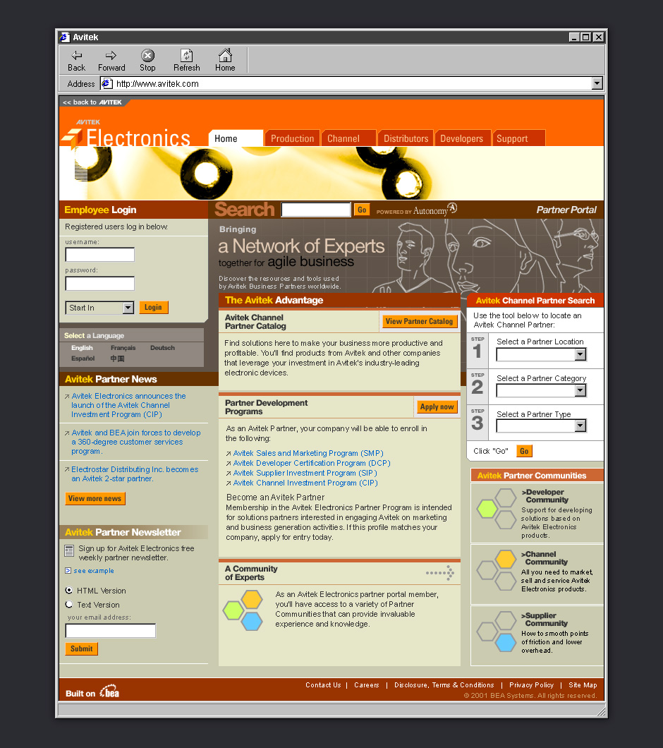
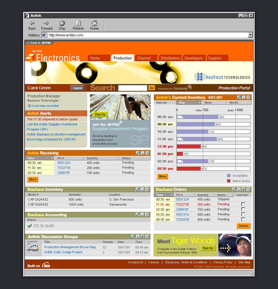
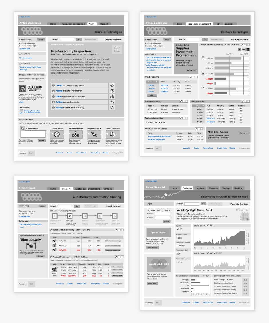
- Avitek Electronics
- This demo was designed to show how BEA could be used for companies that work with channel partners.
- Production Dashboard
- Demo pages had just enough interactivity to give the impression that this was a functioning site.
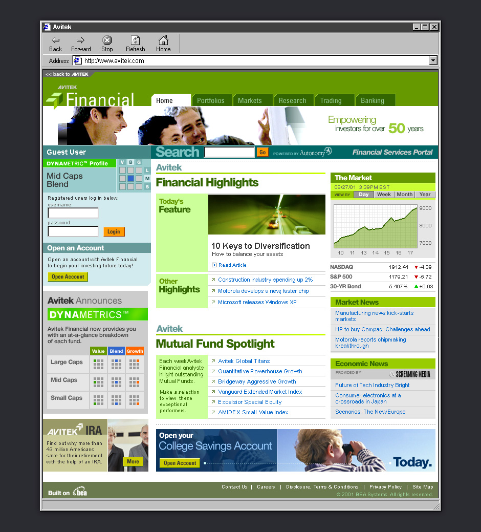
- Avitek Financial
- One of the benefits of making static demos is that we could quickly target different industries.
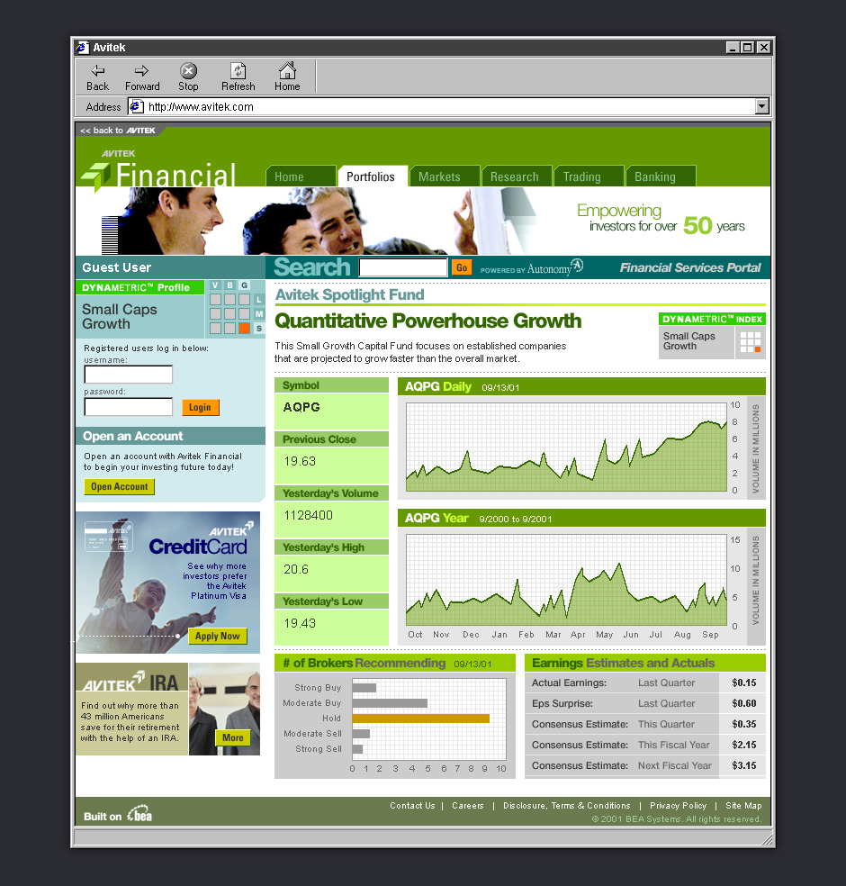
- Financial Dashboard
- We did research to make sure each demo site would impress industry experts.
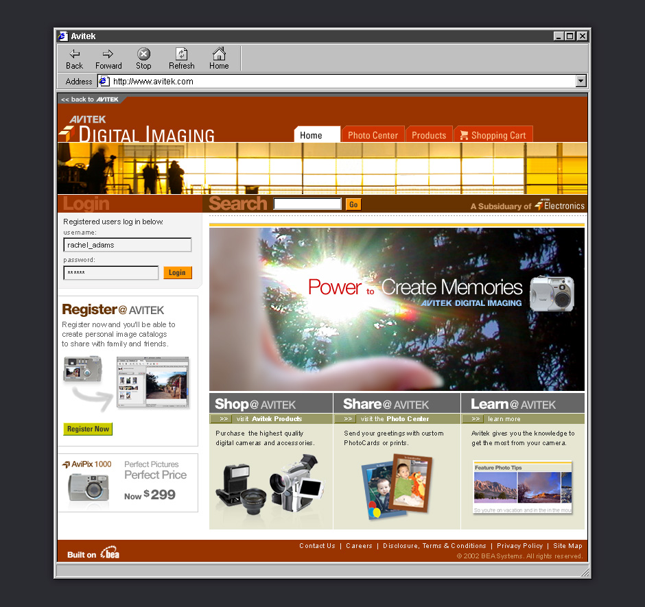
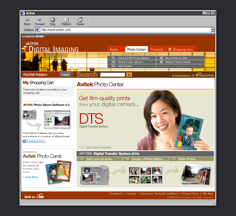
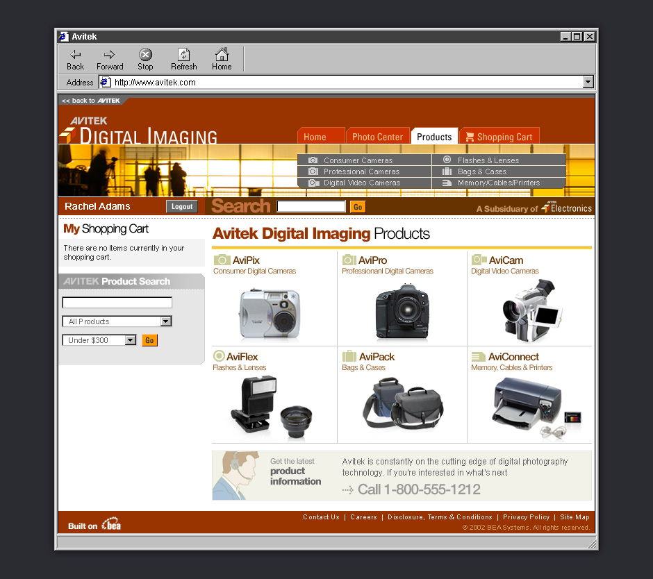
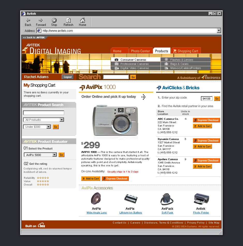
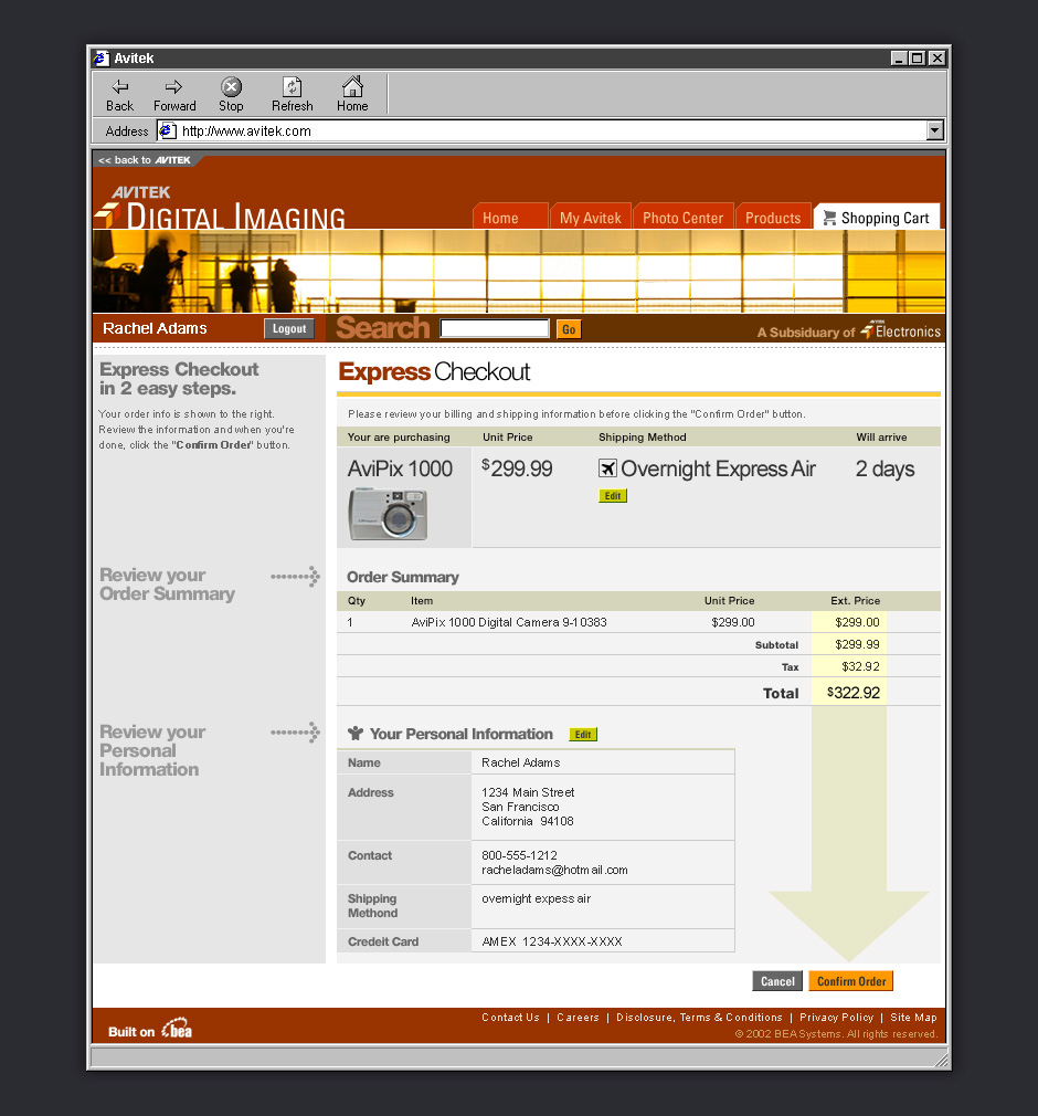
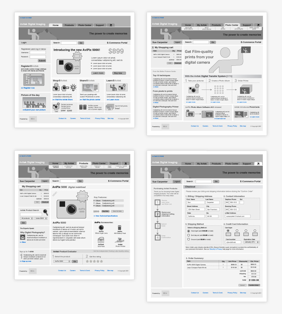
- Avitek Digital Imaging
- This demo was created to show how BEA enables manufacturing, commerce, and inventory management.
- Photo Center
- Some pages were created to help our audience forget that this was a made-up company.
- Products
- This page was used to convey that this is an e-commerce story.
- Product Detail
- Systems integration was one of BEA's strengths. This page combines commerce and inventory management.
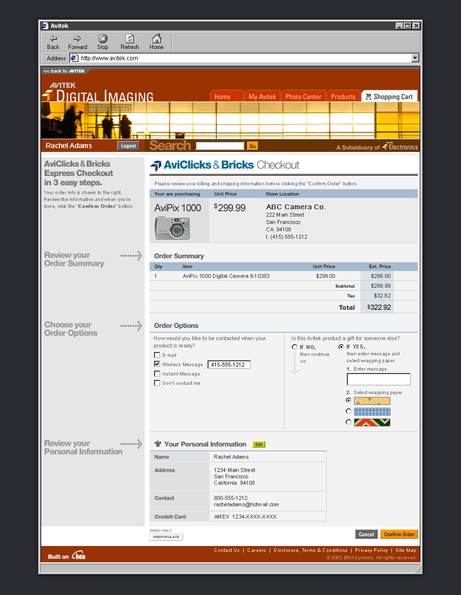
- Checkout
- The presenter would click through the demo site as if it were live.
- Clicks and Bricks
- Page variations were used to show what happens to a business after BEA.
- Avitek Intranet
- This demo was used to show how BEA could be used to improve a company's internal business processes.
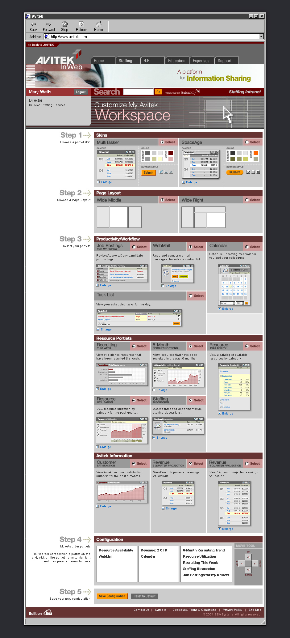
- Staffing Dashboard
- BEA's portal framework was used to show data from multiple systems in a single view.
- Customize Workspace
- This page showed how BEA's portal framework could be customized.
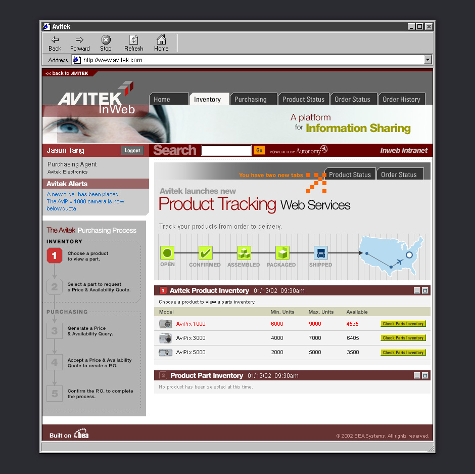
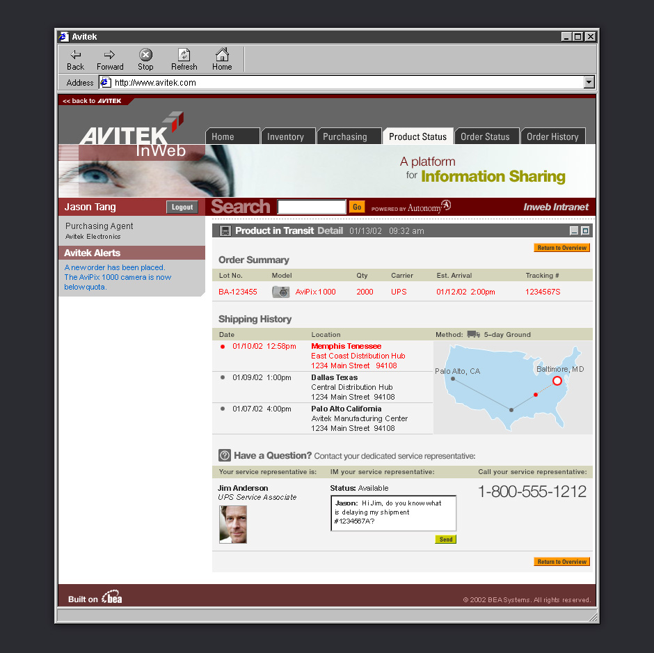
- Inventory Management
- It was important to show how different business roles see different interfaces.
- Inventory Tracking
- This page is part of an inventory management story.
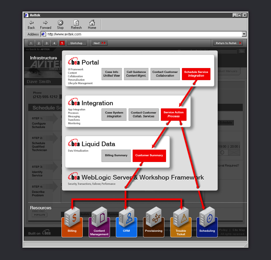
- Process Overlay
- One of the challenges of demonstrating enabling technology is to show how it works in the background.
- Integration Overlay
- This animated overlay shows that the demo page consumes data from multiple systems.
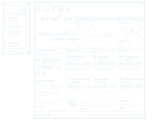
- Wireframes
- Every demo scenario started with a detailed wireframing exercise.
- Wireframes
- A high level of fidelity helped decision-makers give better feedback before visual design began.
BEA Sales Demos
Role: Design Direction, Information Design
Visual Design: Judy Lew, Han Lin
In 2001, BEA Systems, a leading application infra-structure company, found that its sales presentations weren't hitting the mark. During the course of a sales engagement it was common for BEA to build custom sales demos. These demos were expensive, unattractive, and needed to be operated by highly-trained sales engineers.
In response to this, we designed a fictitious holding company which was used as a backdrop to showcase how BEA could be used to improve industry-specific business processes. The demos were tightly scripted and could be presented by non-technical sales staff.
BEA was so satisfied with our initial work that we designed eight additional demos and BEA’s own sales portal. These demos were used to sell over $400 million in software and services. I worked with the BEA marketing team to come up with the appropriate features to support each product story. I wireframed, wrote all content, and art directed.
View this Project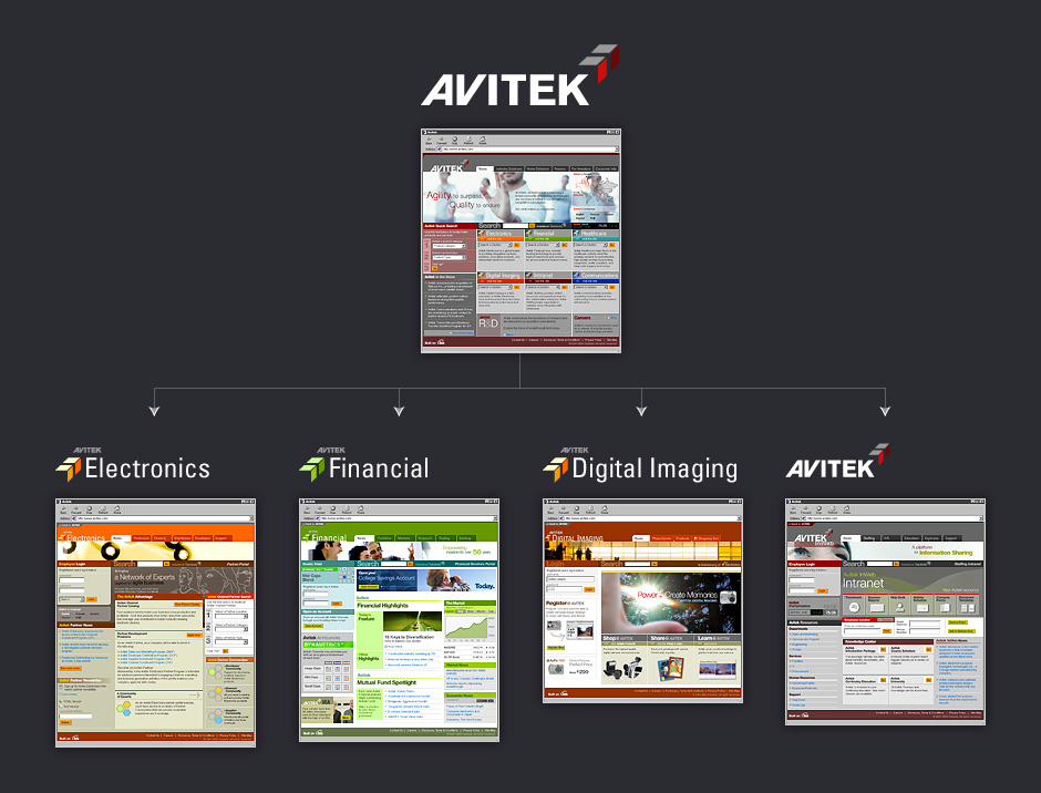



- BEHR ColorSmart Kiosk
- BEHR's ColorSmart kiosk is part of the paint color centers at Home Depot.
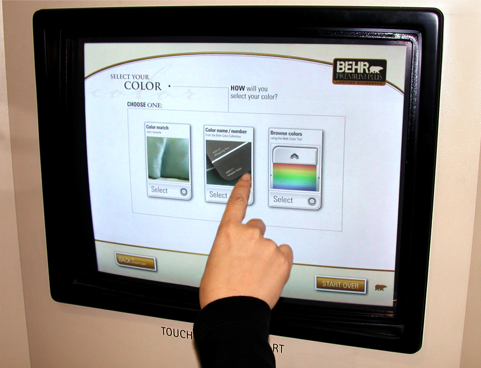
- Kiosk in Action
- The kiosk helps customers find paint colors while increasing their engagement with BEHR's brand.
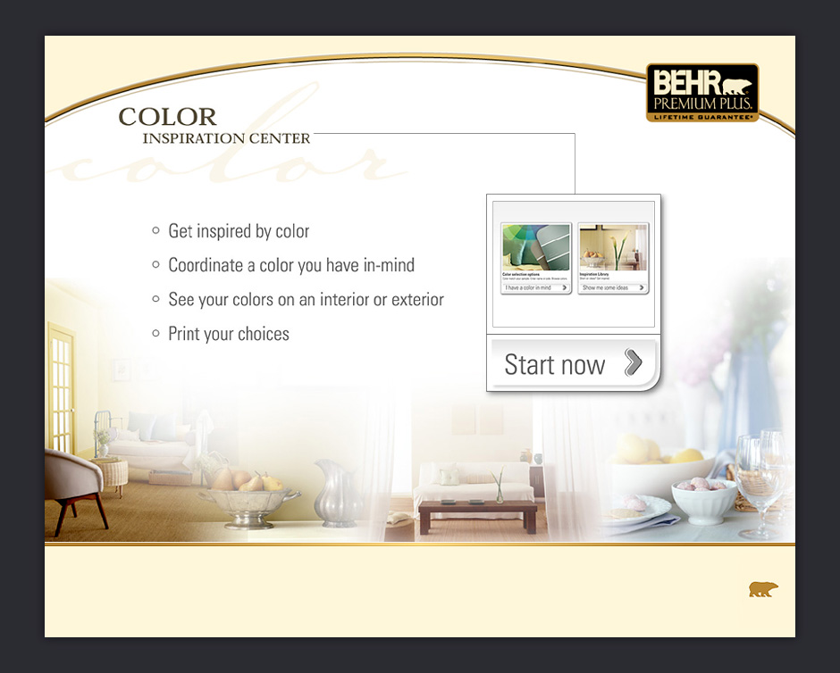
- Start Screen
- When you touch the screen for the first time, you'll see an introduction and a call to get started.
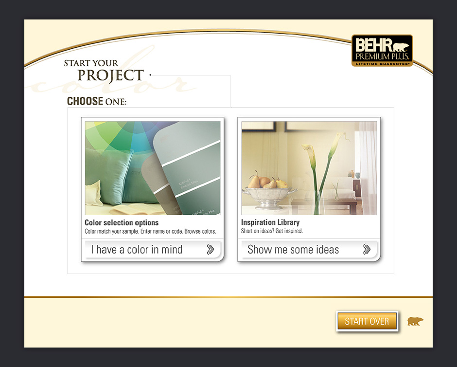
- Choose a Color or Get Inspired
- You can choose a color or browse the inspiration library.
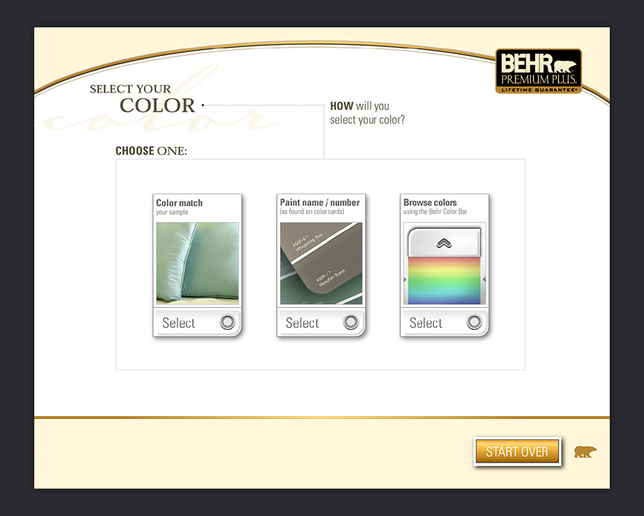
- Color Selection Options
- There are three different ways to select a color.
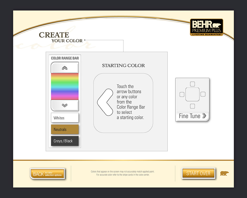
- Create a Color
- You can start by choosing a rough color.
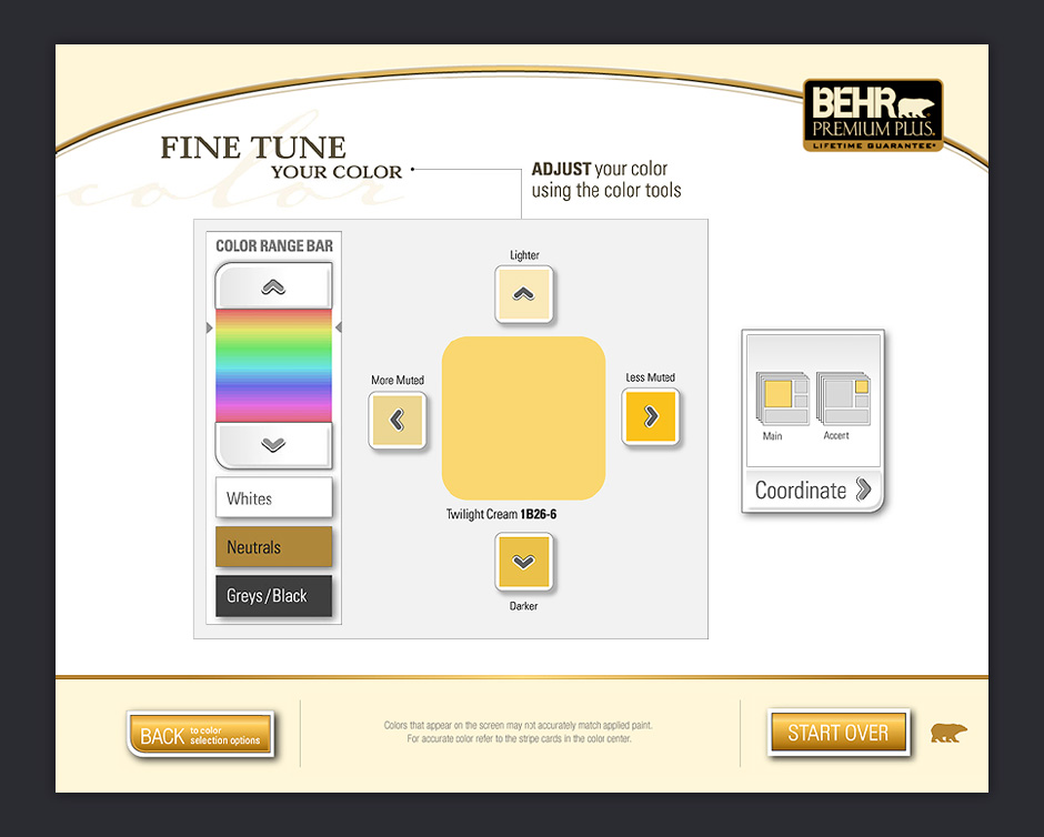
- Fine Tune Color
- Your initial color selection can then be modified. All important calls to action make reference to the current color.
- Get Coordinate Colors
- Once you've selected a color, you can get coordinate colors.
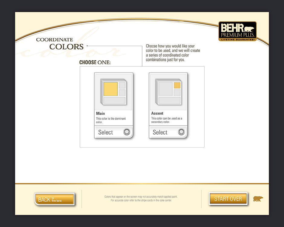
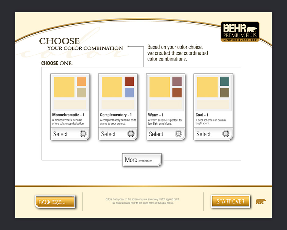
- Choose Combination
- Many people have a difficult time finding colors that work well together.
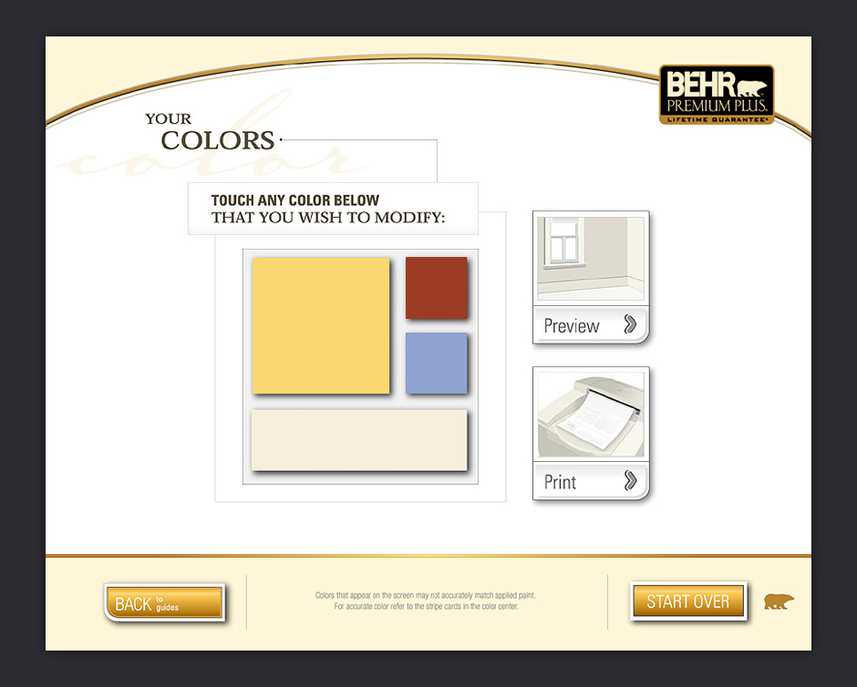
- Modify Palette
- Once you've selected a coordinate palette, you're given the ability to preview or print your colors.
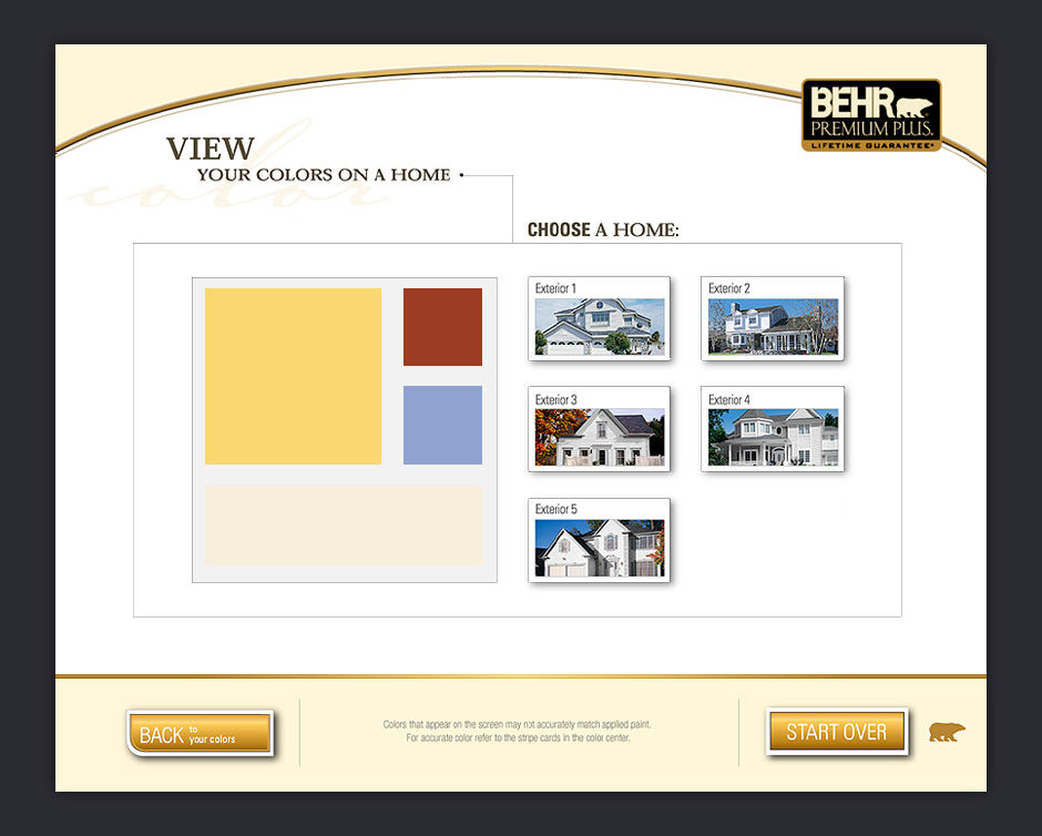
- Preview Colors
- Your colors can be previewed on exterior or interior environments.
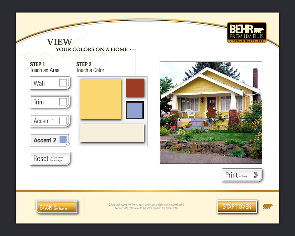
- Apply Colors
- Your color palette is shown on a selected environment. You can apply the colors to as many areas as you like.
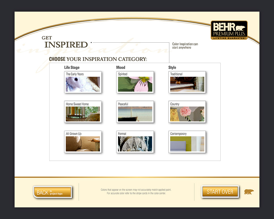
- Get Inspired
- You can also find colors through a library of inspirational images.
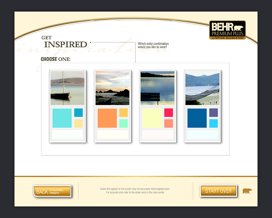
- Inspiration Palettes
- The library features photos with associated color palettes.
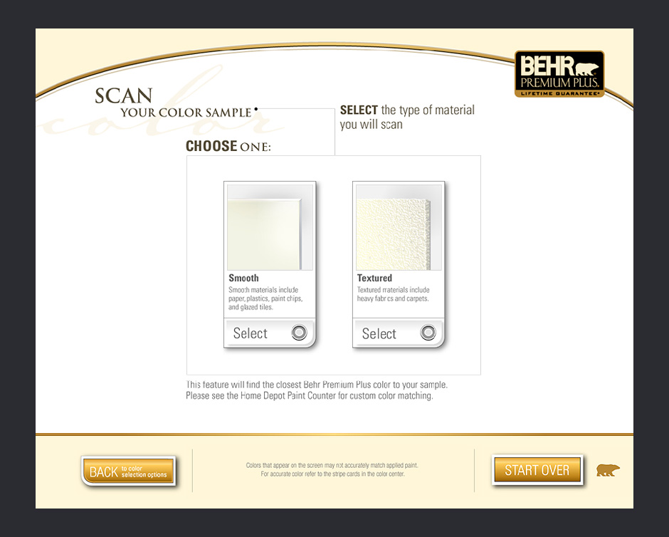
- Scan Color
- It's also possible to scan a material to find the closest matching BEHR paint.
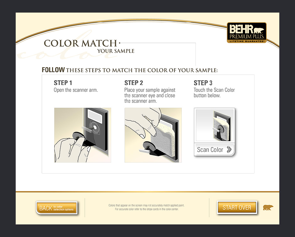
- Scan Instructions
- In order to get the most accurate scan possible, the readings from three scans are averaged.
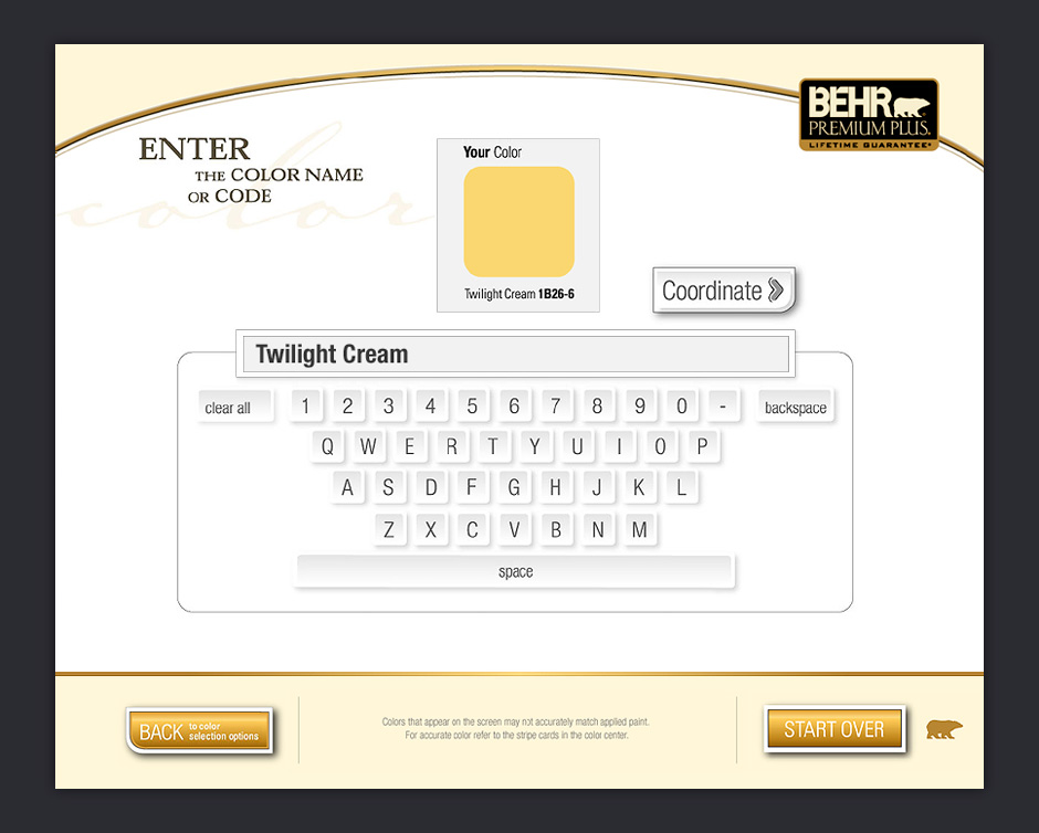
- Enter Color Name
- Colors can be searched for by name or by number.
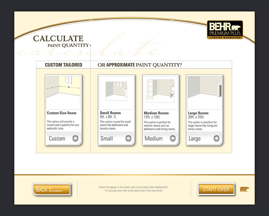
- Calculate Paint Quantities
- Once a you've selected paint colors, you have the option of using a calculation wizard.
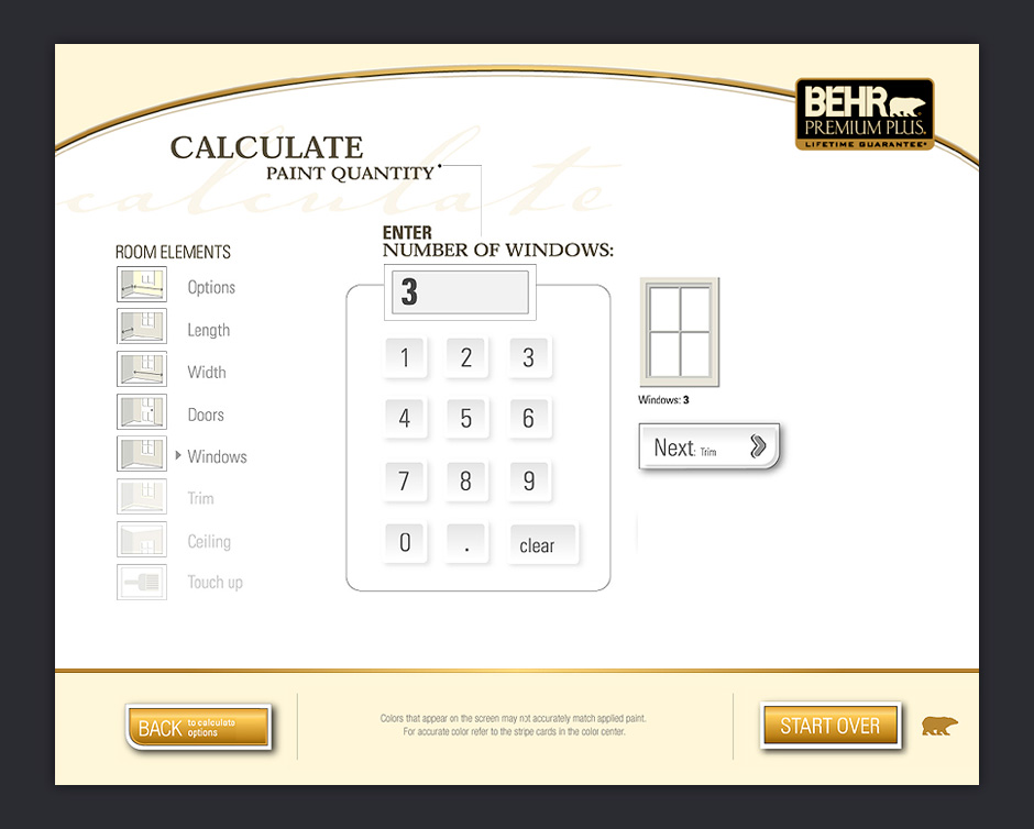
- Custom Calculation
- A custom calculator is available if you want more than a ballpark estimate.
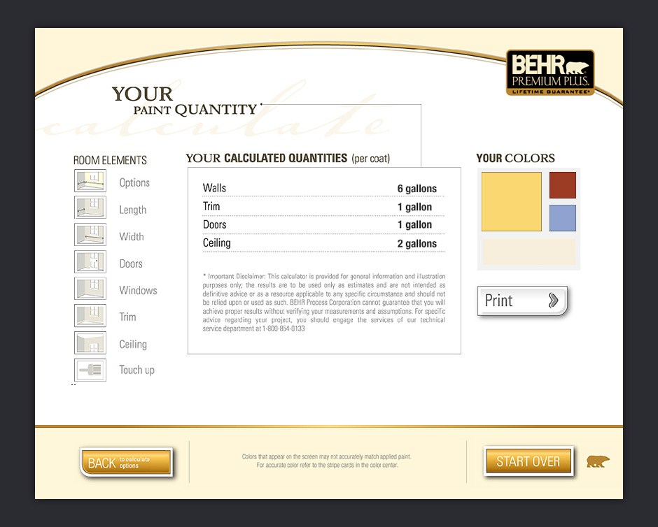
- Quantity Summary
- Once calculations are finished, you're presented with a summary.
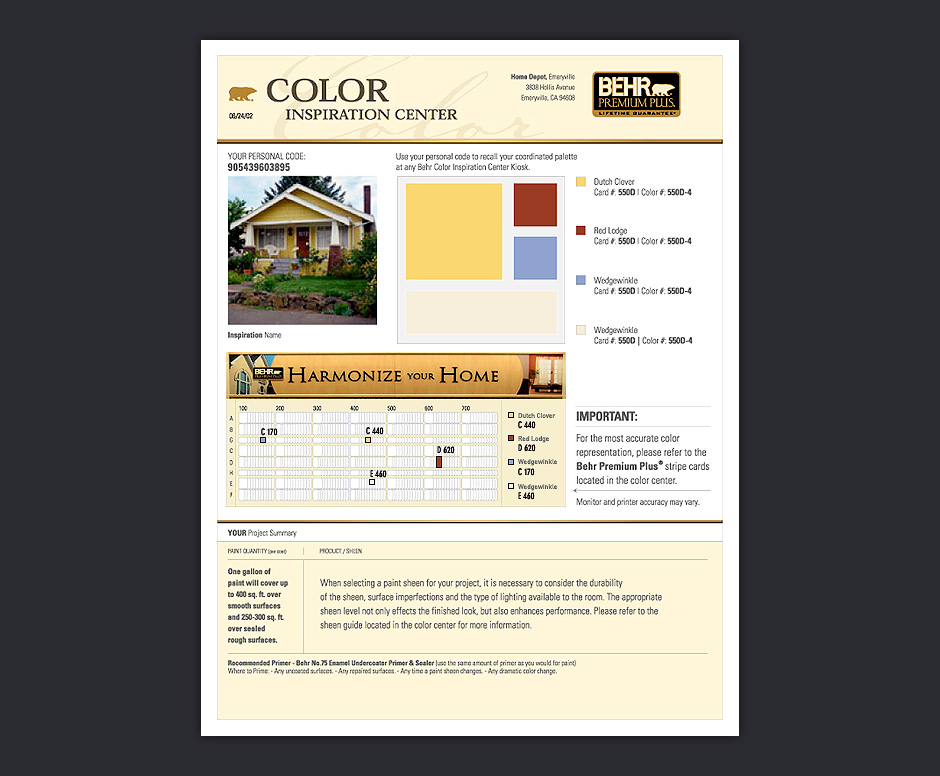
- Color Map
- When you're done, you get a customized printout that helps you locate paint samples in the adjacent Color Center.
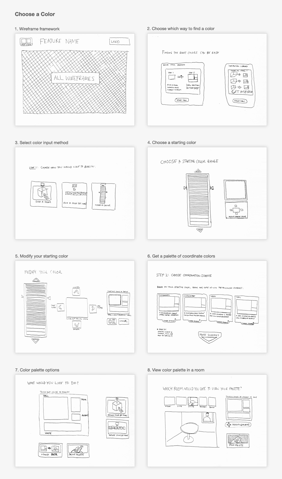
- Choose Color Wireframes
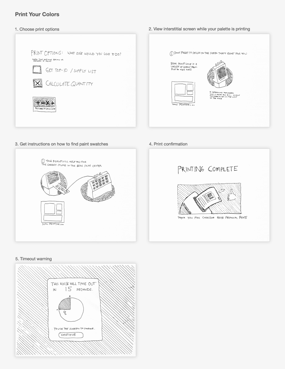
- Time for this project was very short, so I sketched out interface ideas on paper in real-size.
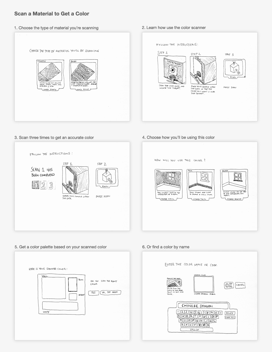
- Scan Color Wireframes
- The sketches were taped to a wall so that we could get a better sense about what the app would feel like.
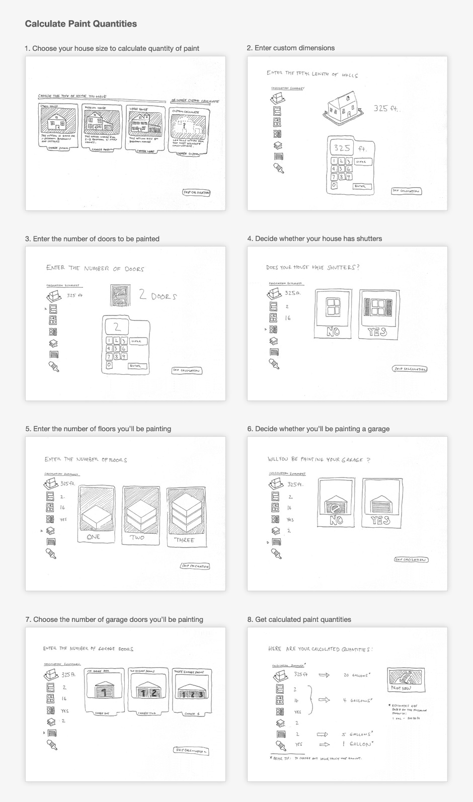
- Calculate Quantity Wireframes
- This allowed us to discover key usability issues before moving to visual design.
- Print Wireframes
- Sketching helped us iterate rapidly, and the final product was better for it.
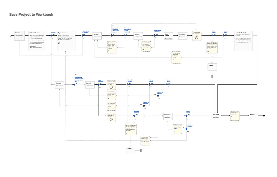
- Application Flow
- This diagram shows how the application needs to behave when users attempt to save their color palettes.
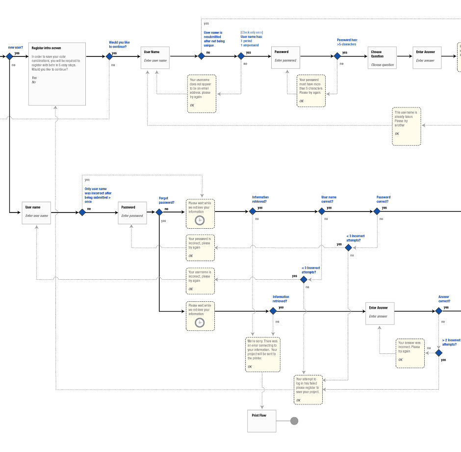
- Application Flow
- This diagram details all of the screen states needed for users to be able to register or sign in.
Behr ColorSmart Kiosk
Role: Interaction Design
Visual Design: Joshua Fehr
In 2001, BEHR decided to increase its presence in Home Depot by adding a touch-based interactive kiosk. The ColorSmart kiosk was designed to help people choose colors, match paints, visualize color choices, and calculate paint quantities.
The timeline was aggressive so I prototyped the application with rough hand-drawn sketches. This allowed us to quickly explore ideas and gave us a sense about what it would be like to use the kiosk.
During the course of the project, we learned that designing for touch kiosks involves many of the same challenges as working in interactive television or mobile devices. Kiosks offer low information density and the number of choices seen on the screen at any one time must be minimized to reduce the potential for error.
The BEHR ColorsSmart Kiosk can be found in over 1500 Home Depot locations in the US and Canada.
View this Project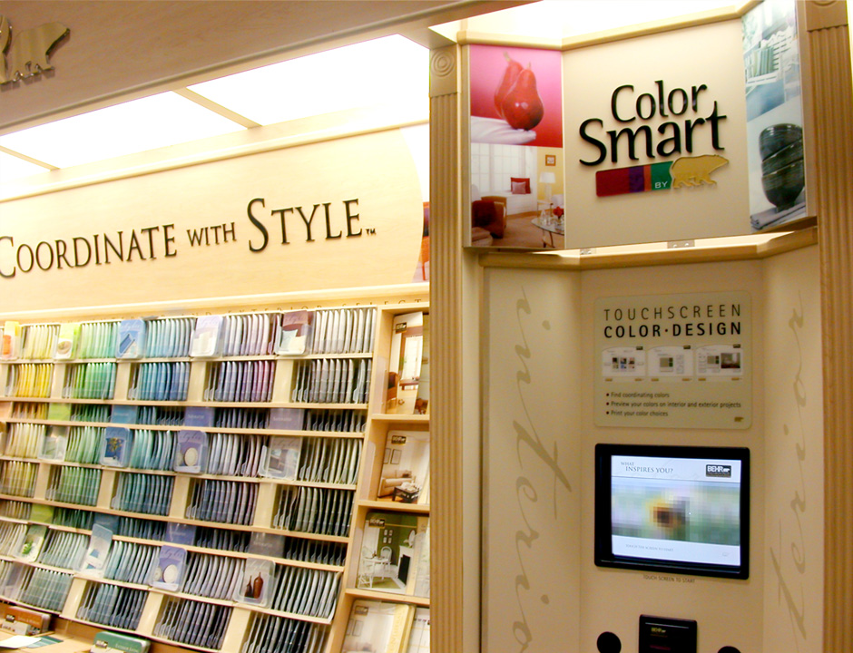
- Microsoft Zune Wireframe
- I was the lead information architect for a redesign for Zune.net
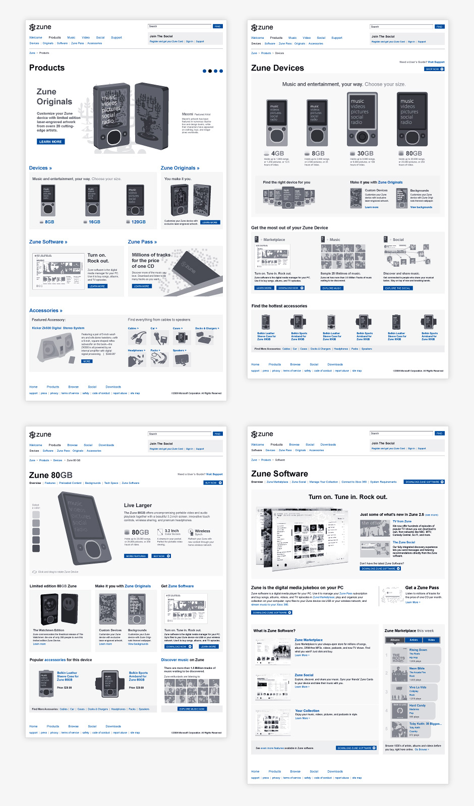
- Zune Product Wireframes
- The site promoted Zune devices and software.
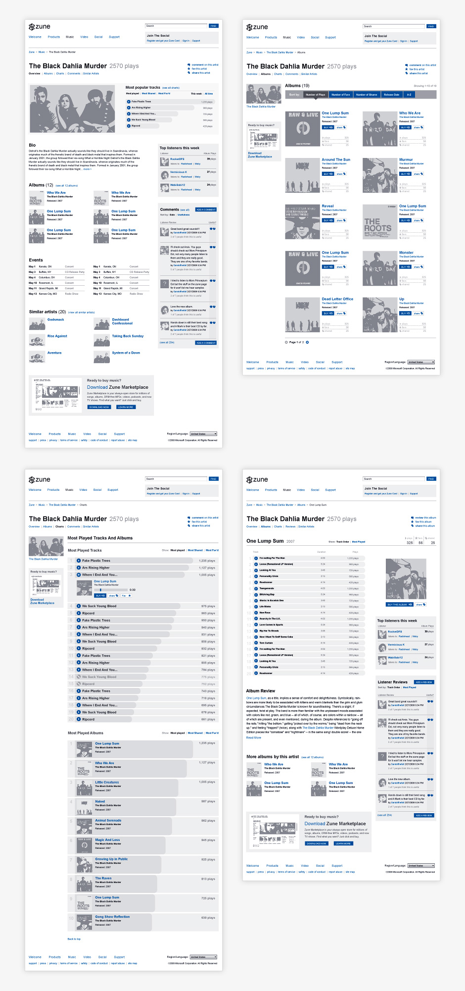
- Zune Music Wireframes
- Zune owners could explore and download music for their devices.
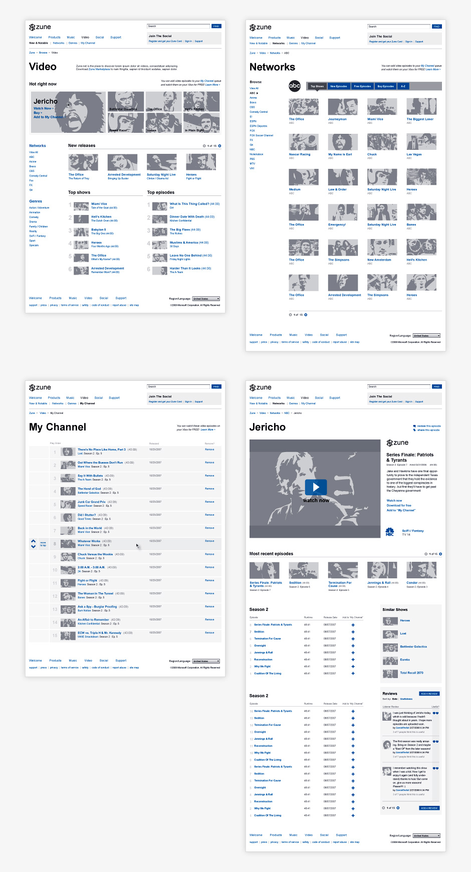
- Zune Video Wireframes
- The site aimed to be a video destination.
- Zune Site Architecture
- There was a considerable amount of content to organize.
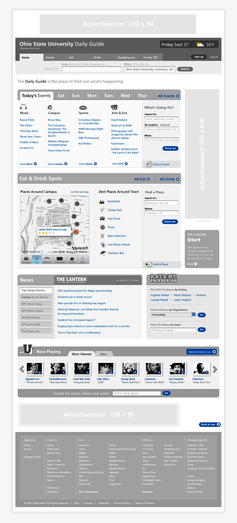
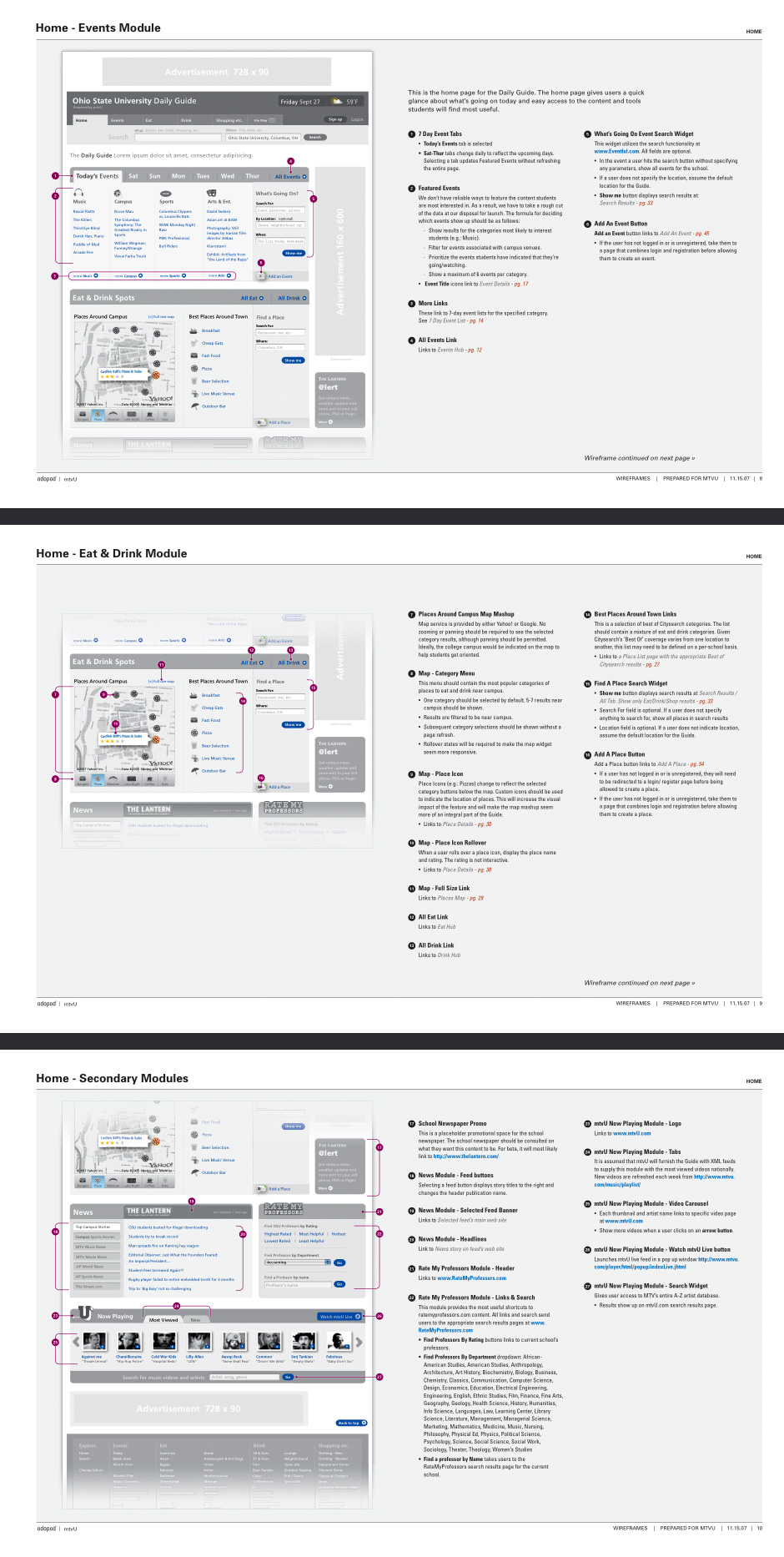
- MTV University Local Guide Wireframe
- I was the lead information architect for an MTV-sponsored local college guide.
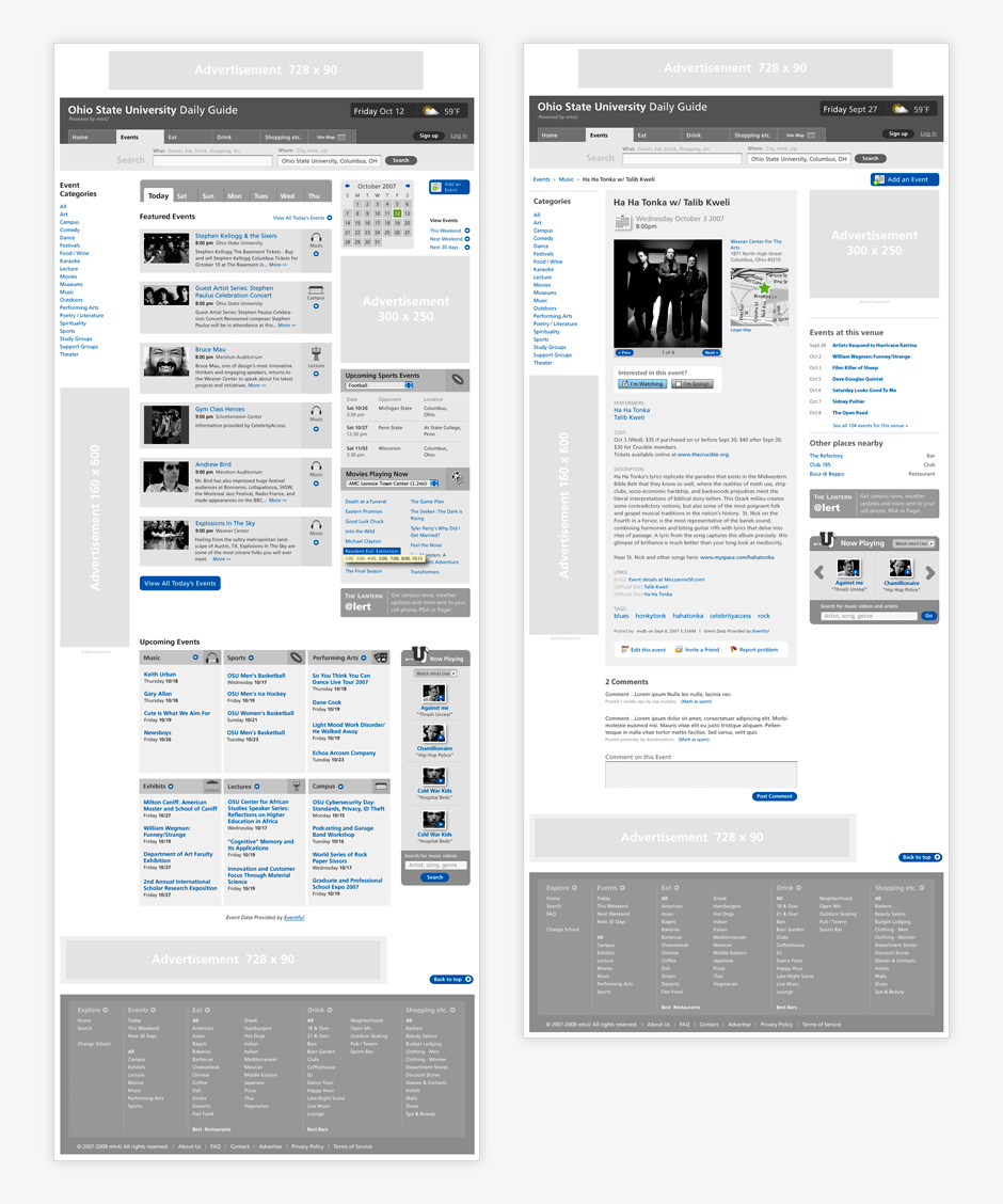
- mtvU Event Wireframes
- mtvU aimed to be a resource for college students to discover local events.
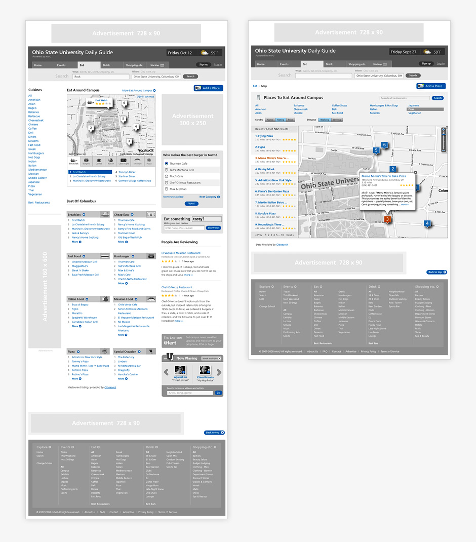
- mtvU Place Wireframes
- Students could also use the guide to find nearby places to eat and drink.
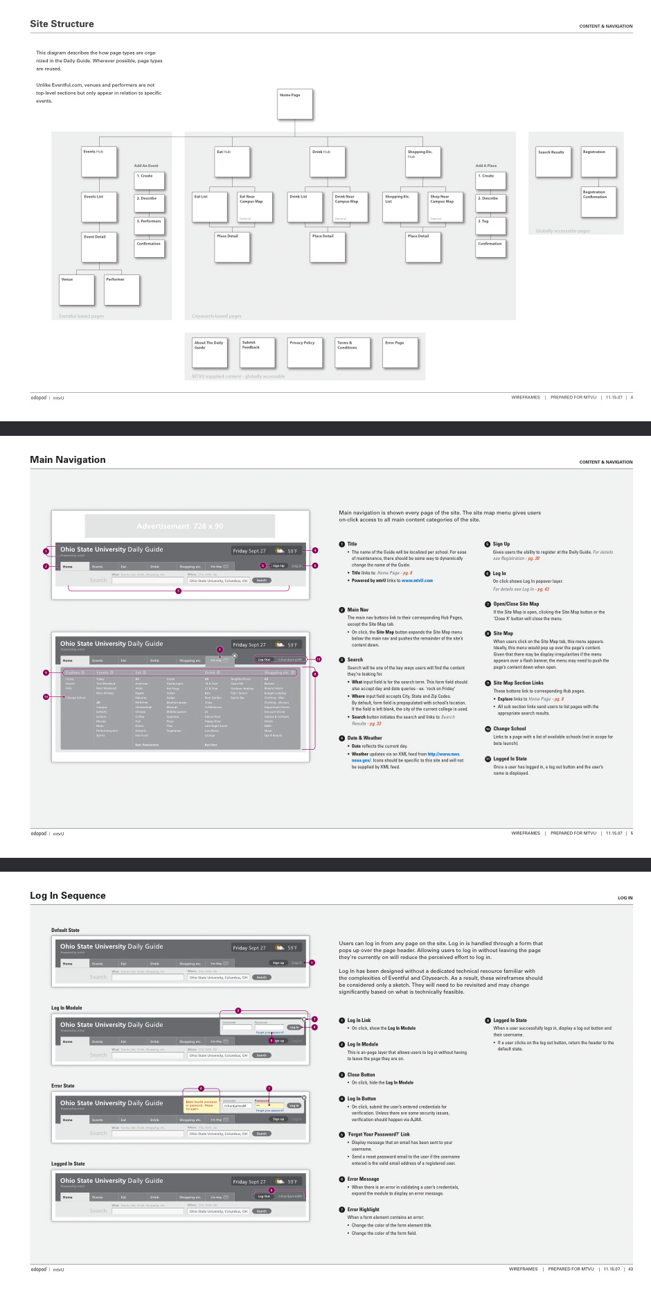
- mtvU Site Structure
- The project team was distributed so the design needed to be thoroughly documented.
- mtvU Wireframe Annotations
- Interface behaviors were specified to ensure the final product worked as expected.
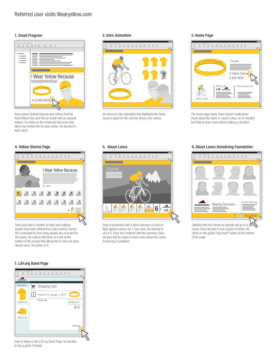
- Wearyellow Storyboard
- This is an early storyboard for what eventually became the LiveStrong band site.
- Wearyellow Storyboard
- These storyboards helped decision-makers better articulate what they wanted.
- Cranium Sketches
- These concept sketches were made for a children's game manufacturer.
- Interaction Design Approach
- I authored this document while preparing to tackle a humongous project (it tackled me).
Site Planning
Role: Information Design
Every interface design project starts with an attempt
to understand what a site or application is supposed
to do, what functionality it will contain, and how an audience will use it. During the course of a project,
it's common to employ a combination of sketching, schematic diagramming, architecture diagrams, wireframes, and prototypes.
These artifacts help a project team figure out what
an application is supposed to do. They get decision-makers involved in discovering promising design solutions. They give developers the information required to build and test a functional application.
The following screens show some of the things I've produced when employed to gather requirements, organize information, and propose ways for interfaces to accomplish a project's goals.
View This Work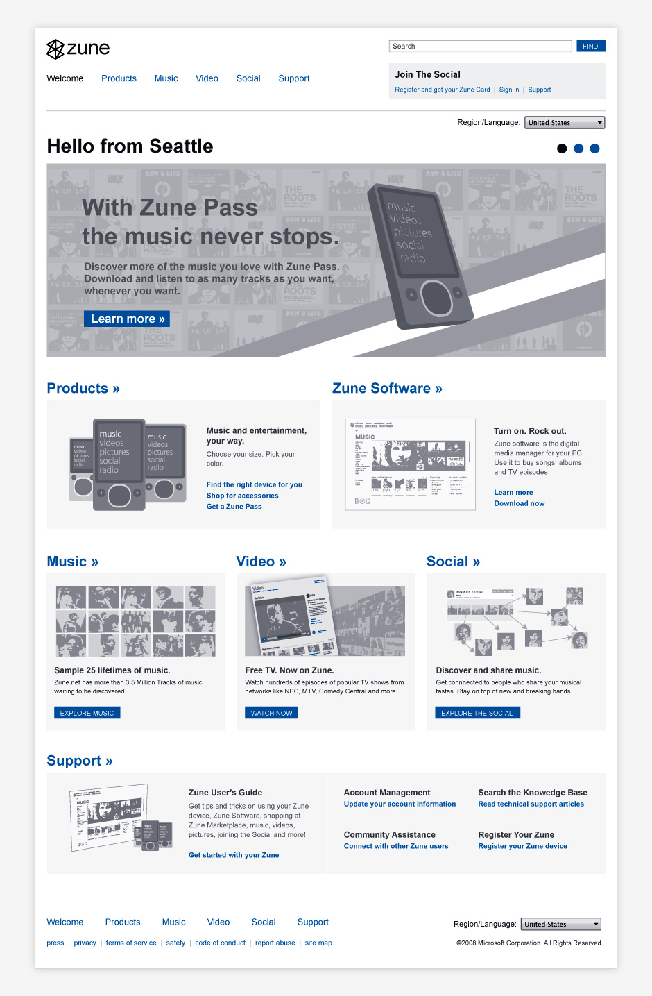




- Swivel Beta Product Icons
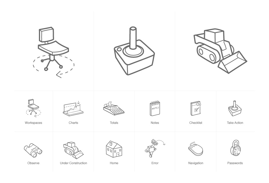
- These hand-drawn icons were used for an exploratory beta product.
- Swivel v.2 Icons
- These icons were created for a social data startup. They were used in product definition documentation.
- Swivel Product Diagram
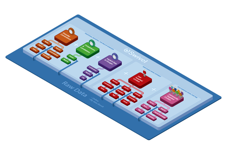
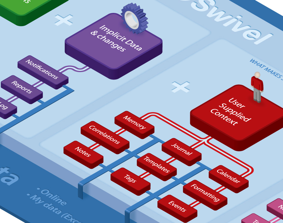
- This diagram was designed to illustrate what a social data startup was going to be when it grew up.
- Swivel Product Diagram
- This diagram was well-received but was very difficult to modify.
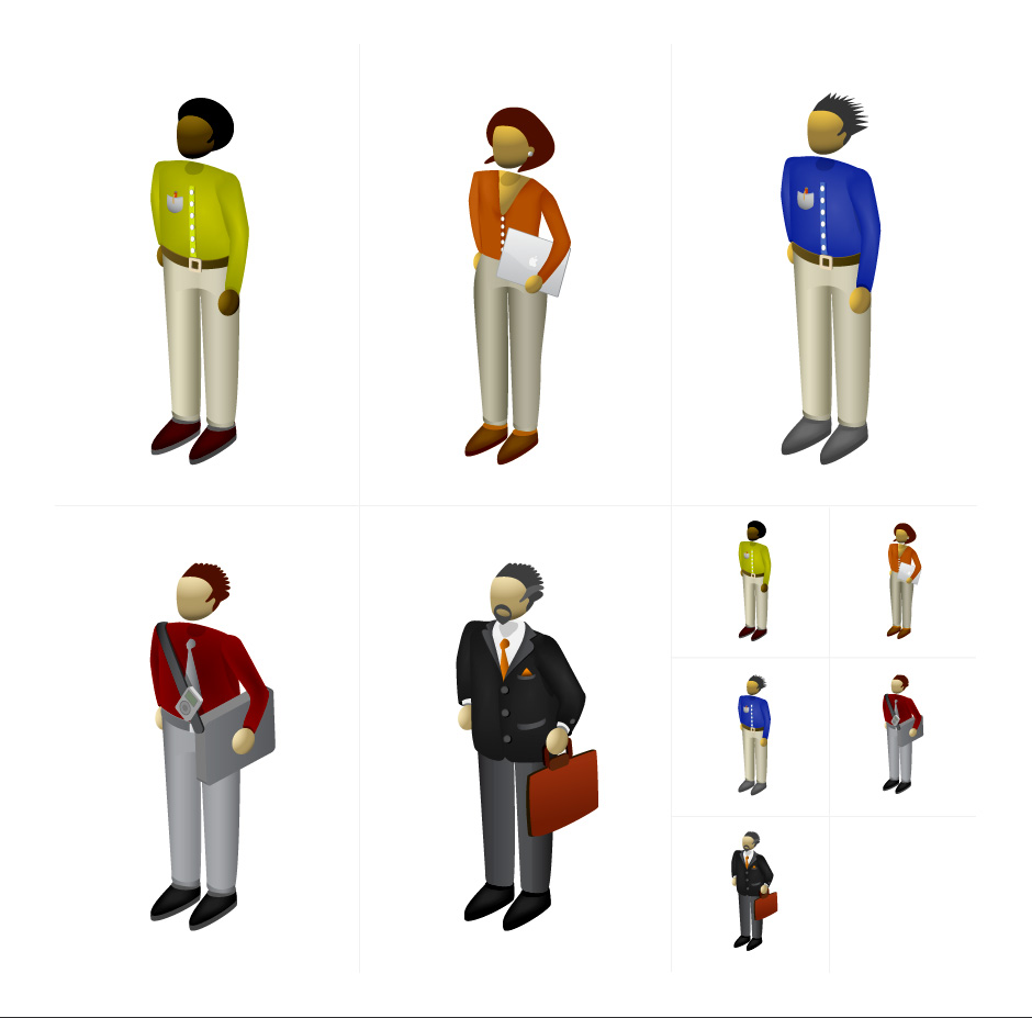
- People Illustrations
- These were designed for a professional services company.
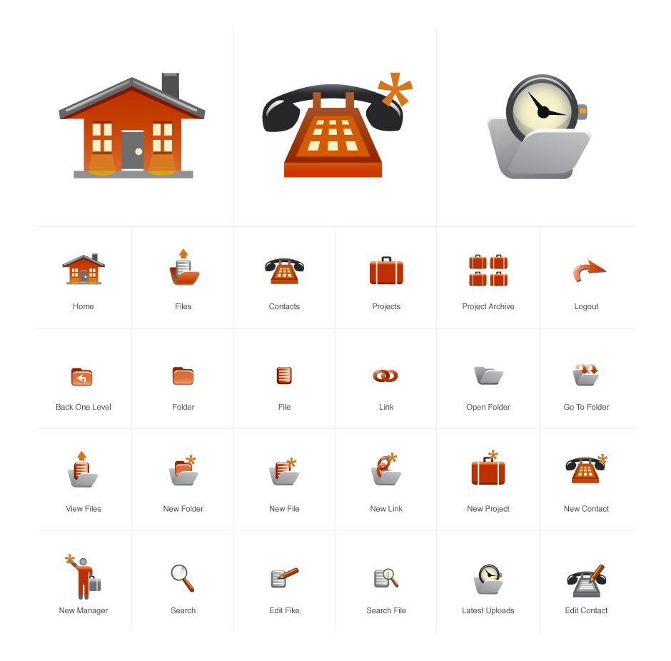
- Extranet Icons
- These icons were designed for an old-school extranet.
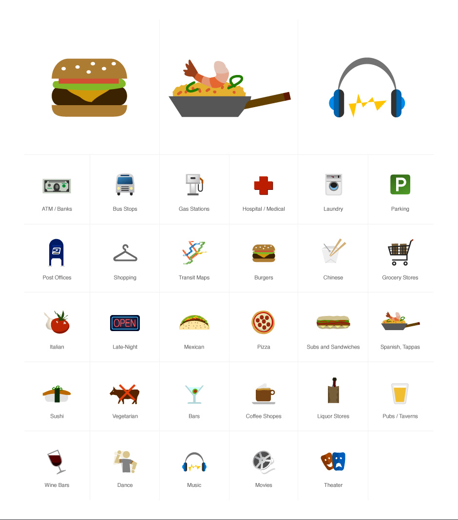
- MTV Local Guide Wireframe Icons
- These icons were used to make wireframes for a college guide more descriptive.
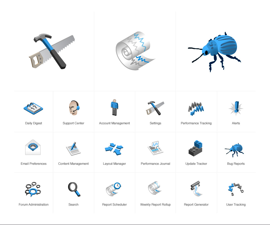
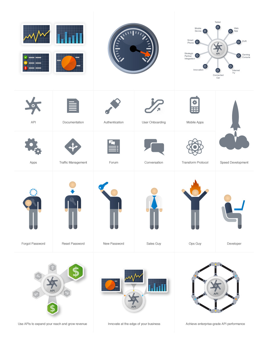
- Apigee Marketing Icons
- These icons were created for an API management company.
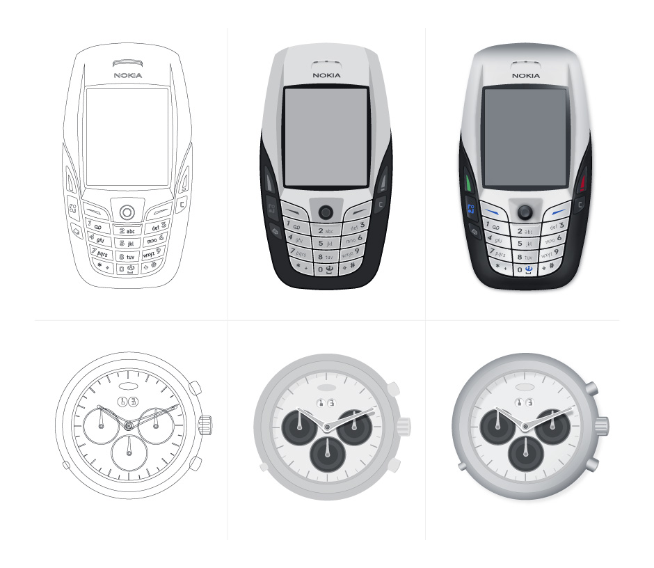
- Rendering Steps
- Start with simple vector shapes. Greyscale fills are applied. Gradients, shadows, and color round things out.
- Personal Project
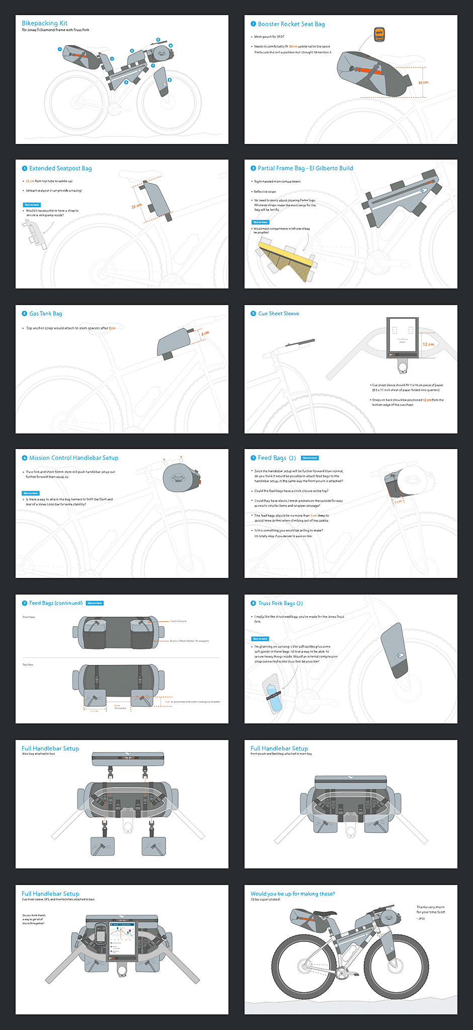
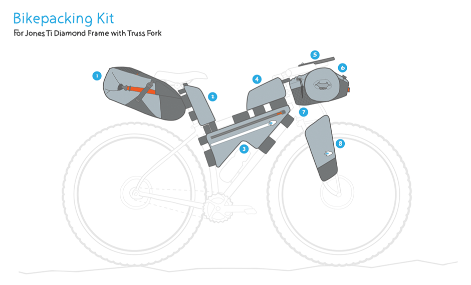
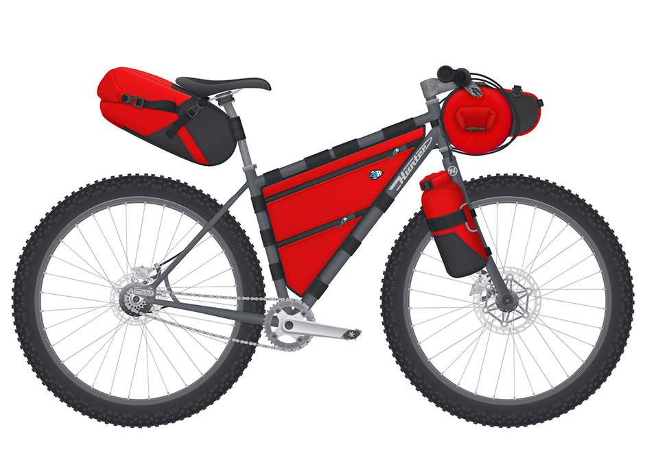
- This is a set of quick illustrations I made for a touring bicycle I'm assembling.
- Detail
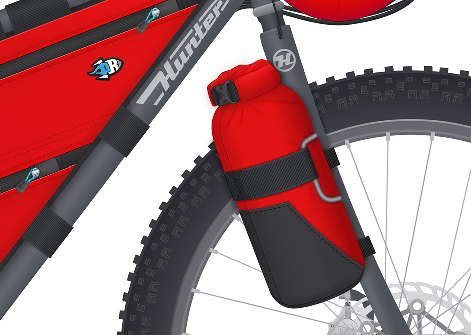
- I wanted to see if Scott Felter of Porcelain Rocket would make a custom set of frame bags for me.
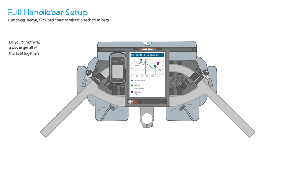
- Handlebar Detail
- Scott liked them so much, he asked if I'd be interested in making some illustrations for his site.
- Porcelain Rocket Illustration
- I made a set of technical illustrations that could be used in web and print.
- Bag Detail
- I'm always surprised how simple vector shapes, gradients and shadows can create the illusion of three dimensions.
- Bike Detail
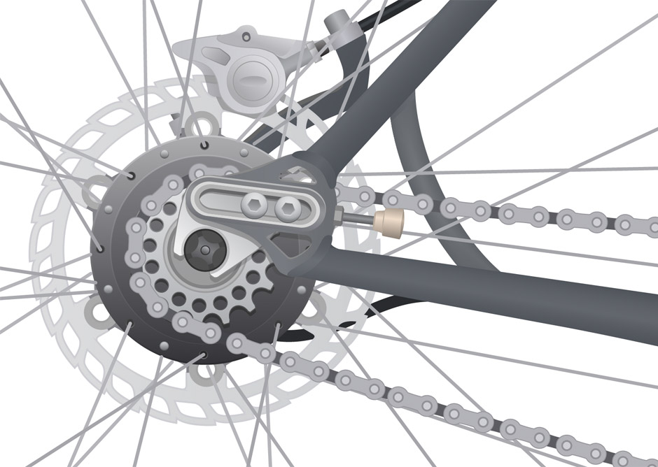
- Most details will escape notice, but they help contribute to the impression that this is a real thing.
Icon Graphics
Role: Visual Design

A big portion of my work happens long before a project moves into visual design and development. Icons and illustrations can be useful in helping communicate what's at stake before product development begins in earnest.
Icon graphics used in project documentation are a great way to encourage the agreement required to move a project along to higher levels of design fidelity.
Many of the interfaces I've made tend to be transactional or involve a lot of content. Icons and diagrams can be useful for describing and organizing functionality.
The following screens show icons and illustrations I've made for various projects.
View This Work